

Stripes have always held a quiet yet strong place in interior design. Unlike trends, which often come and go with a lot of noise and over-use, stripes are a timeless favourite. They have a versatility which allows them to move between eras, styles and changing tastes. For this reason, we love using stripes in our work at Hygge and Cwtch Design. The simplicity of a stripe aligns well to our design style and ethos, and never fails to bring personality and life to scheme.
The versatility of stripes
The beauty of stripes, and a nod to their rich history in interior design, is that they can be adapted to suit almost any scheme. From subtle to playful, traditional to contemporary. Differences in width can completely change the whole look and feel of a stripe. A gentle narrow stripe can play a background role by creating more of a textural look. A wider form delivers a punchy and statement style. When combined with intentional use of colour, a stripe can be a powerful print in conveying personality and creating a visual ‘moment’ in even the simplest of rooms.
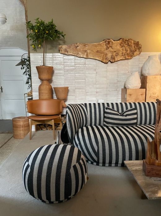
Stripes taking centre stage
We’re seeing a bolder take on stripes for 2026. Often reserved for easily interchangeable soft furnishings, striped furniture is putting the print front and centre. Stunning accent chairs in sculptural shapes and wide stripes are taking a lead role in design schemes. Rugs are becoming a hero piece that tie a whole room together. This is a great trick for drawing the eye to a seating area, encouraging connection and socialising.
Stripes are becoming a bold, confident choice in interior design, proving that they are much more than a trend and are a print that people are investing in for the future.
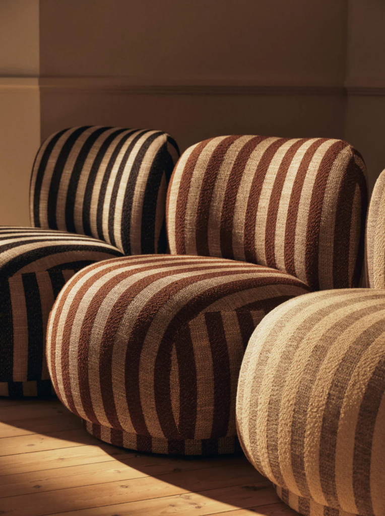
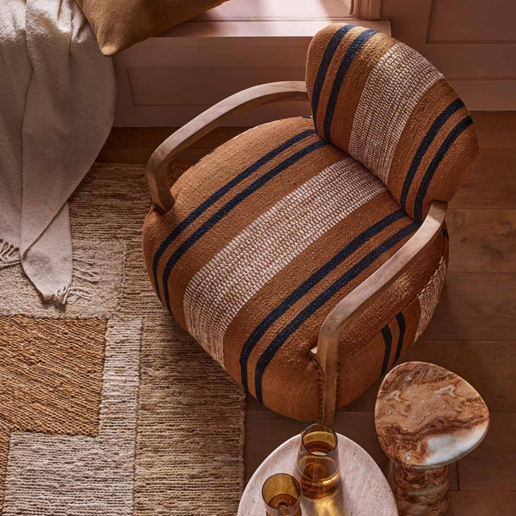
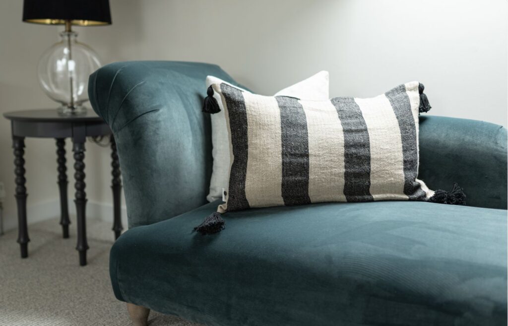
We love these accent chair examples, pairing stripes with earthy colours and plenty of texture through chunky weaves. While the overall look differs, the stripes deliver a visual impact while the shape and fabric texture draws us in with its tactility.
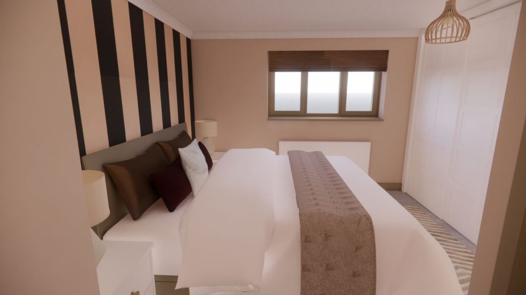
We created this 3D visual for our client to show them how a bold stripe wallpaper contrasts with the gentle colour palette, creating a space that feels peaceful and full of personality. We’re excited to see this room come to life!
Coastal and beyond
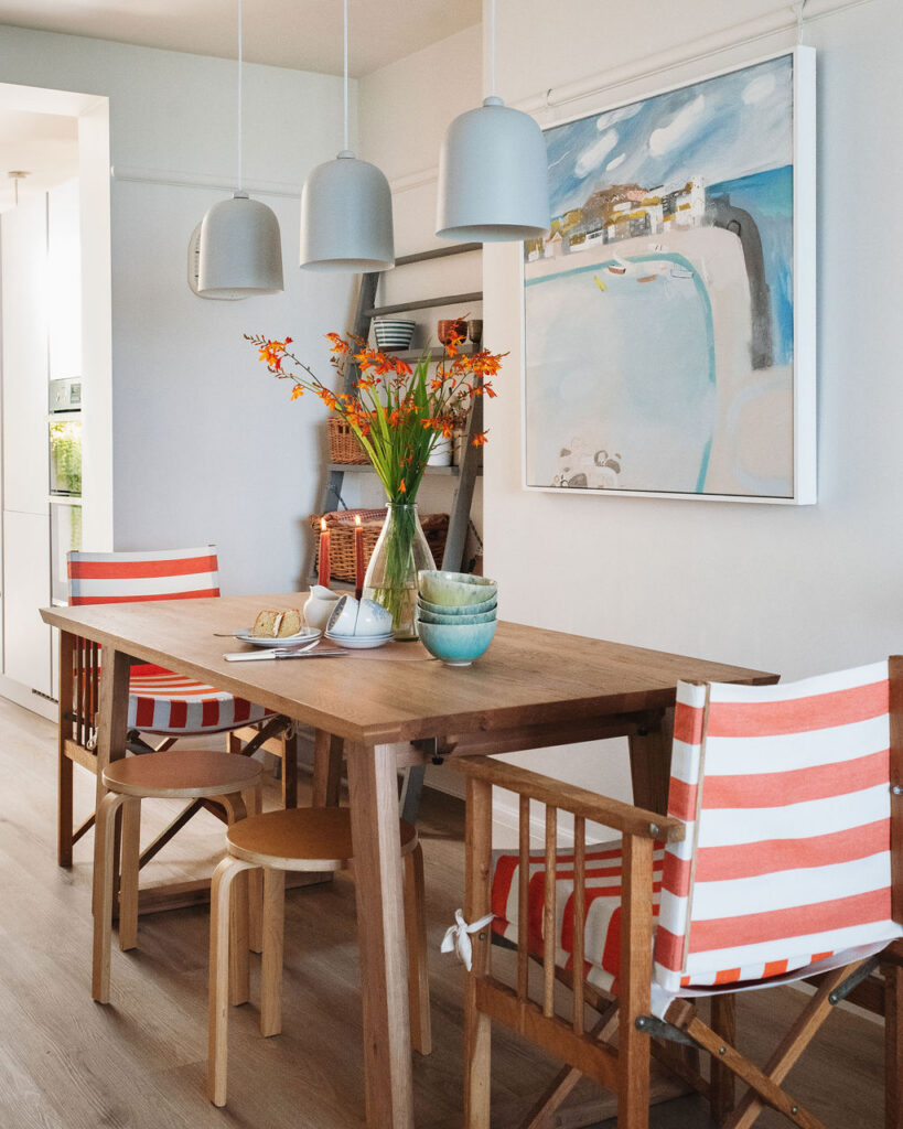
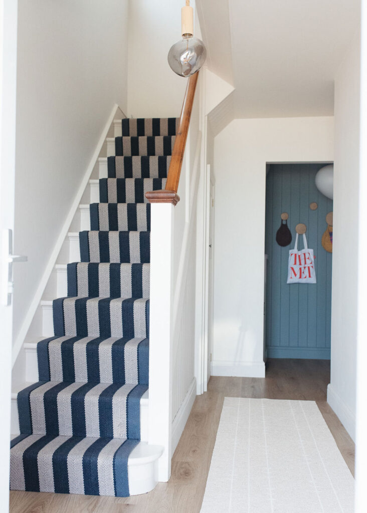
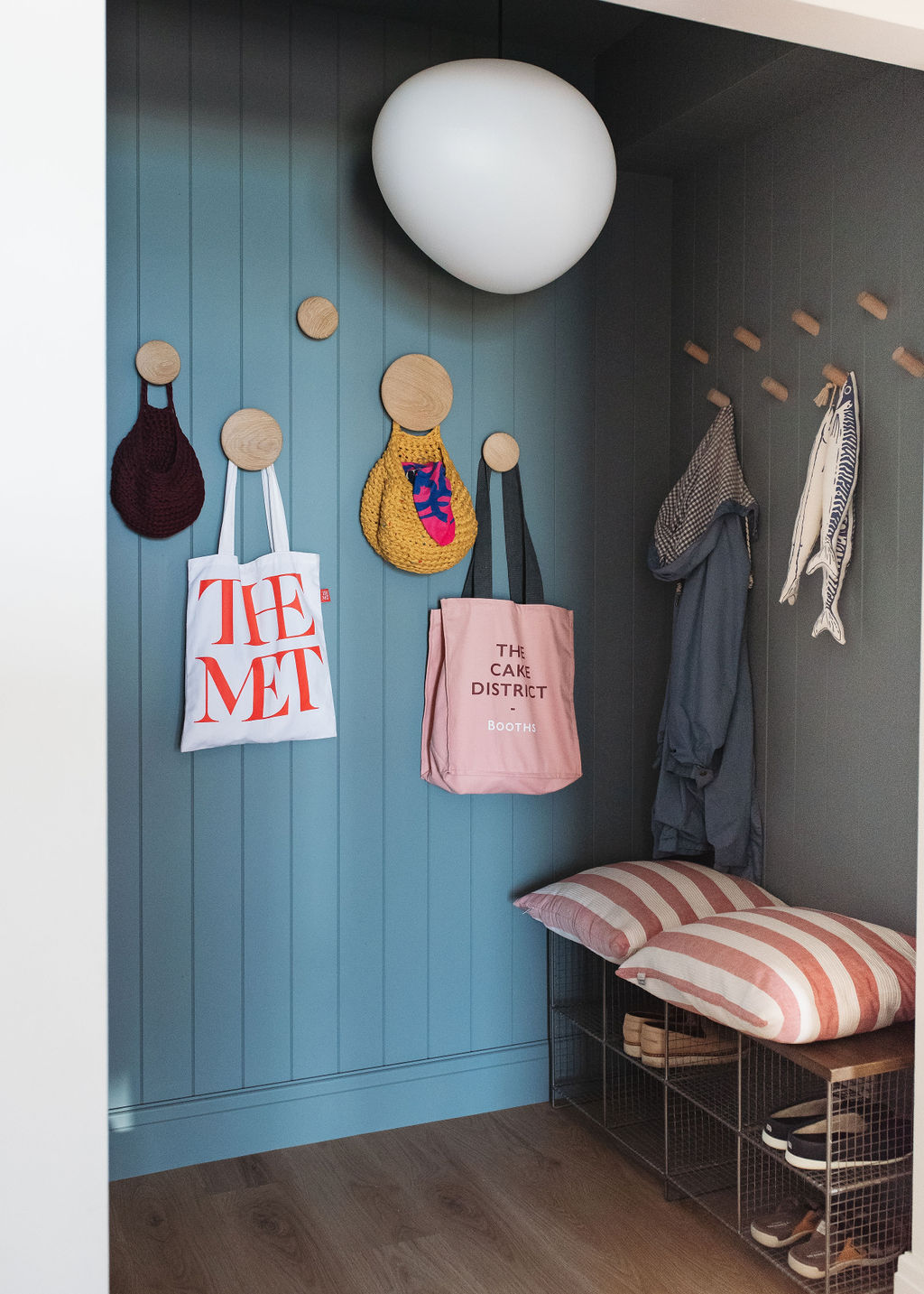
It’s fair to say that stripes are synonymous with the seaside, so they often feature in coastal schemes. While we’re not here for ‘themes’, we do like a nod to our surroundings and have been known to use a playful stripe in coastal properties where it can elevate a design.
Our Beach Road project is one such property where we chose to lean into the seaside location, developing a home which suited our clients’ personalities and brought them joy in their every day. Stripes were a natural fit in this home. Combined with a considered colour palette they created a layer of playfulness and cohesion which make this a stand out project.
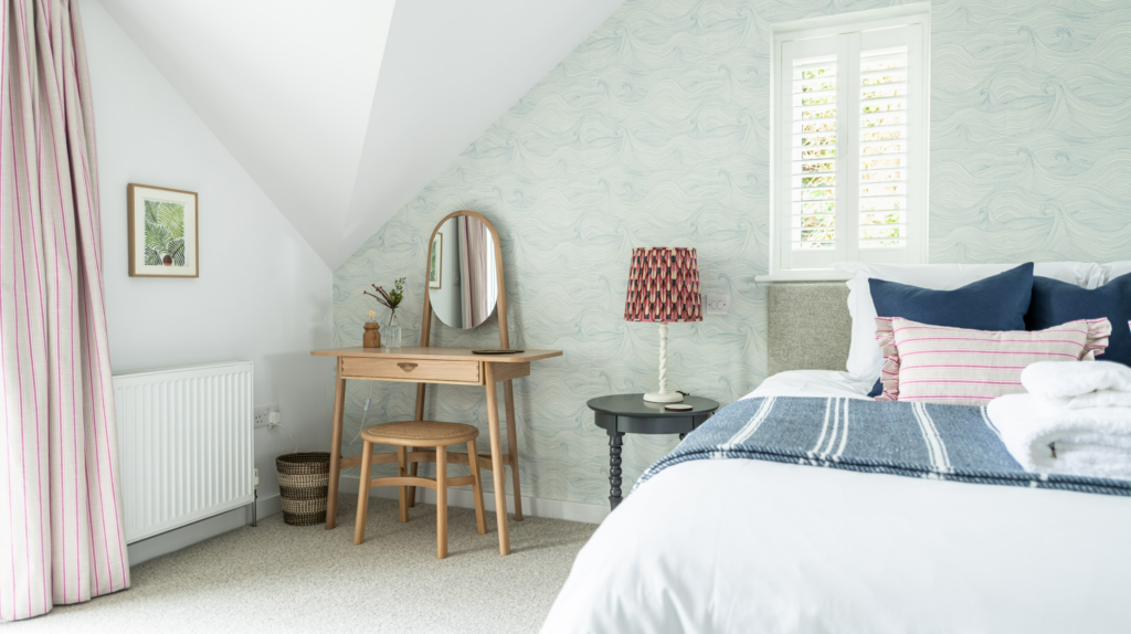
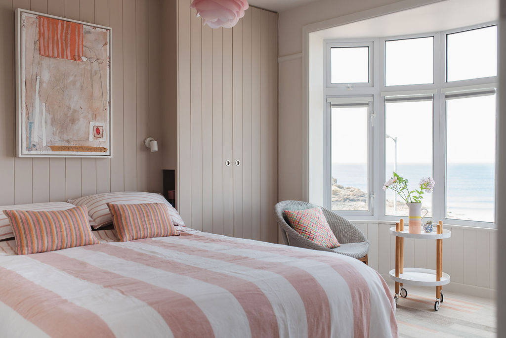
Our Lahaina project is a stunning holiday let in the seaside town of St Ives. A holiday let, as we’ve talked about before in this post, is a great opportunity to have some fun with interior design. While we leaned into the coastal style in this project, stripes took a more supporting role. In the master bedroom we mixed traditional nautical blue and white with bright pink narrow stripes for a playful take on this coastal classic.
How to get stripes right
The trick to getting stripes right is a considered width and colour palette. It’s all about proportion, balance and intentional use of stripes (and colour) to deliver on the overall feel of the space that you’re aiming for.
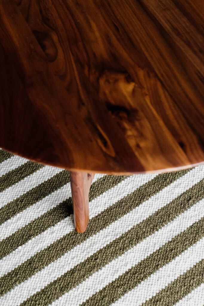
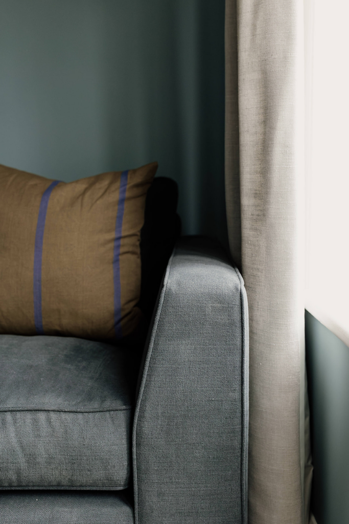
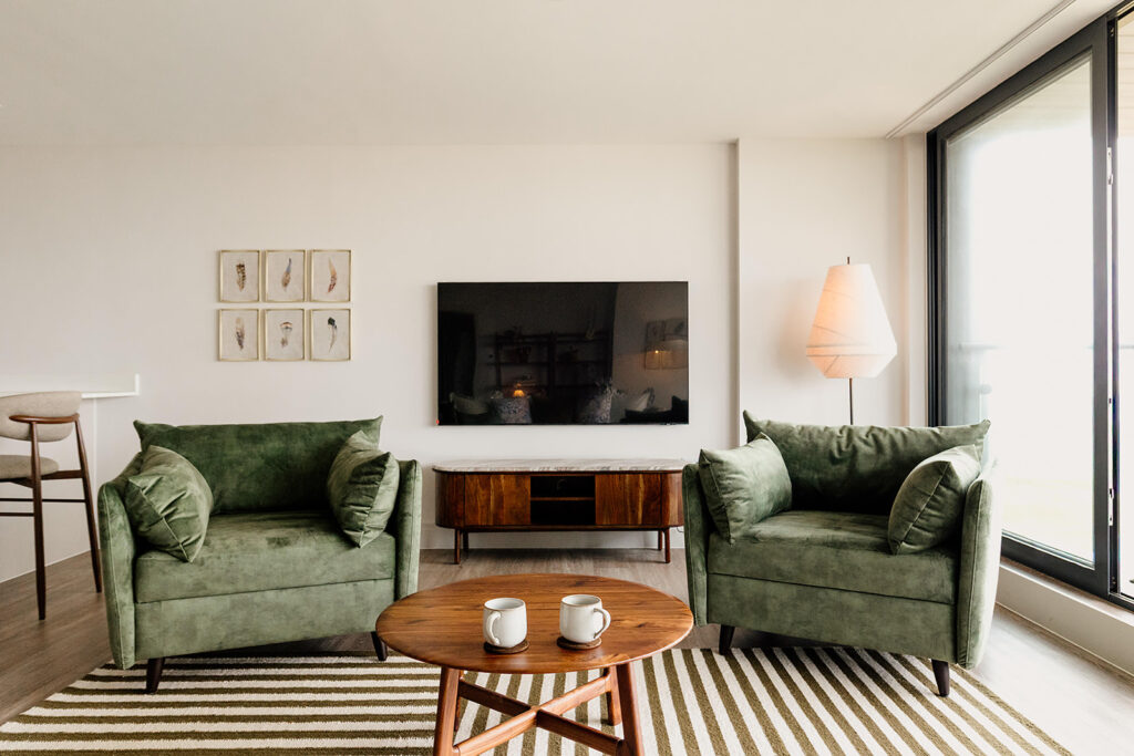
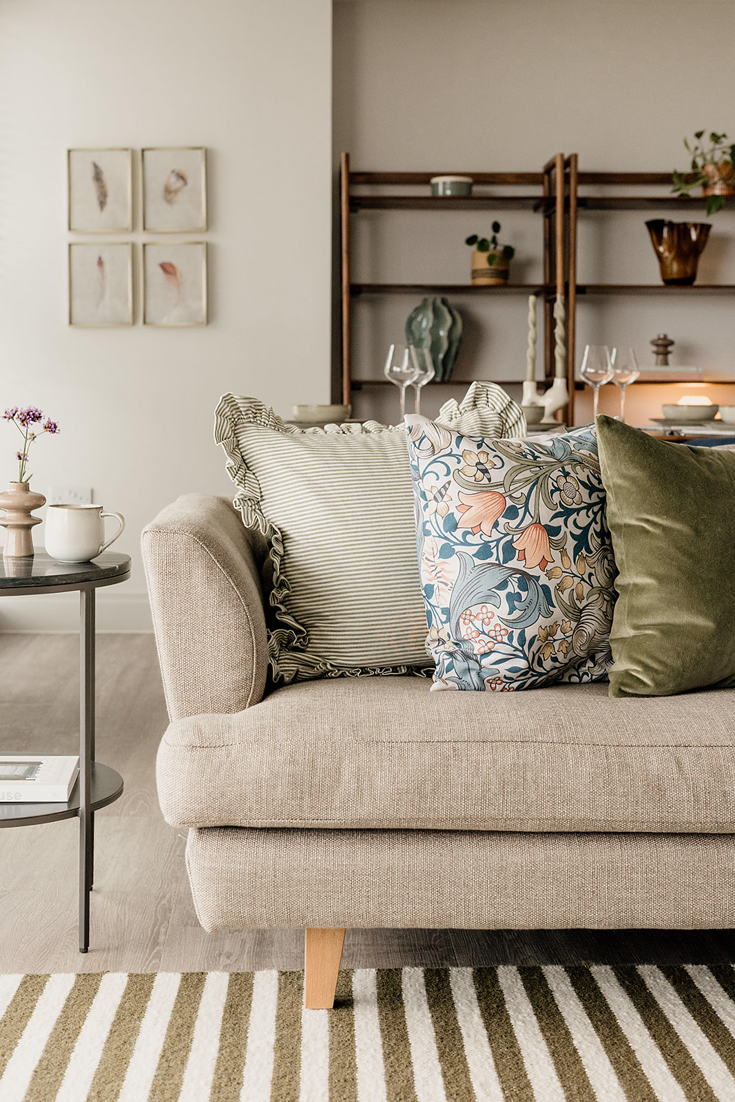
Mixing widths is a great way to layer stripes within a space. At our Porthcawl project, we layered stripes in different widths but a consistent colour in the living area. The wider stripe of the rug balanced out the dainty stripe of the cushion, giving it a contemporary edge that was aligned to our client’s style. It felt considered and intentional and it’s that attention to detail that elevates a design from the ordinary into something special.

Not sure where to start?
Whether it’s stripes or any other pattern, if your home needs an injection of personality but you’re sure where to start, get in touch for a chat! We have a range of services that enable us to work with a range of needs and budgets. We’d love to talk!

Previous Post
Next Post
For more of our latest projects, follow along on instagram at @hyggeandcwtchstudio.
© hygge and cwtch creative studio 2026 | all rights reserved | privacy policy | cookie policy
considered Art & INTERIOR Design for Beautiful Spaces
cardiff, CORNWALL & WALES
Hygge Cwtch
&


quicklinks


+ Show / Hide Comments
Share to: