In 2022, Hygge & Cwtch were hired to take on our biggest project to date. Tasked with designing the whole interior and rear outside space of the property, we were also asked to liaise with the builder to deliver the project successfully on site. Otherwise known as a turnkey project. Ten months in the making, we’re so pleased that we can finally share with you the full house tour of the Lahaina project. Read on for part 1, which is all about the downstairs of the house. Then head over the The Lahaina Project Part 2 for upstairs.
The project brief
Positioned close to the coastal town of St Ives, Cornwall, the Lahaina project is a luxury 5-bed holiday let. Our brief was to create a luxury coastal retreat. The plan was to breathe a whole new lease of life into an empty building with a full house redesign, including a garden design and a kitchen remodel.
Unlike the usual residential projects, a holiday let has a myriad of factors to consider. Of course, making the owner (our client) happy is our number one priority. But it’s important to consider how the property might be used by a different set of holiday makers week in, week out.
The layout needs flow and space for that all-important sense of ease and calm. Facilities need to be easily accessible and work practically. The finishes need to be durable and either stain resistant or washable, even more-so than in a private home.
Visually, the key was to curate a vibe which has the wow factor, setting this holiday home apart from other properties on the holiday let market. A place which not only attracts a constant flow of new guests but which keeps previous guests coming back year after year.
Three double bedrooms, one kids’ room, one snug-come-bedroom, an open plan kitchen, dining and living area, three bathrooms and an entrance hall designed to impress. And that’s just inside! So, where did we start…
Our design approach
In classic Hygge & Cwtch style, the design approach was to create a welcoming and cosy property from top to bottom, inside and out. A simply beautiful home from home. Each space needed to feel special in it’s own right, while flowing nicely with the rest of the house.
To get there, we took the surprise and delight route, mixing colours and prints which shouldn’t work together but just do! Making bold but intentional choices to create the perfect holiday vibe for its guests. We were striking a balance between design which they might not find in their own home, whilst making them feel completely at home.
As always, we were inspired by nature and took the lead from the local surroundings, bringing together ocean-inspired palettes with natural textures and understated prints. Calming yet vibrant. Stylish yet oh-so-comfortable.
Sustainable, local brands and makers were top of our sourcing list, and ensuring every inch of the property was considered and carefully planned was a key part of the approach. The attention to detail was essential for the building and installation phase of the project, so we invested in 3D modelling for the entire house as part of the design process. This not only enabled our clients to better visualise the final look, but gave us confidence in our own choices so that once the building work started and orders were placed, we were all on the same page and knew exactly how the finished house should look.
What the client said…
Following the final installation, Lahaina’s owners (our client) visited the house. Their 5* review on Google and Houzz made all the hard work over the past ten months worth every second. This is why we do our job, and love what we do.
“We were looking for a full turn-key service as we are located 220 miles away so we really needed someone we could trust...
We could not be happier with the result of our property and we have had so many positive comments from viewers. I cannot recommend Annie and the H&C team highly enough.”
The Entrance
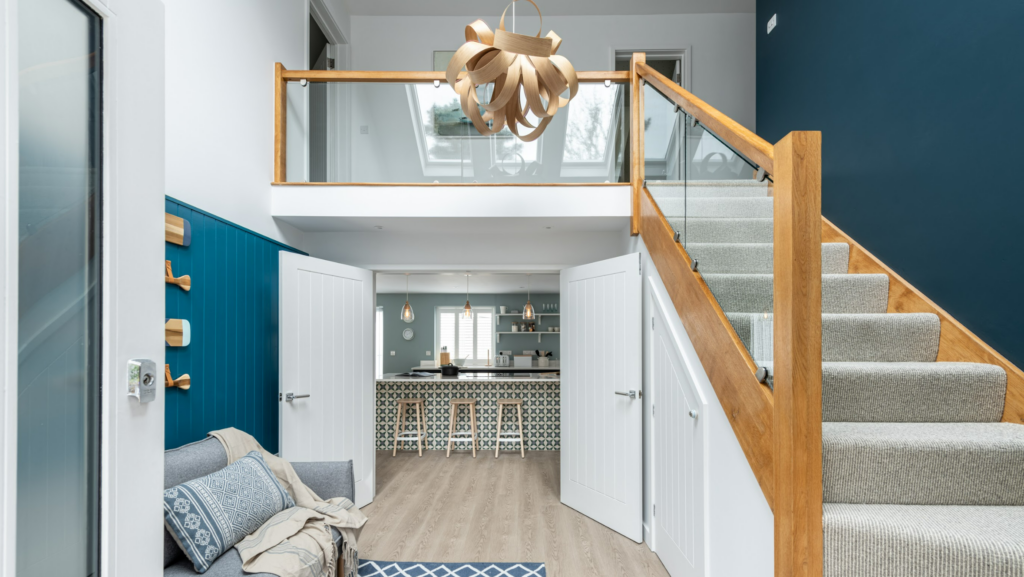
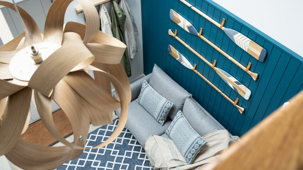
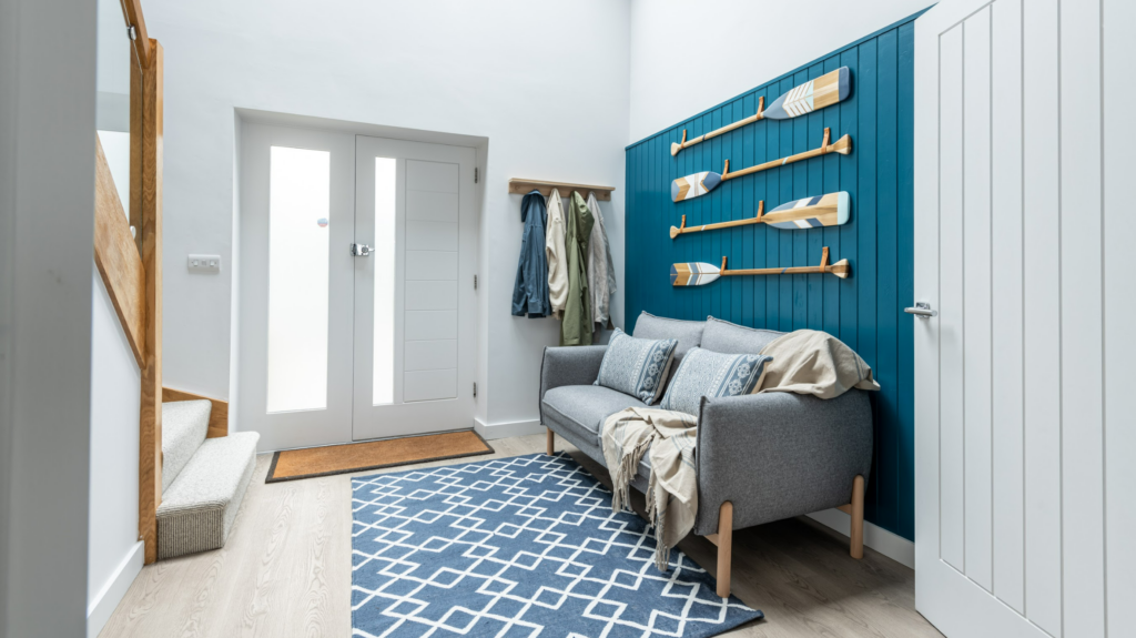
Taking that first step into Lahaina had to be memorable. The bold blue feature panelling with the gorgeous hand painted oars are unashamedly coastal. The comfy sofa and rug set up screams ‘sit down, relax!’.
Fresh off-white paint keeps things airy, while the expansive blue wall to the right draws your eye upwards and highlights the double height ceiling, emphasising the sense of space and light. The glimpse into the kitchen draws you further in, while the wooden accents in the staircase and pendant by Cornwall-based designer Tom Raffield are a nod to our classic nature-inspired style.
Before you’ve even taken your shoes off, the scene has been set for the rest of the house.
The Kitchen
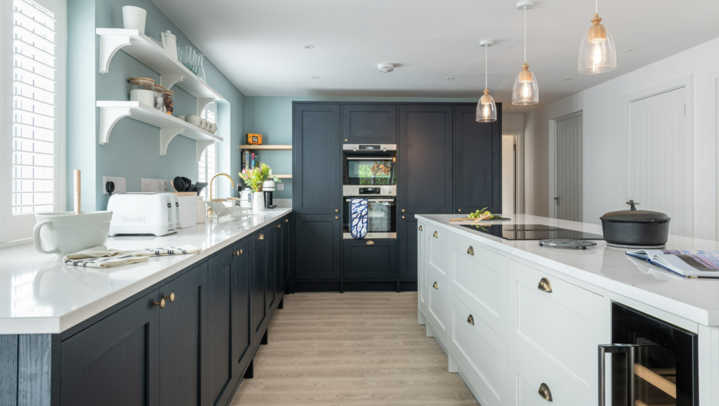
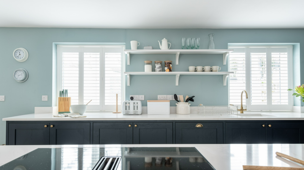
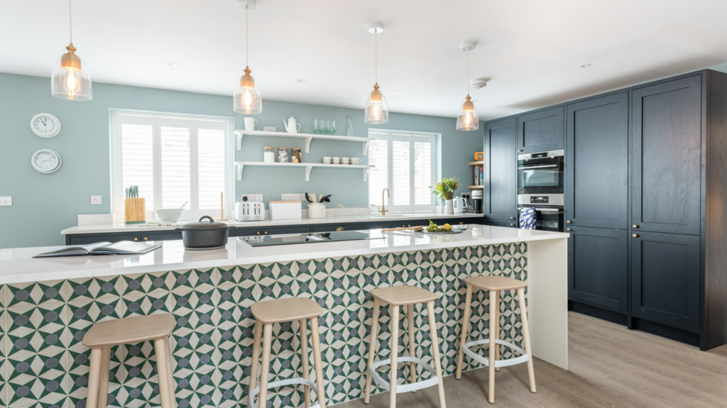
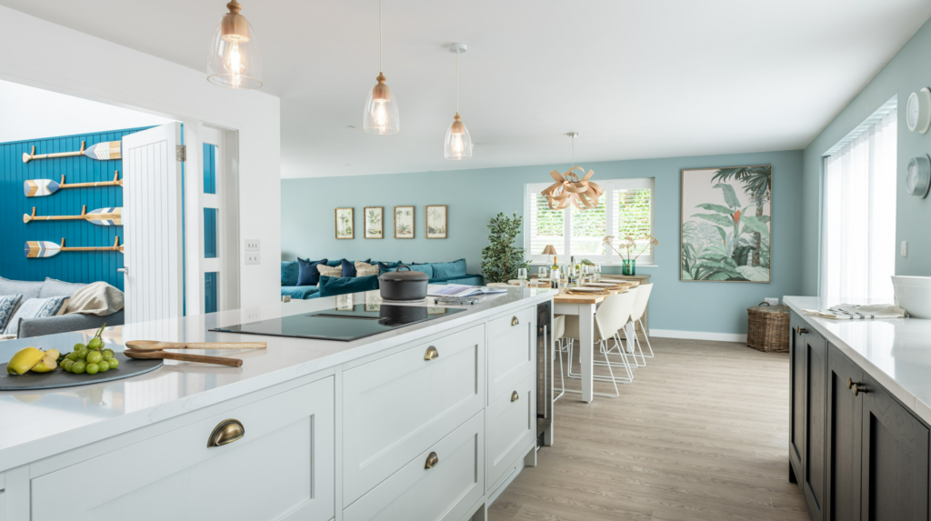
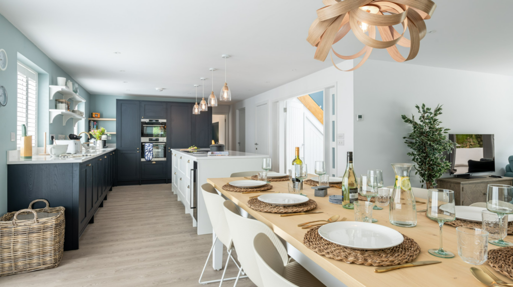
The kitchen area was completely transformed by knocking through to a separate study space to create this open, airy beauty. We removed the existing cabinets, took out a wall and lifted the floor throughout the downstairs. In its place went a two tone kitchen in contrasting shades of blue and porcelain white. Utilising the wall space for full height cabinetry and low cabinets along the length of the wall, as well as within a huge 3-metre island, there is now an easy flow around the kitchen as well as generous storage and worktop space. Open shelving between the windows as opposed to wall cabinets retains an open and airy feel.
The island is a real social spot for gathering around while cooking or sitting at the Scandi-style stools. The patterned tiling on the open side of the island is a feature in itself. Tying all the colours of the space together and creating a sense of fun and visual impact. It’s this kind of detail which elevates the space from ‘just’ a gorgeous kitchen to something really special.
The Dining Area
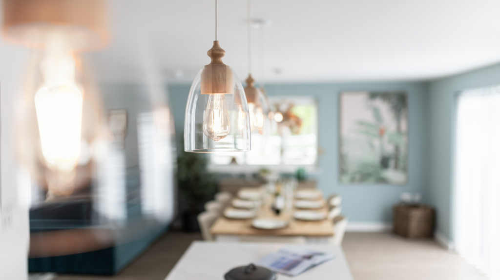
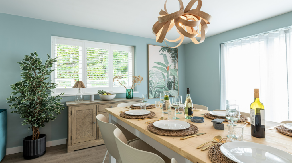
As the central point of the open plan area, the dining space had to feel like a cohesive and natural gathering point. The light blue walls and oak flooring both run throughout the open plan space to create this joined up flow.
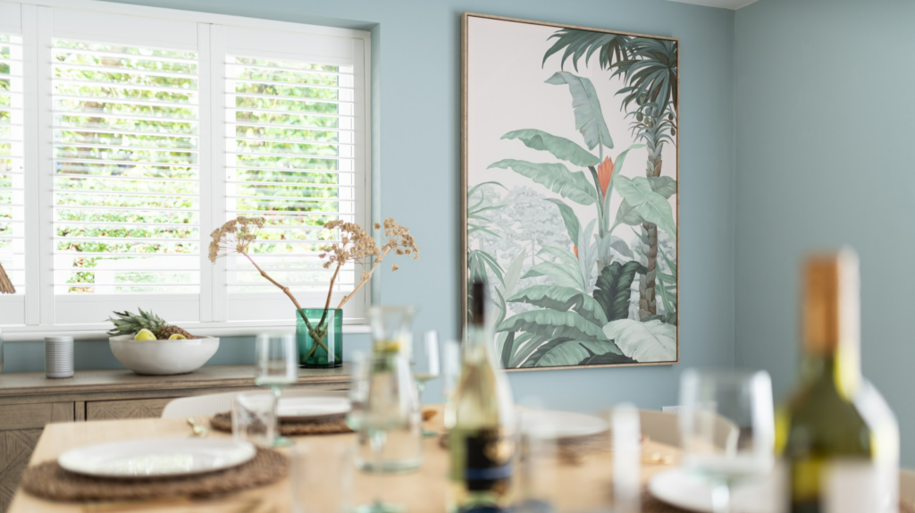
The contrast between the abundance of natural textures and the angular ribbed chairs deliver a cosy coastal yet modern vibe. On the walls, we played with proportions by filling the space with a single oversized piece of art. When looked at from the kitchen perspective, alongside the multiple frames in the living room and multiple oars hung in the entrance, the large single piece of art provides some much needed balance and a chance to catch your breath (in design terms!)
The Living Room
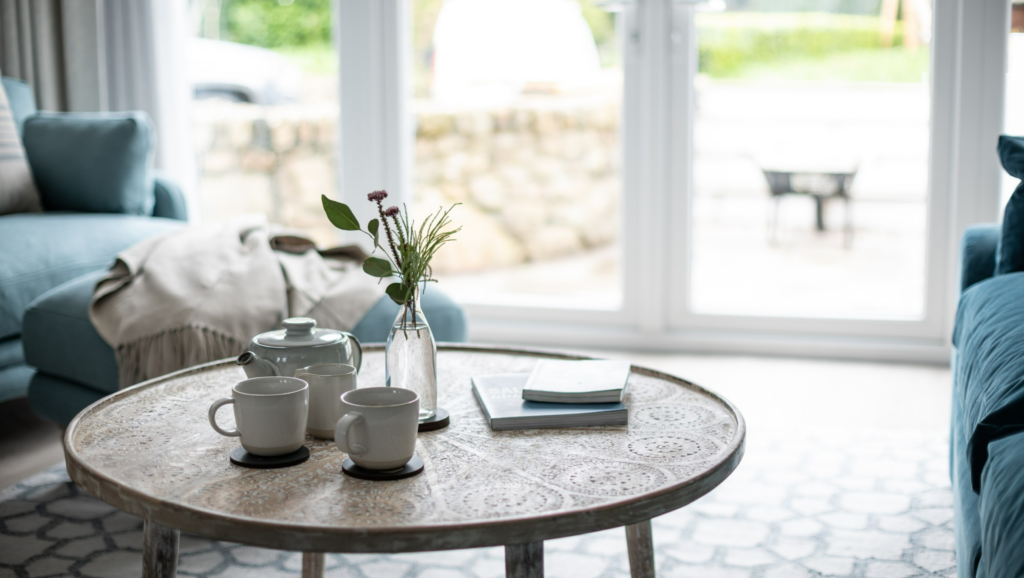
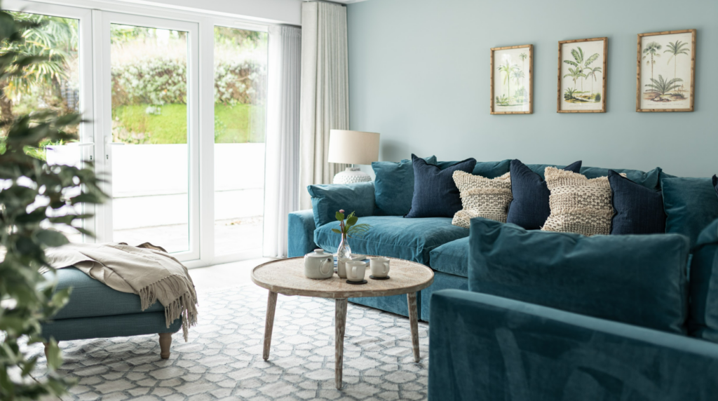
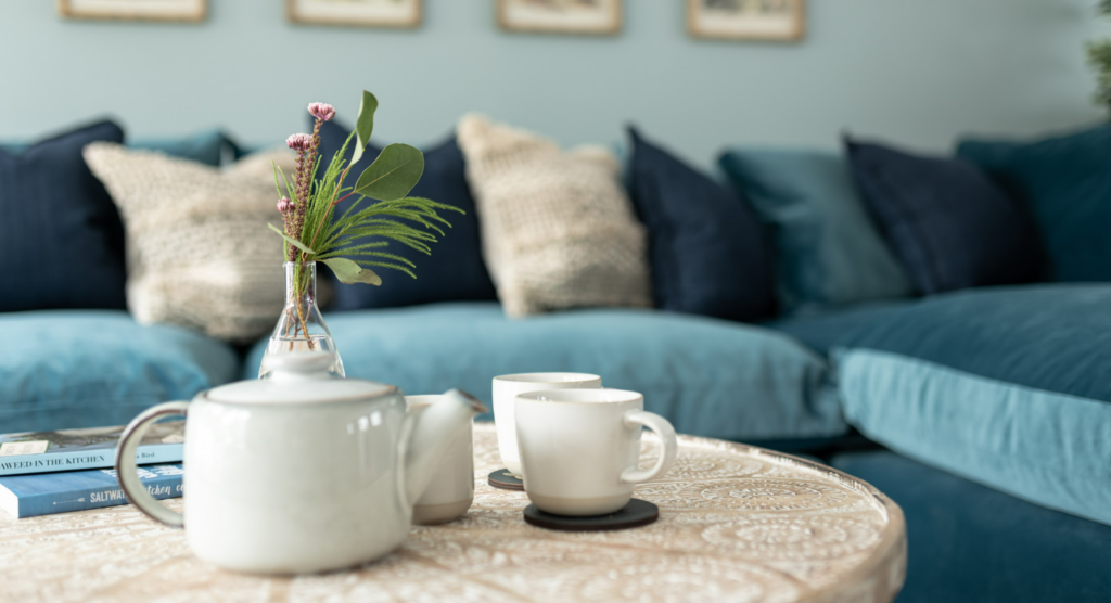
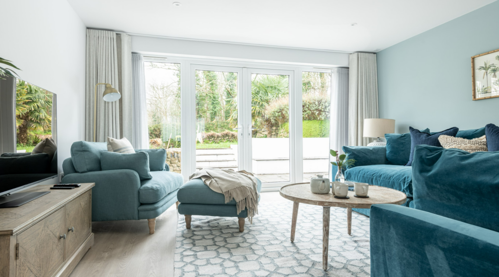
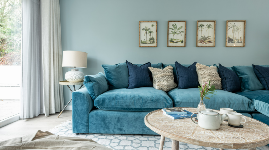
We can personally vouch for the comfort of this huge Loaf corner sofa. It’s an absolute delight to sit on and in this rich teal with complementary navy and natural cushions, it’s a feast for the eyes as well. The L shape makes the best use of the space and is perfect for families to join together to relax.
Teamed with an armchair and footstool which are slightly more formal in shape but no less comfortable, a round rustic coffee table on top of a huge area rug which links all of the furniture together, it’s a room designed for getting comfortable and being sociable.
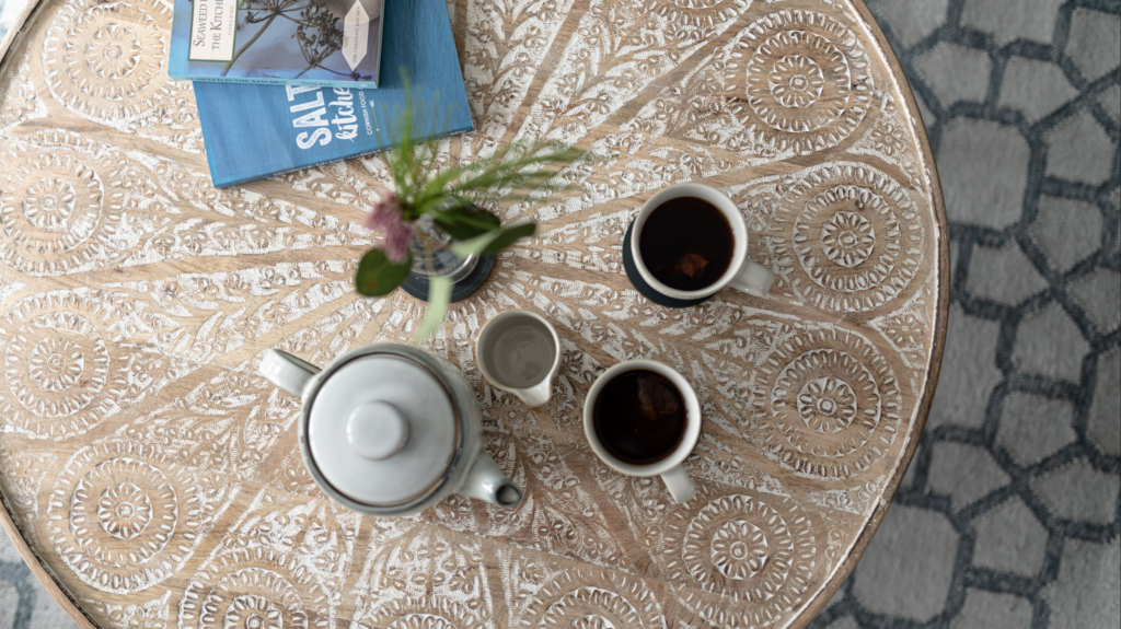
The Snug
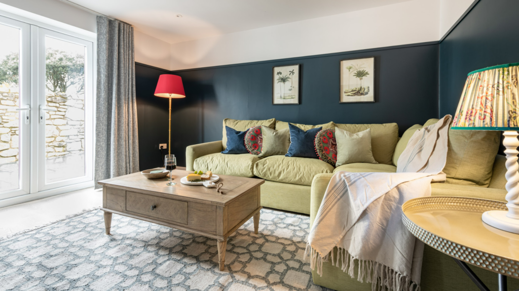
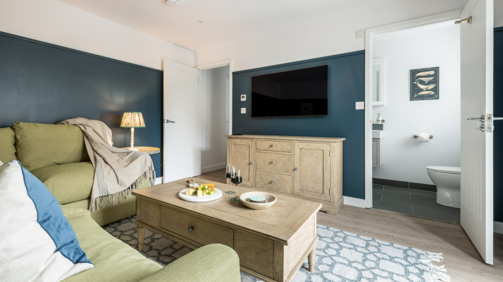
We have to give another sofa shout out here, because you would never guess that this super comfortable sofa is actually a sofa bed. Beautiful and practical, giving us our fifth bedroom when needed and the ultimate snug when it’s not.
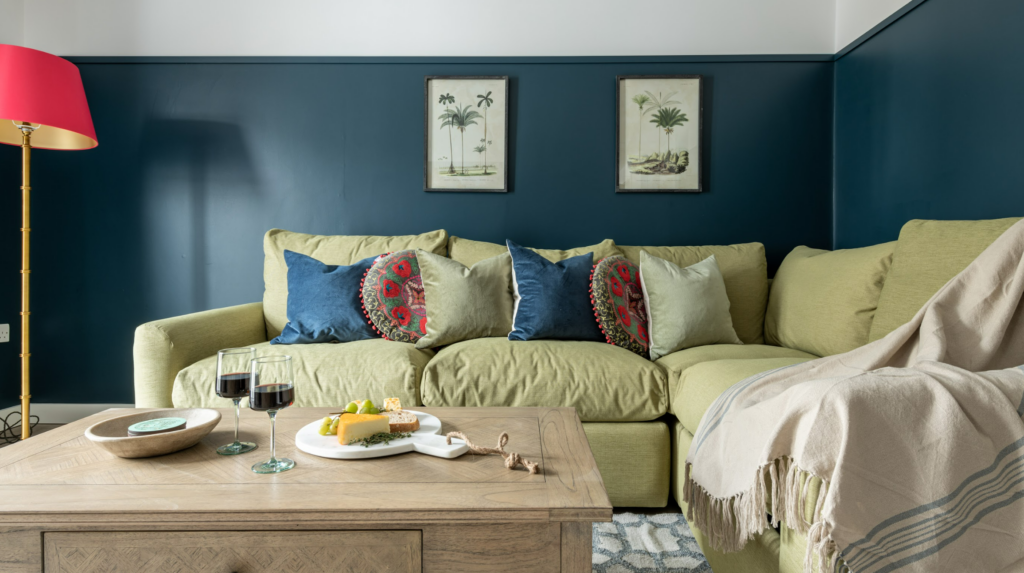
The approach in the snug was to create a real cohesiveness between the rest of the downstairs, but with a twist. You’ll notice details such as the artwork, coffee table and rug are consistent in style (or an exact match) for those in the living space. Already it feels like part of the home. But as a room intended for a teenage hang out, a games room or chill out space, we went a little bolder in the accent colours to ramp up the personality.
The green sofa against the dark blue wall shouldn’t work but it really does! Punctuated by hot pink, mixed wood and brass finishes and just a little pattern clashing, this is not your average holiday home spare bedroom!
That’s part one of the house tour complete! Now if you’d like to follow me upstairs I have four stunning bedrooms and two bathrooms you might like to see, over in the Lahaina Project House Tour, Part 2.
We’d love to hear what you think of this project, please leave us a little comment below or over on our Instagram with any thoughts or questions on the house. And if you have a home (holiday or private!) that you’d like professional interior design help with, please do get in touch for a chat.
Special thank you and credit to Ross Sheppard for all of the wonderful photography shared in our Lahaina house tour posts.
Leave a Reply
For more of our latest projects, follow along on instagram at @hyggeandcwtchstudio.
© hygge and cwtch creative studio 2025 | all rights reserved | privacy policy | cookie policy
considered Art & INTERIOR Design for Beautiful Spaces
cardiff, CORNWALL & WALES
Hygge Cwtch
&
quicklinks


[…] Lahaina project got a huge response when we revealed it exclusively in our April Edition newsletter in 2023. A […]