

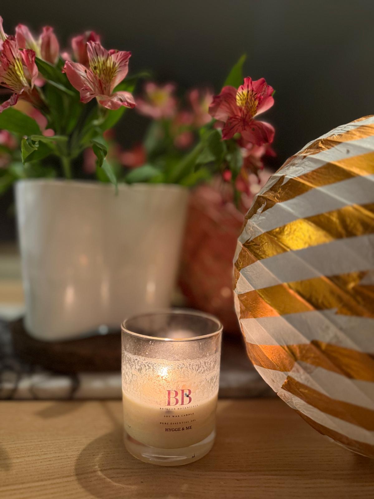
One of our signature interior design styles here at Hygge & Cwtch, is colour blocking. It’s a versatile trick which can transform the look and feel of a space with minimal effort or cost.
We talk a lot on our blog about how we design for the five senses, with texture and pattern being integral to the activation of our senses and creating a hygge home. But colour… colour just may be one of the most powerful tools in our kit. You will rarely see a Hygge & Cwtch home that doesn’t have flashes of colour to inject personality and help to gently guide the home owner through the ebb and flow of a home.
In this month’s post, we’re letting you in on why colour blocking is one of the great interior design tricks, and how you can use it to maximum effect in your own home.
Create a scheme to impact on the senses
How we perceive colour is the key to understanding how we can best use it in our homes. Colour theories are built around the idea that certain colour groups evoke certain emotions, having a mental and physiological effect on us. This is why the most important question an interior designer can ask is ‘how do you want to feel when you’re in this space?’ The answer will influence every design decision, not least the choice of colour and how it is used in the room.
That’s not to say that a room has to be flooded with colour to have the desired effect. As Oliver Heath writes in his 2021 book ‘Design a healthy home’:
“The trick is to not overwhelm the senses, but to use colours in your home in much the same proportions as you might find them in nature”
We are fundamentally driven and inspired by nature, and if colours harmonise in nature, they will harmonise in our home too. So rather than picking just one colour, we like to create a scheme of a few colours which will work together to activate our senses in the desired way. Just as they do in the natural world.
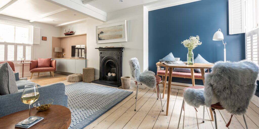
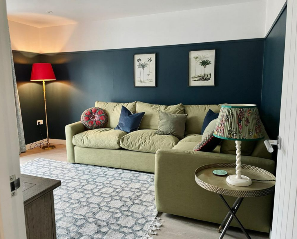
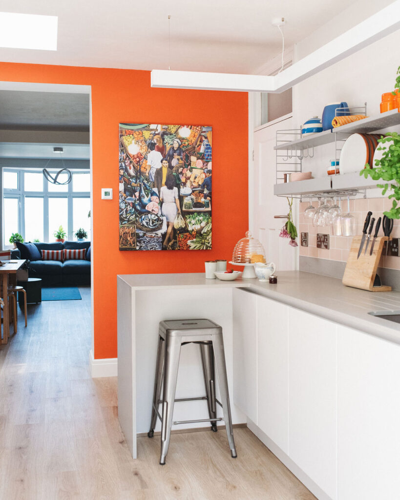
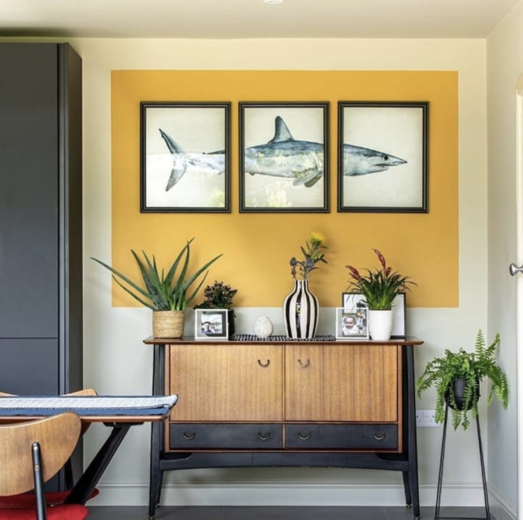
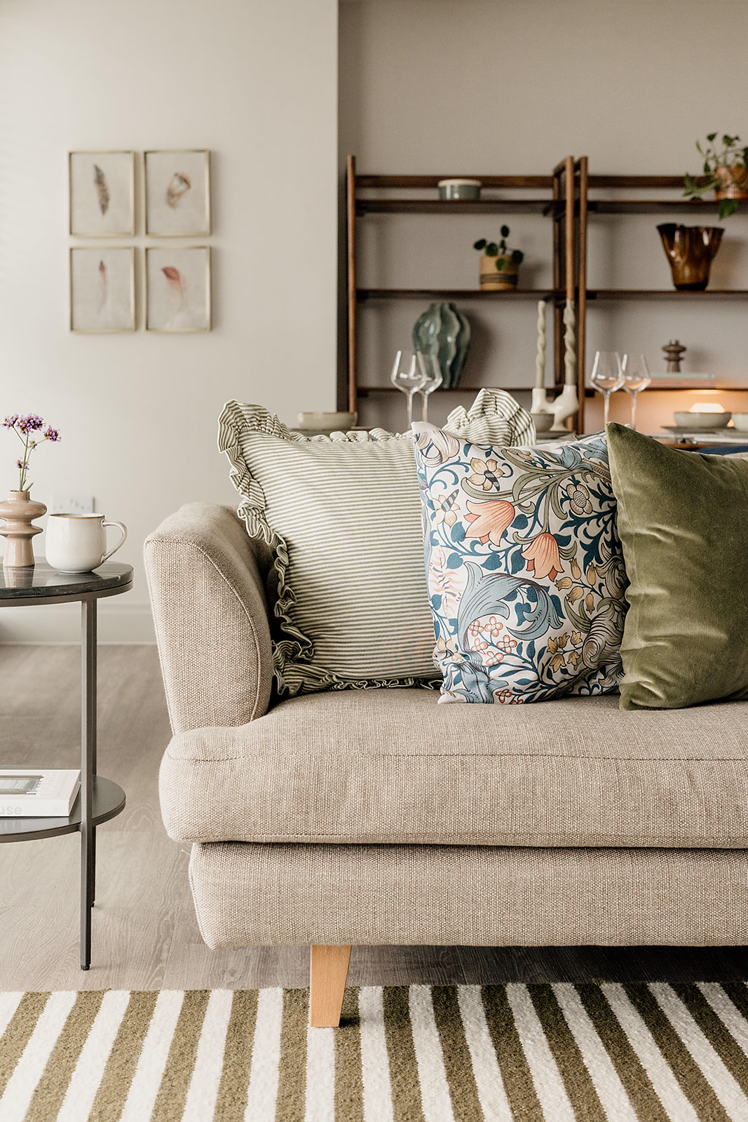
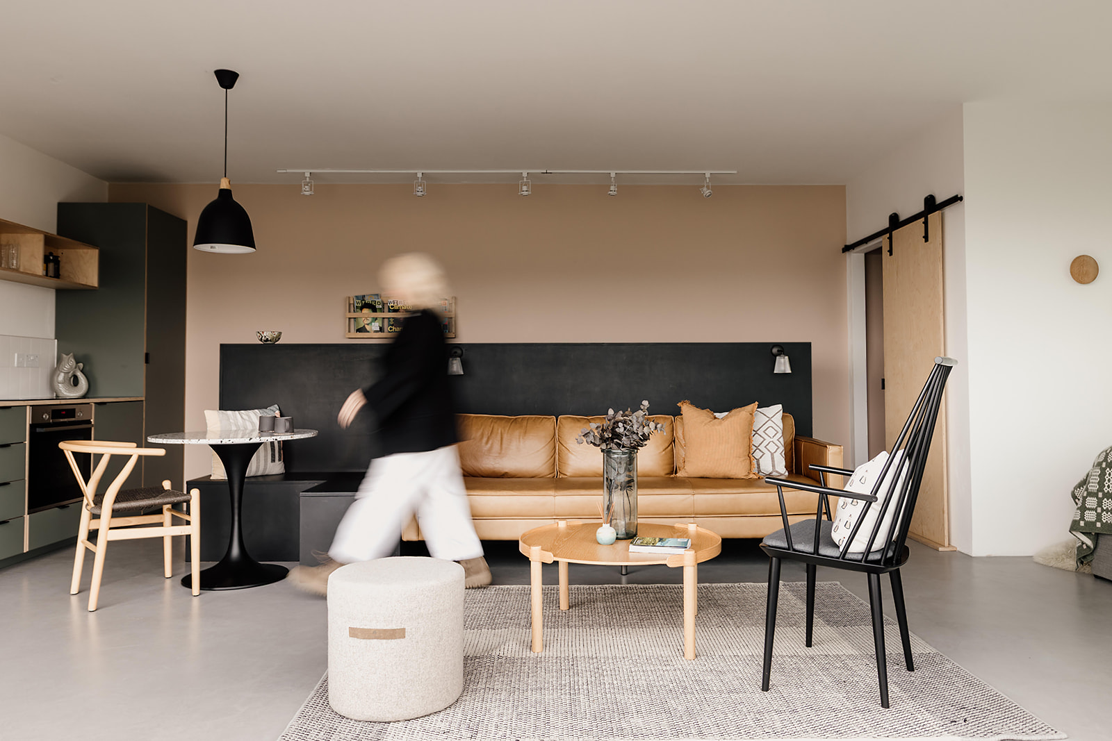
This is where colour blocking comes in. A wall of blue here and a block of sandy pink there, teamed with a warm neutral, will deliver coastal, calming, happy vibes. A block of mossy green near a section of zingy ochre yellow will create a real earthy, welcoming energy. Our approach is pared back, simple, not overdone. Just a nod to nature to get the senses working.
Be intentional with your use of colour
As with all design, we believe it’s important to approach every decision with intention. When deciding on where and how you want to introduce colour into a room, ask yourself what will be the overall effect? Can it deliver more than just a shot of colour?
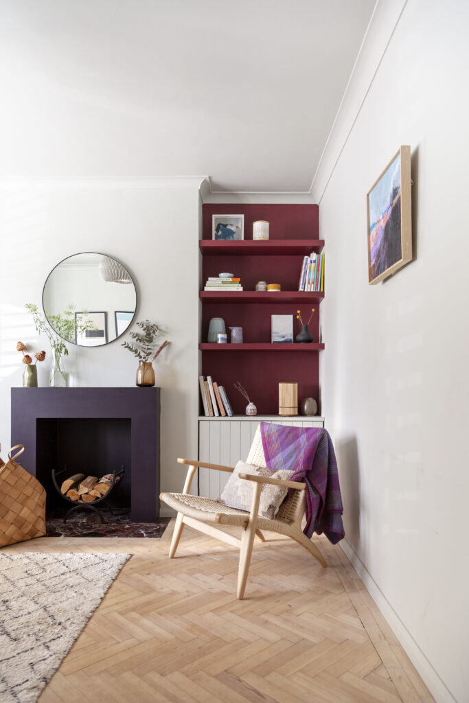
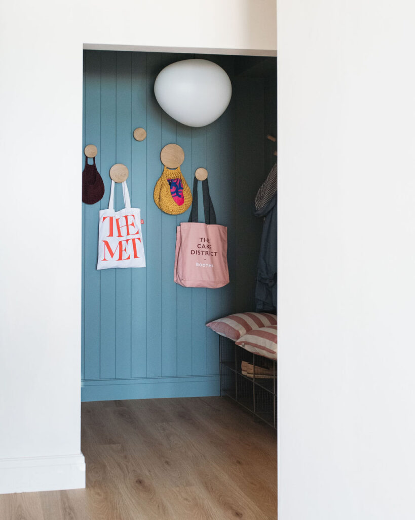
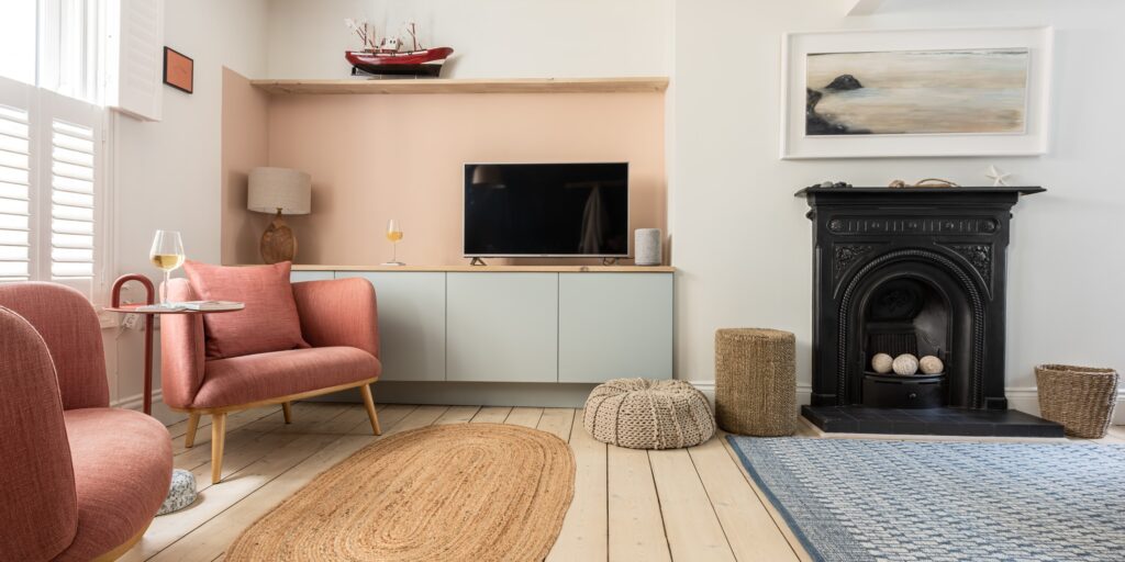
For example, a deeper colour in alcoves or the recesses of bookshelves can subtly introduce colour while adding the illusion of depth.
A block of colour on all walls, stopping two thirds of the way up the wall can be the difference between a cosy cocoon and an oppressive cave. Diagonal blocks of colour are often used as a design feature in children’s rooms as it can signify energy and fun.
Again, think about how you want to feel in the room. Next, consider what else you want to achieve with the space or individual areas. Clever use of colour in small doses can tick all the boxes when it’s thought through and carefully applied.
Zone your space with colour
Often used in open plan multi-function spaces, zoning is a valuable interior design trick. It’s all about creating a ‘unit’ within a space dedicated to a particular purpose or function. Colour blocking is a great option for zoning, as a block of colour can have the effect of anchoring together everything within it’s vicinity.
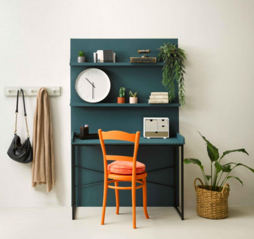
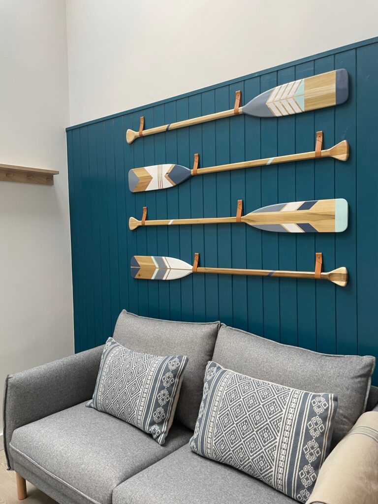
A challenge in interior design is often the feeling that accessories or even larger pieces of furniture are ‘floating’. Think about how rugs are used for zoning furniture on the floor, physically joining each item together. Well colour blocking can be used in the same way to join items together on a wall. Pictures and shelves which might otherwise feel like they’ve been randomly placed can suddenly feel perfectly intentional and put together once a block of colour is in place in the background.
Colour block to your strengths (or weaknesses!)
When done well, colour blocking can create optical illusions which play to a room’s strengths or balance out its weaknesses.
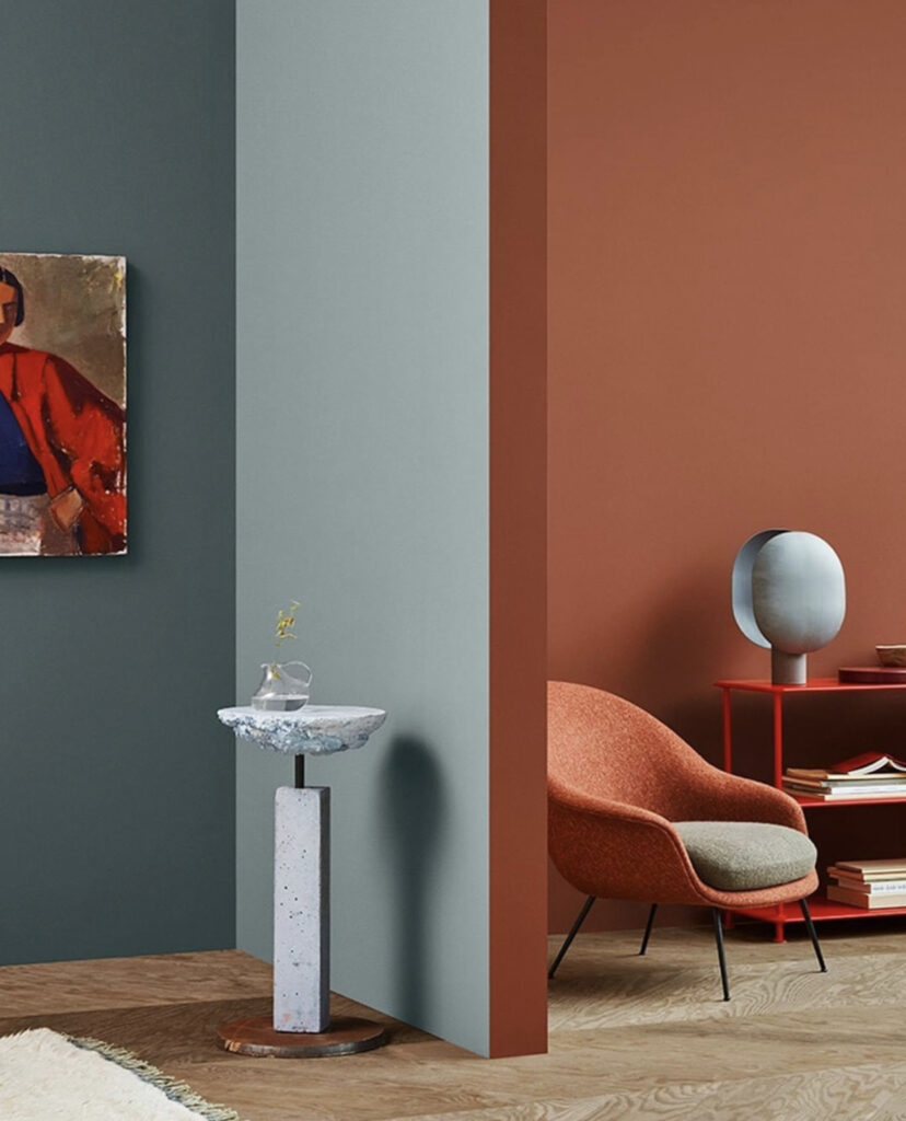
Small ceilings can feel taller when colour is extended from floor to ceiling as it draws the eye upwards. A shorter room can feel longer with a block of colour running the full length. This is especially true in both cases when the colour is done in a narrower (but still in-proportion) panel, as it really makes the eye focus and follow the direction the panel is travelling.
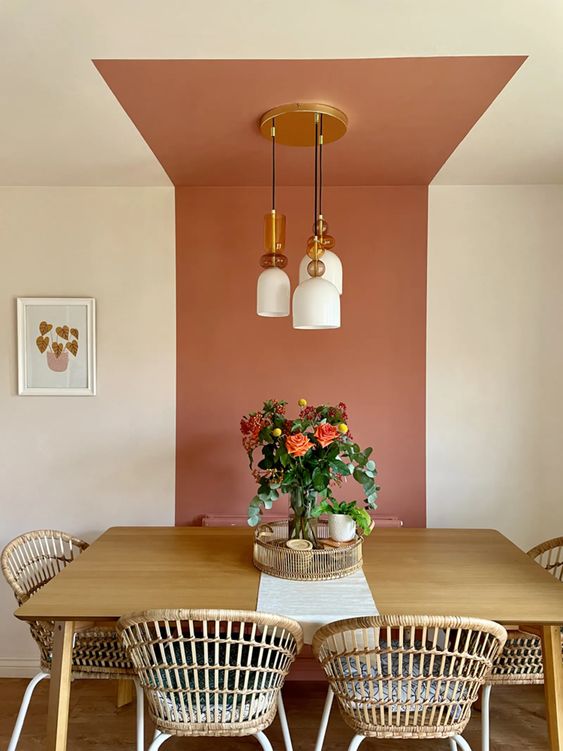
Draw the eye towards a focal point, such as a beautiful garden or stunning piece of art, using colour as a guide. A wall can feel bigger and more open when painted in an expanse of bold colour which invites you to take a step back and look at every inch of it in all it’s glory.
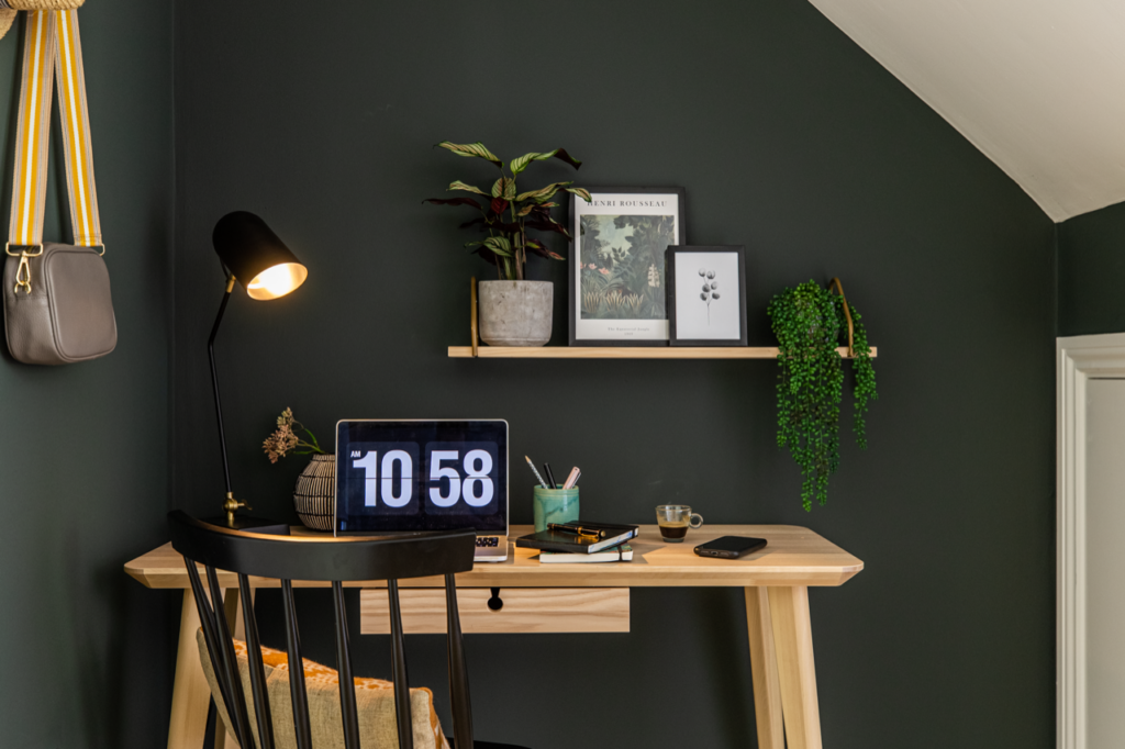
Even a typically functional area can be made beautiful. The right shade, applied as a block to zone the area, can distract the eye away from unsightly monitors and appliances.
Have fun with shapes and shades
Colour blocking is an opportunity to have fun with colour and shapes without long term commitment. There are so many ways to approach colour blocking depending on your personal style and how bold you want to go. If you don’t like it or fancy a change, paint over it. Simple!
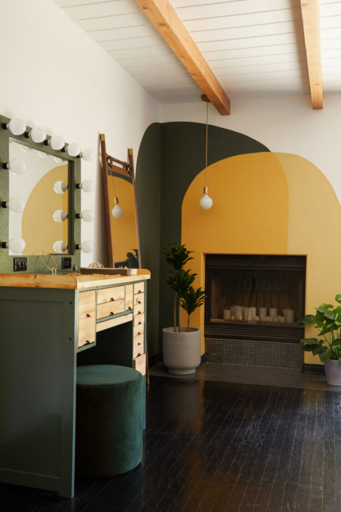
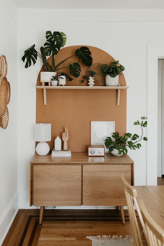
Colour blocked arches are great option for adding some softness or energy to a space. This is particularly effective when there are a lot of clean lines and straight edges in the room. Overlapping blocks or mixing shapes gives the opportunity to use a number of colours and really go to town on bringing your personality into the room.
Blocking large areas using complementary or contrasting colours immediately next to each other is bold way to colour block. Flooding a space with a colour scheme, creating drama and impact by the bucket load.
We have loads more colour blocking inspiration over on our Pinterest board. If you like our use of colour at our Hygge & Cwtch projects, then get in touch and let’s see how we can achieve the look in your home!

Previous Post
Next Post
For more of our latest projects, follow along on instagram at @hyggeandcwtchstudio.
© hygge and cwtch creative studio 2026 | all rights reserved | privacy policy | cookie policy
considered Art & INTERIOR Design for Beautiful Spaces
cardiff, CORNWALL & WALES
Hygge Cwtch
&


quicklinks


+ Show / Hide Comments
Share to: