

Earlier this month, I hit pause on Autumn and jetted off to the stunning island of Madeira for a few days. A much needed break with friends to enjoy all that the island has offer and feel the warmth of the sun one last time before we throw ourselves head first into the hygge season at home. While I was there, it struck me just how much stepping away from daily life and doing something completely different to our ‘norm’ can have such an impact on our wellbeing. Its all about contrast. It got me thinking about how contrast in interior design can have a similarly positive effect.
Why is contrast so effective
According to Collins Dictionary, contrast is “a great difference between two or more things which is clear when you compare them.”
It’s not necessarily about one ‘thing’ being better than the other. It’s about the power in experiencing both side by side.
The difference I felt in my mind and body when I was out in Madeira was almost instantaneous. Daily life is busy. It will be a familiar story for many of you. Running this business of mine at Hygge & Cwtch Design Studio. Being a wife and a mum to two teenage boys and CJ the dog. Keeping on top of life admin, friendships, attempting some sort of regular self care to avoid burnout. And currently, project managing our own home renovation and all of the challenges that brings.
Stepping out of the juggle and the hum drum of every day life and into something so wildly different in every way was like a full reset for the senses. The difference in what I saw and how I felt made me feel alive. It was impossible to not live in the moment and enjoy the simple pleasures of my surroundings, which in itself is very hygge. Wouldn’t life be dull without that contrast?

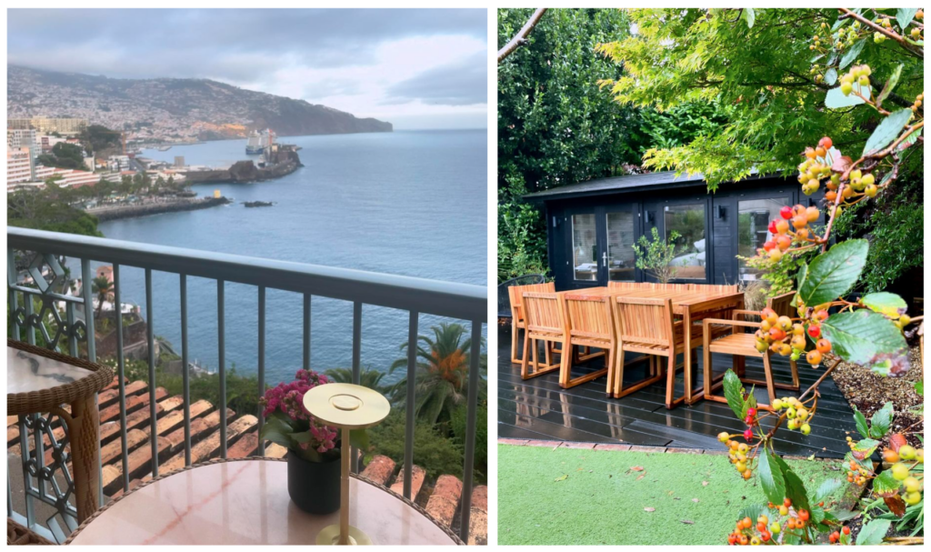
The warm sun and fresh scents, sounds and sights of a volcanic Portuguese island are worlds apart from the vibe of Cardiff in October. It’s such a contrast from every day life that it was easy to switch off from everything going on at home and focus instead on what we were there to do. Have fun, relax, recharge. This set me up nicely for returning home, feeling more motivated and ready to put my all into the last few months of 2024.
How does contrast work in interior design
The power of contrast is a tool used in interior design for both functional and aesthetic purposes. That hygge element I felt when I was away, the feeling of coming alive and being in the moment, brings in a more holistic wellbeing angle too.
Let’s take colour as an example. I recently learnt in an art course how value contrast (light and dark) are the most effective ways to improve art. Interior design is art, therefore the same theory applies.
Strongly contrasting shades can highlight particular features of a room. It can aid flow and balance, creating an overall appealing visual experience. The change of pace between two very different colours can instinctively tell a person how they are supposed to feel and what they are supposed to do in that moment.
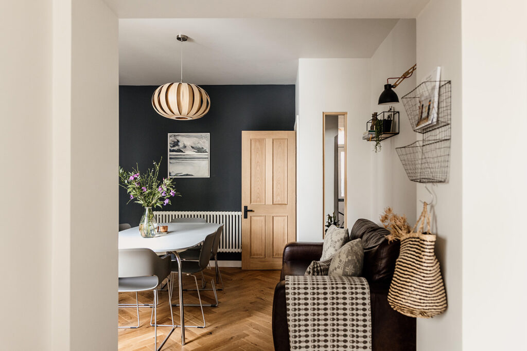
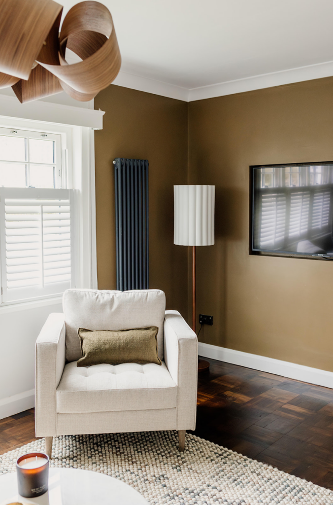
Imagine moving between a kitchen flooded with natural light and walls painted a fresh off-white into an adjoining snug with mood lighting and dark blue walls. The colour and lighting alone – that contrast between light and dark – signals that the kitchen is the place to connect, to be alert and get stuff done. The snug is the place to relax and perhaps to be more insular.
Types of contrast in interior design
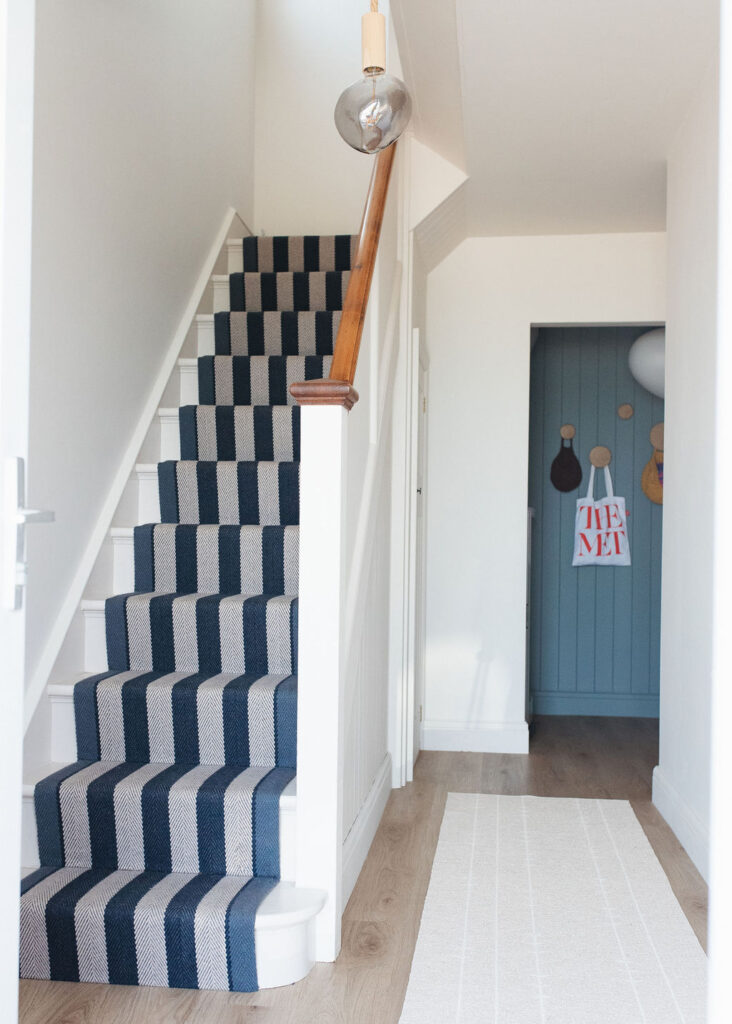
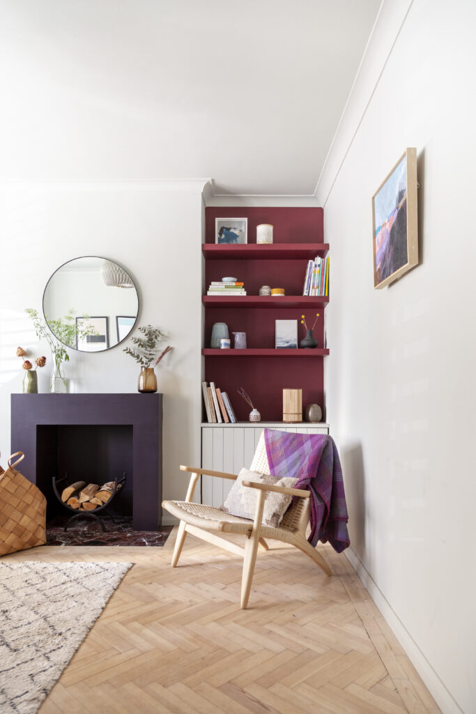
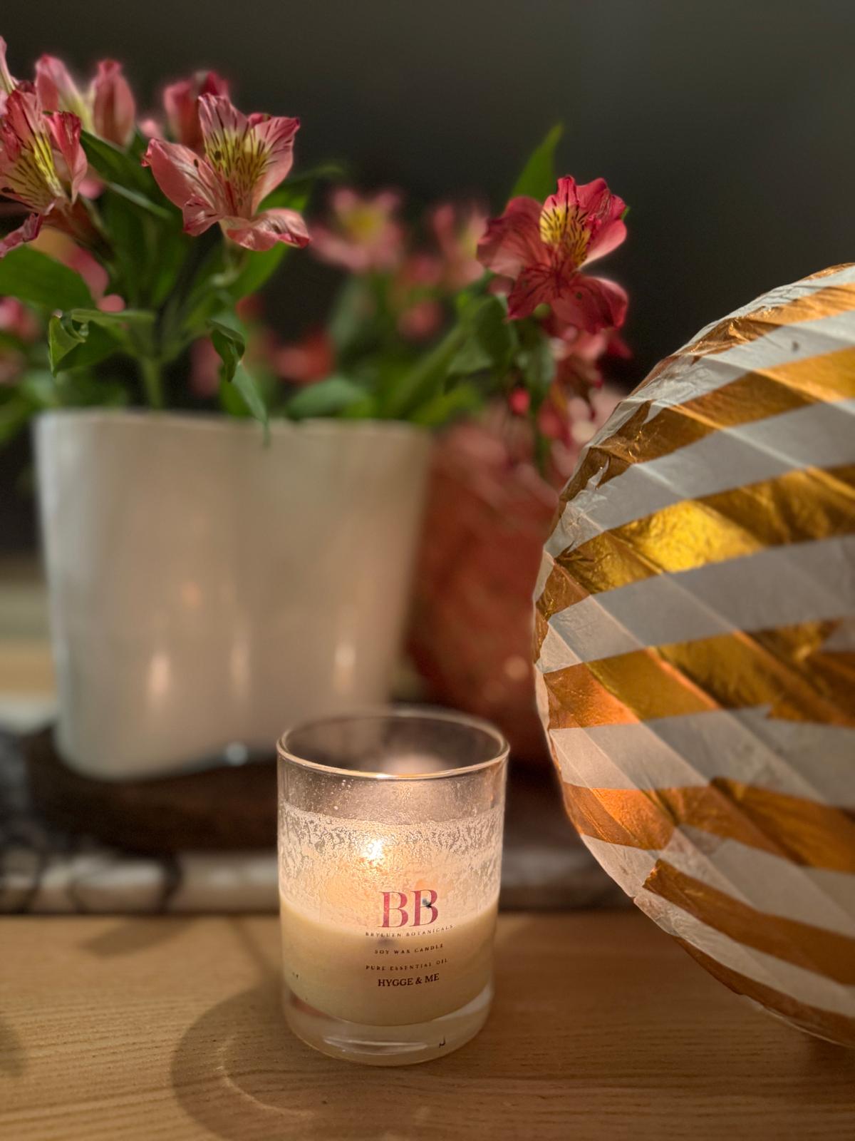
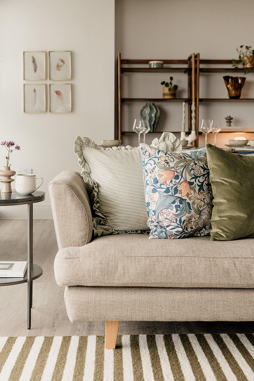
Light and dark is one of the most visual examples of contrast in interior design, and is one that we deploy a lot here at Hygge & Cwtch. We often use it to zone rooms, to create that flow and understanding of a space that we mentioned earlier. It’s also great for creating points of interest. There’s nothing like a sharply contrasting colour combination to draw the eye and create a visual moment.
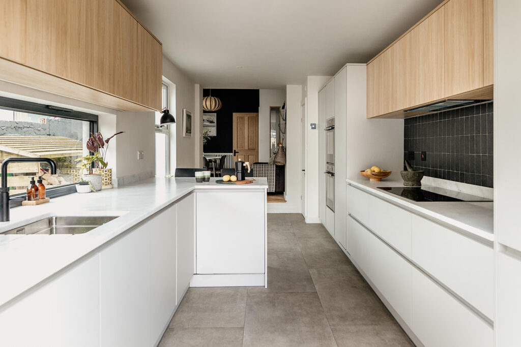
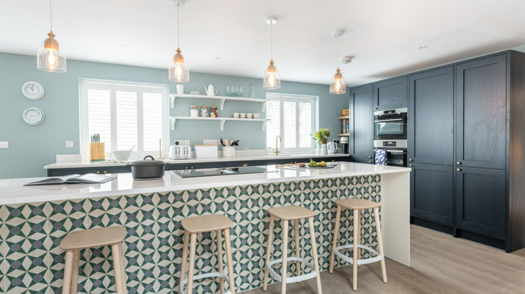
Materials are also a great example of how contrast can be used to clarify a room’s purpose. Multi-purpose rooms can really benefit from considered use of textiles and finishes to help identify what each area is for. Even two sides of a kitchen island can tell two stories. Hard surfaces and clean lines set up the ‘business’ side of the island, making it clear that this is where we get stuff done and isn’t the place to linger. Contrasting beautifully with some high backed cushioned stools on the opposite side which invite you to sit, to connect, to stay a while.
Contrasting playful and timeless design
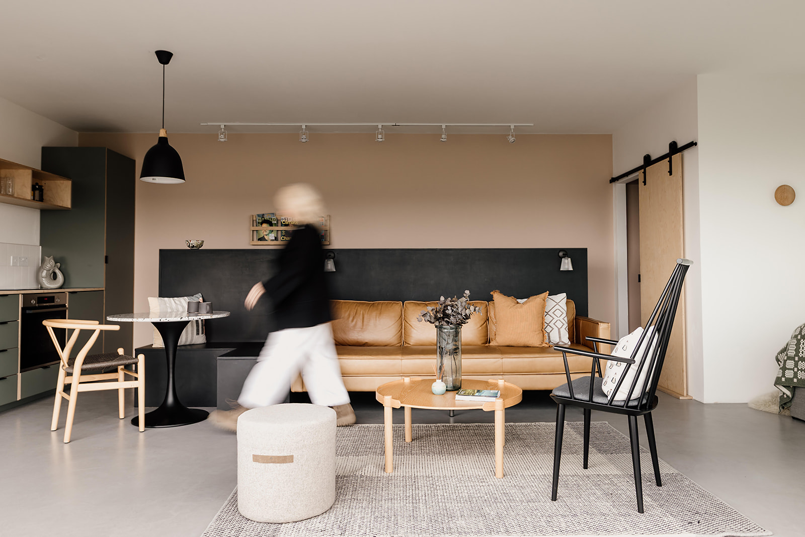
We also like to consider how contrast plays a part in the decision-making process. How it pays to switch up our design preferences at times to create impact. Sometimes to deliver a sense of ebb and flow in a space.
Within the home, we always look around at where we can afford to contrast playful versus safe design choices. Playing it safer with those areas which require investment pieces that will need to last. Getting more bold and playful in the parts that may be more easily or regularly changed. The contrast between the two approaches allows us to inject some personality and push the design boundaries a little more. Creating points of interest and balancing form and function while being mindful of our client’s needs and preference.
One place where we can really go to town with this type of contrast is holiday let design. A holiday home needs to be robust and durable enough for the multiple holiday makers who will come through the doors. Replacing furniture, kitchens and bathrooms which are damaged or simply go out of style is not good business sense. Therefore some elements of a holiday let absolutely have to be timeless. But the opportunity presented by the fact that most people are staying for a short period and not actually living with any of the choices, means it pays to go bold in other areas and make a real impression.
Have you considered contrast in your home before? We can help identify the areas where it would have the biggest impact, so if you’re planning a reno or refresh, get in touch for a chat. You can also catch more interior inspiration and musings over on our monthly Edition newsletter.

Leave a Reply
Previous Post
Next Post
For more of our latest projects, follow along on instagram at @hyggeandcwtchstudio.
© hygge and cwtch creative studio 2025 | all rights reserved | privacy policy | cookie policy
considered Art & INTERIOR Design for Beautiful Spaces
cardiff, CORNWALL & WALES
Hygge Cwtch
&


quicklinks


[…] more when we know we have our safe place to retreat and reconnect. It’s all about balance and contrast, you need one to truly appreciate the […]