We can’t think of a better way to kick off the year than with a new project reveal! We’re really happy to be sharing with you the first completed stage one of our 2023 projects, Marshfield House. Our client, in the beautiful town of Marshfield, Cardiff, took on Hygge & Cwtch Design Studio to help them transform their living room and master bedroom. We were only too happy to give it our signature touch to create cosy spaces for our clients to relax and unwind.
PROJECT NAME
Marshfield House.
THE Living Room
A living room and master bedroom in a lovely detached property. The client has undertaken some building work and exterior updates and completed the living room in time for Christmas 2023. We look forward to sharing the bedroom with you later in the year!
The Brief
The living room in this property is a good size, nicely square-shaped room with a generous, deep bay window overlooking the front garden. Our clients had not long bought two new sofas in a light grey fabric and had a number of pieces of lighting, furniture and art that they wanted to make use of if possible.
As a North-facing room it often felt dark and cool, which was enhanced further by the walls being painted in a light neutral shade, accompanied by a dated wallpaper feature wall. The room lacked warmth and the design style felt unaligned to the owner’s personalities. While the shape of the room offered great potential as a sociable space and TV room, a set of internal double doors on one of the main walls limited the layout options. These doors also created a shortcut from the hallway to the dining room, therefore interrupting the flow of the room and turning this potentially cosy snug into a traffic route to other parts of the house.
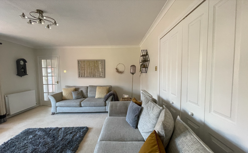
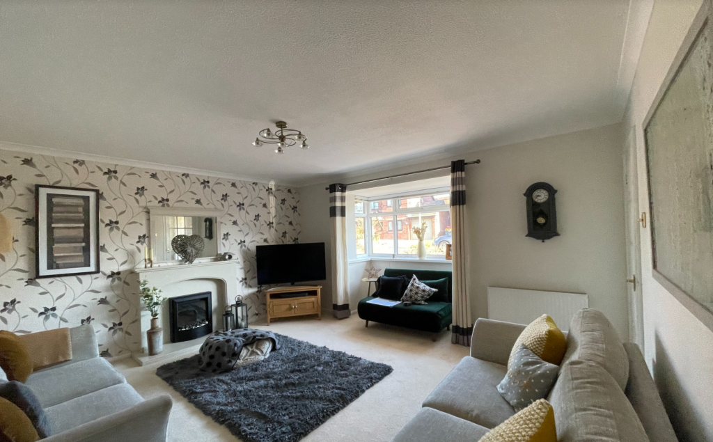
Our clients wanted to use this room mainly for watching TV, reading books and relaxing. A place to feel snug and reconnect at the end of a busy day. A real fire in place of the existing electric fire, and some bespoke storage either side of the new chimney breast were top of our client’s wishlist. They also asked for an option of additional storage within the deep bay window, although they were undecided on whether to go ahead with this as it does make the perfect spot for a Christmas tree! The style brief is cosy, colour, luxury but in a quiet Hygge & Cwtch kind of way.
THE INTERIOR DESIGN APPROACH
Structural
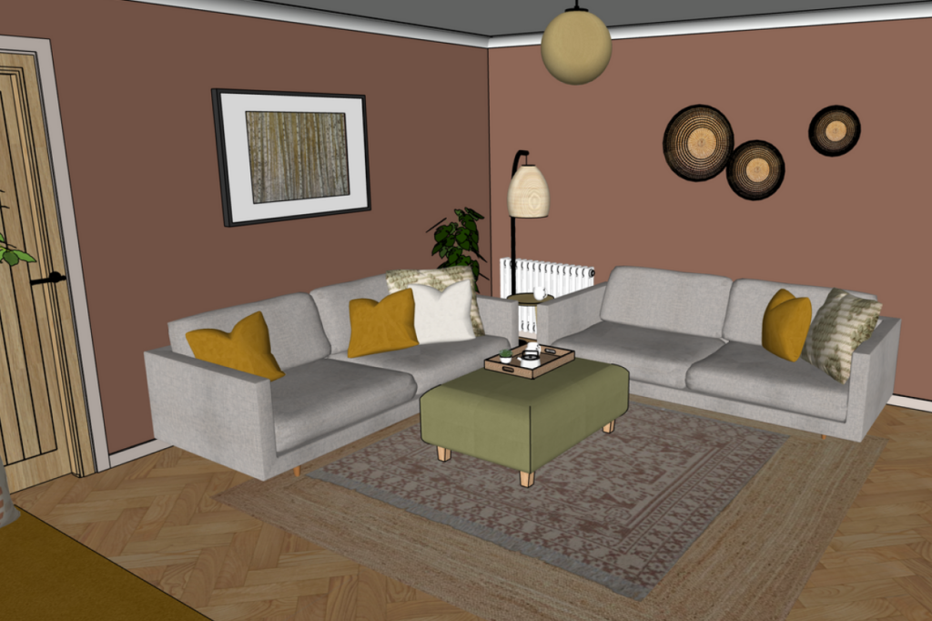
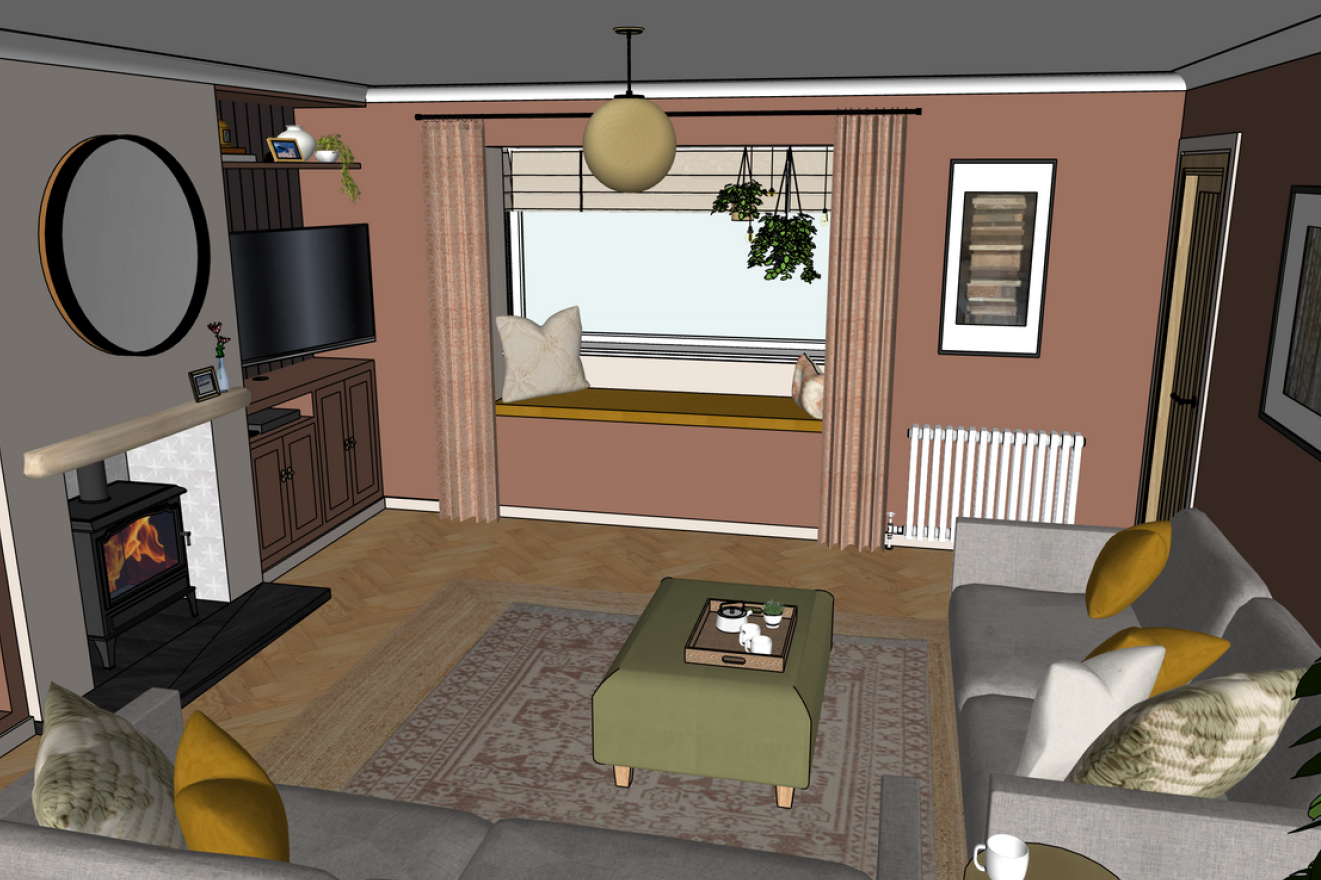
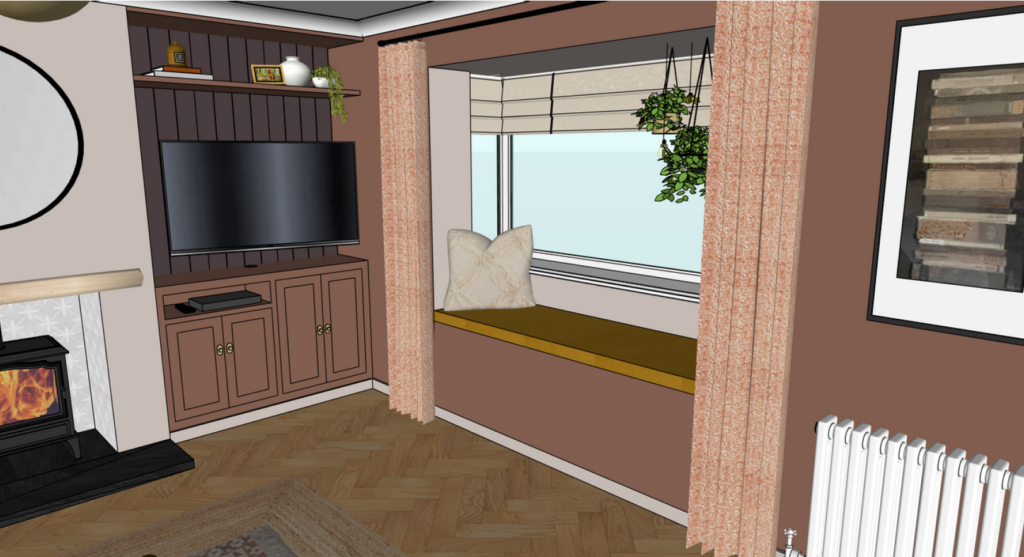
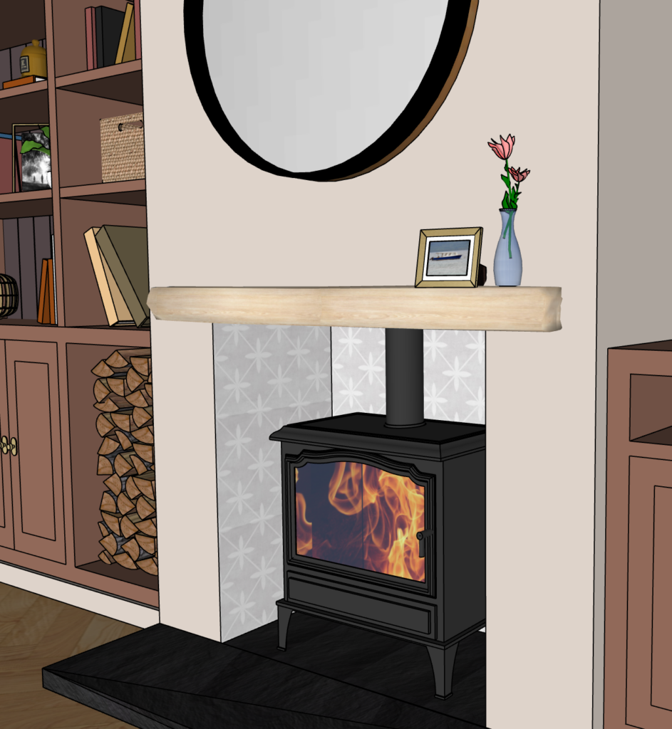
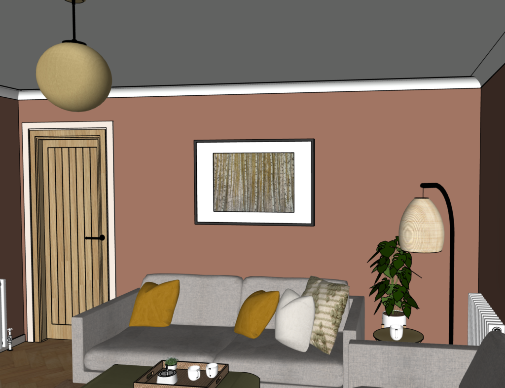
With such big changes to the room in terms of layout and design, this project called for a design pack with 3D visualisations (known as ‘renders’) to help our clients visualise how our ideas and the structural changes would come to life. This section shows those renders, scroll on to see the photography of the completed living room.
Once we’d confirmed building works such as blocking up the double doors and building the chimney breast for the beautiful log burner they’d selected, we got to work on the design of the room.
Layout and storage
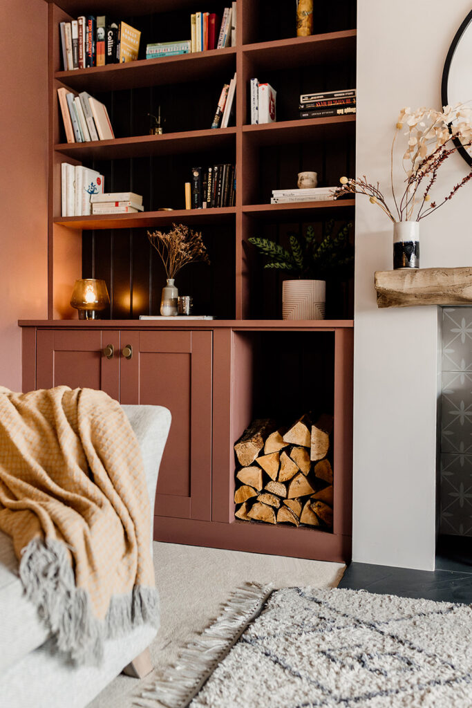
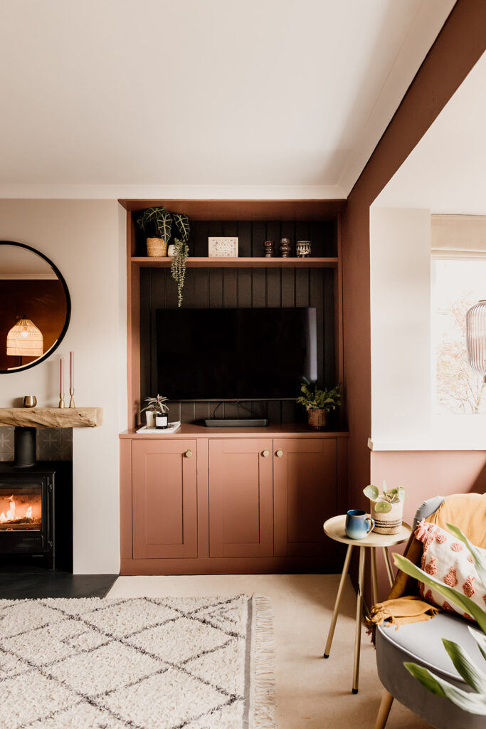
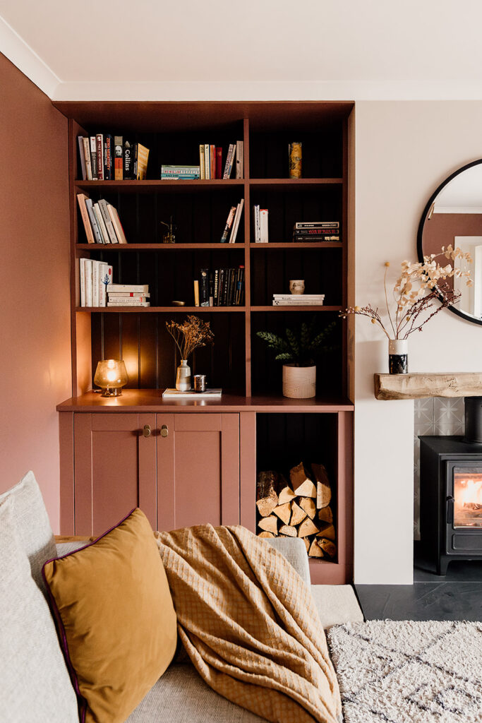
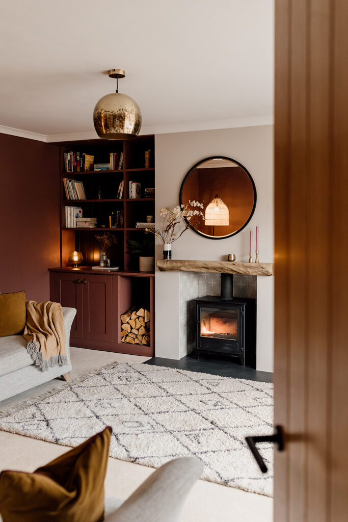
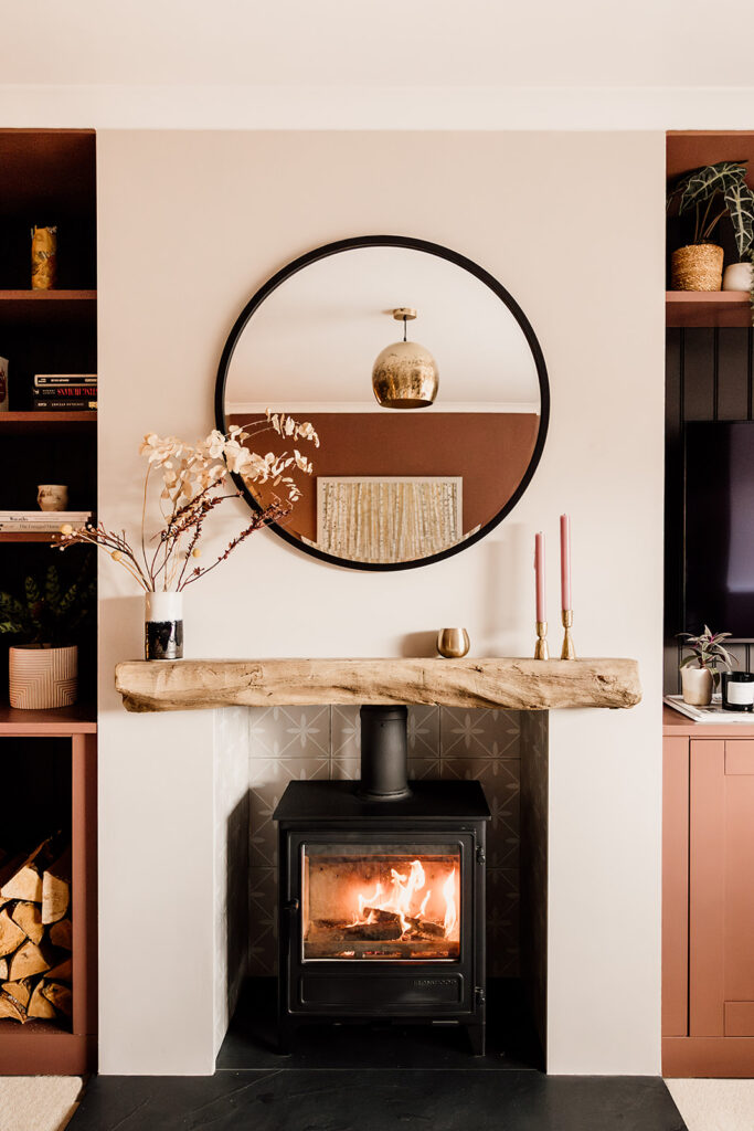
The new chimney breast presented the perfect opportunity to create built-in storage and media unit. While the TV needed to be in a prominent spot, the deep colour of the panelling enables the TV to blend into the background rather become a feature. A log store next to the fireplace was not only practical but added texture and a rustic informal aesthetic to break up the straight lines and clean edges.
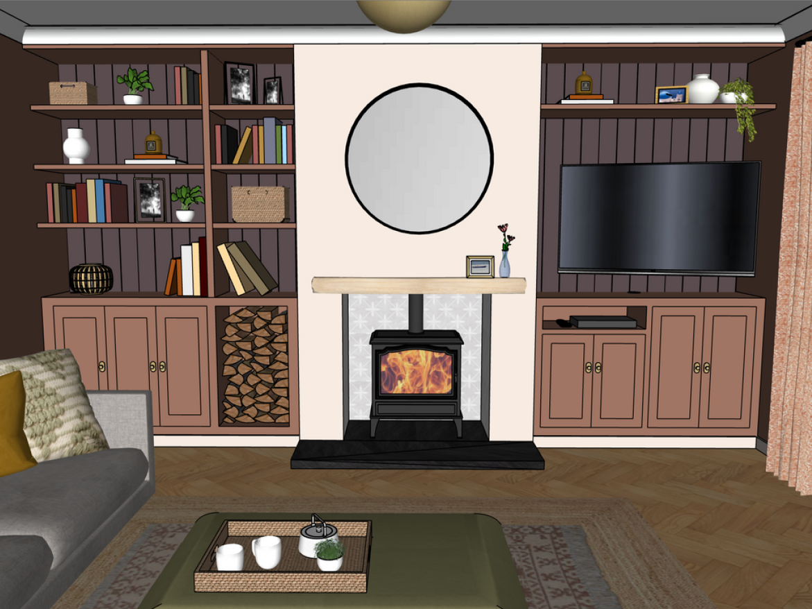
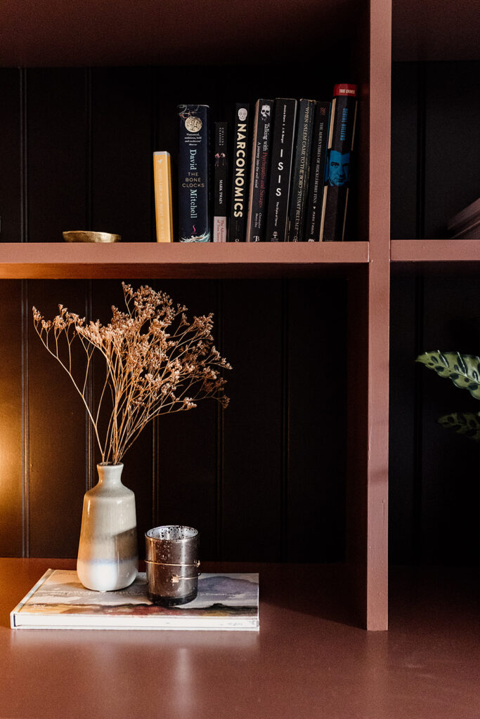
At Hygge & Cwtch we believe in informality in design. We don’t want to create perfect show homes with not a single item out of place or off-scheme. Having personal touches on display is essential to bringing a house to life. It’s the loved books, ornaments and photographs which provides a true sense of ‘home’ to our clients. We achieved this at Marshfield House by designing open and closed storage. Giving our clients plenty of practical hidden storage, plus the opportunity to play with styling, putting their favourite items on display and within easy reach. The bespoke cabinetry was finished with stunning antique brass hardware and a panelled backdrop. It’s an intentional and elevated use of space.
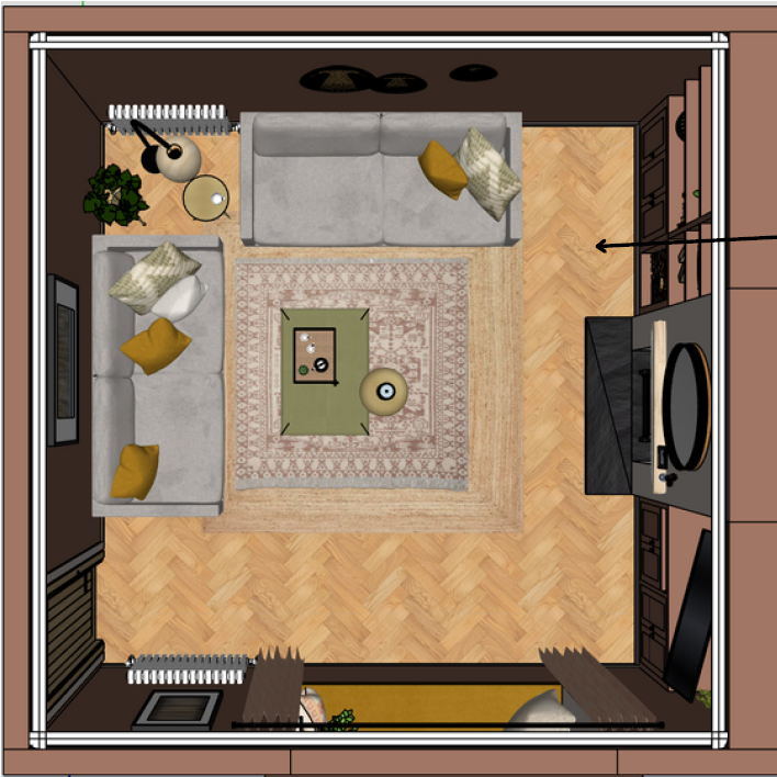
Once the internal double doors had been blocked up, we had a natural, sociable layout for the sofas. Facing the media unit but with views out of the window, they’re now in a good position to encourage connection and conversation. A window seat has been designed for optional extra seating and deep storage. A quiet, cosy place to sit, read and watch the world go by.
COLOUR
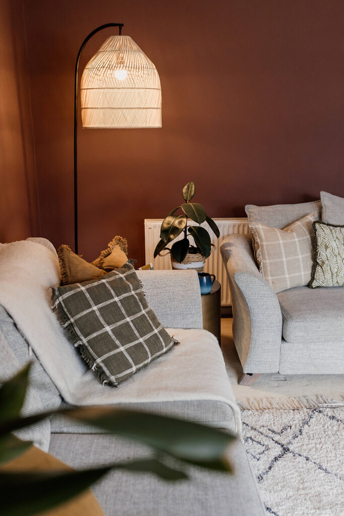
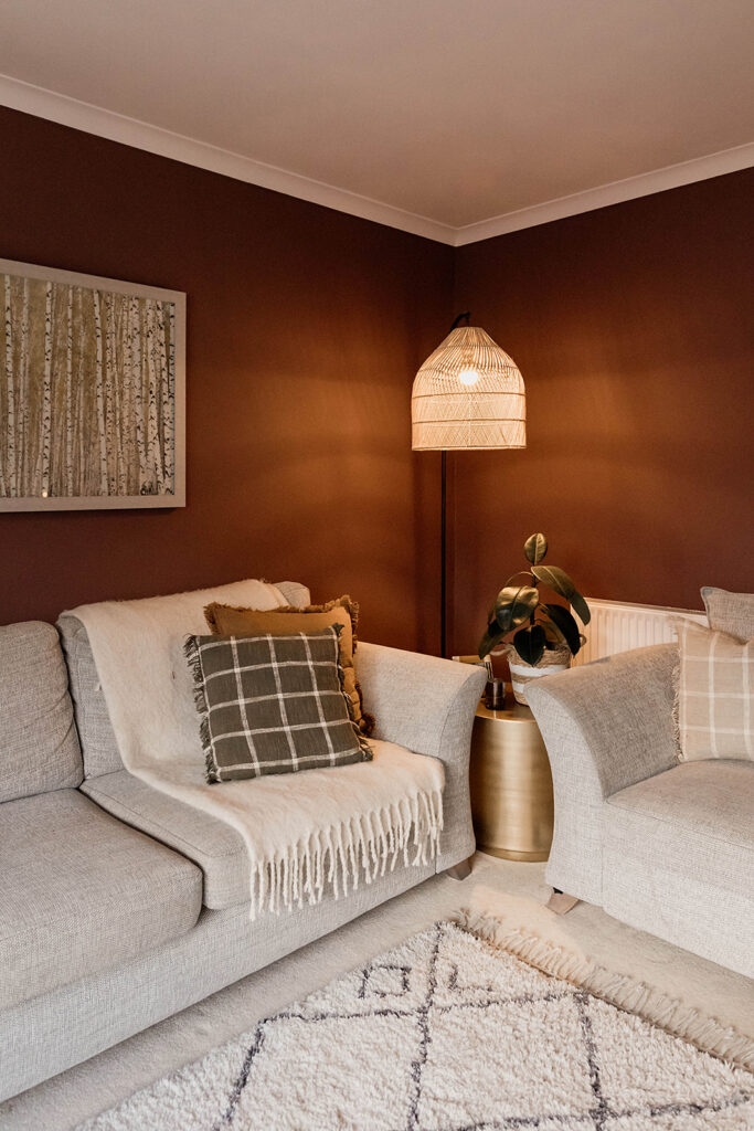
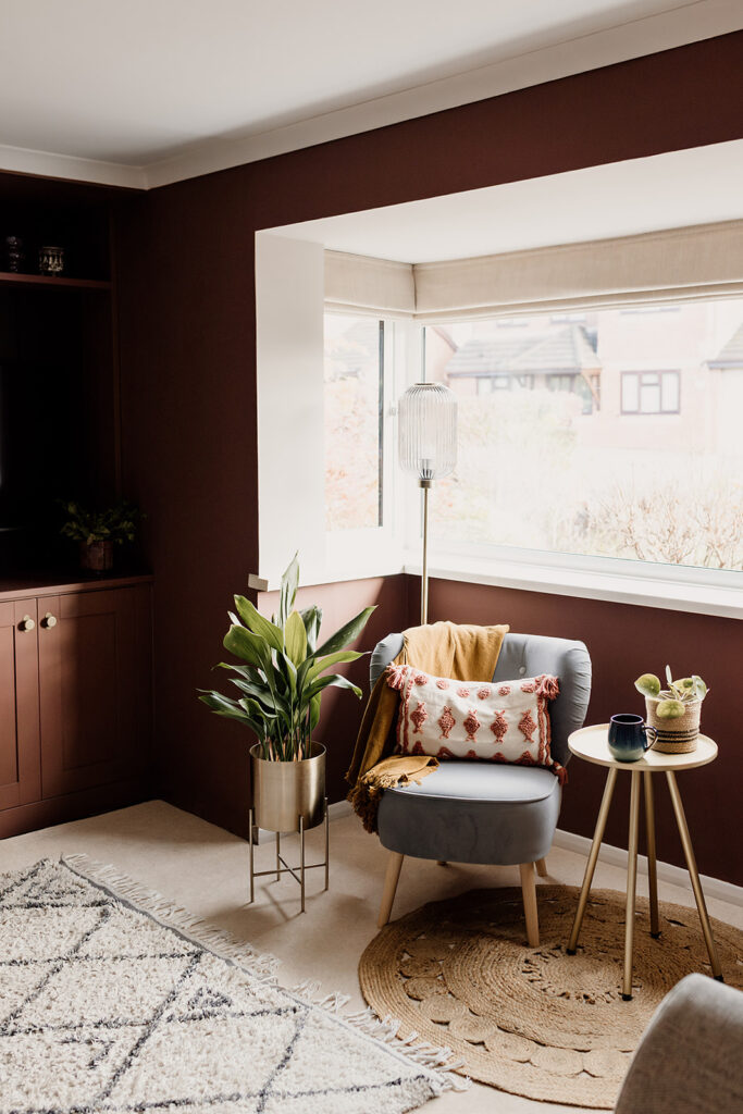
To counteract the cool Northern light of this living room, we opted for a bold, warm, deep brown-red for the walls. Saturating the walls in this shade – rather than opting for a feature wall – instantly warms the room and creates the ultimate snug-like environment.

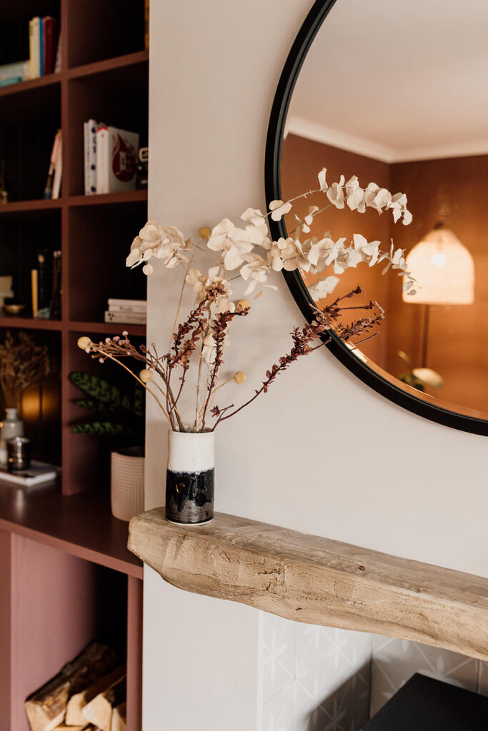
A warm taupe lifts on the chimney breast and skirting lifts the wall colour. A deep warm brown shade on the T&G panelling behind the cabinetry gives the built-in shelving some extra depth and interest. This rich, warm colour palette complemented our client’s existing sofas and worked with their furniture and lighting in brass and natural materials. It makes the perfect backdrop for green foliage which creates a natural, biophilic-led calming environment . Opting for a tonal palette instead of pops of contrasting colour creates the calming vibe our clients wanted.
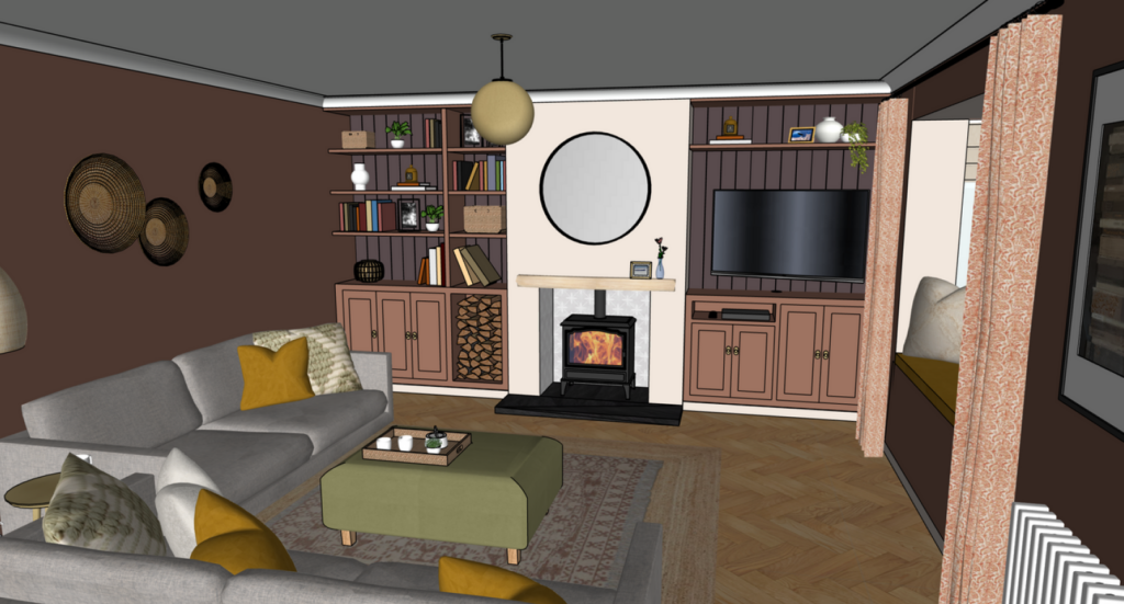
Accent colours of mustard and pale green – picked up from our client’s existing birch artwork – were introduced through soft furnishings, accessories and the option of a footstool. We went for the Loaf Sugarloaf footstool in Gardening Glove Green. These accent colours help to lift the overall palette and add extra interest for our colour-loving home owners.
Pattern
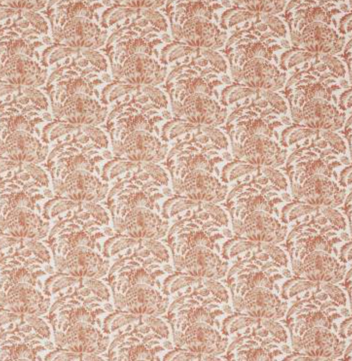
Our clients weren’t huge fans of pattern but we introduced it gently through some subtle prints around the room. They loved the busy yet delicate Linwood Torosay fabric in Russet. As part of the design we used this fabric for curtains to frame the window seat, creating an extra layer of softness and comfort. Layered rugs in a jute and a faded print were a practical choice to fill this generous space, while also adding texture and low key print. Finally a subtly printed porcelain tile in the fireplace offers the perfect backdrop to the beautiful log burner.
Lighting
Lighting is key to any interior design scheme. Particularly so in a darker room such as this one. A mixture of task and mood lighting was important to meet the brief for this room. Creating a cosy atmosphere to aid relaxation was our priority. Ensuring there was enough light to comfortably read and enjoy the room was also important. We were able to achieve this by mixing some of our client’s existing lighting with a couple of new pieces. Re-using is one of the easiest sustainable design practices. Making use of our clients existing and loved pieces made complete sense for this room.
THE COMPLETED Living Room
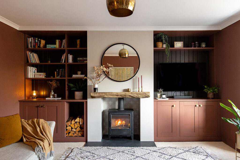
The finished room ticks all of the boxes for our clients and we’re excited to share these photos with you. All photography by Aga Hosking.
What our client said
“It has been lovely to work with Annie and Sarah on designs for my living room and bedroom.
I felt inspired from the get go with Annie’s initial visit and the time taken to listen to my needs. My personal style and taste was fully embraced within the designs and they have beautiful, unique touches and attention to detail.
It was really valuable to have a 3D visual of the design before commiting to anything and Annie and Sarah were always on hand for support and advice throughout. Over the moon with how the designs have worked out in real life so far, a total transformstion of the space, can’t wait to finish all the work in due course! A professional, friendly and quality service, highly recommend Hygge and Cwtch Design Studio!”
If you love this room, or any of the interior design or garden design projects we’ve shared on our blog, get in touch and let’s have a chat about how we could work together on your home. In the meantime, subscribe to our monthly newsletter for more interior inspiration.
Leave a Reply
For more of our latest projects, follow along on instagram at @hyggeandcwtchstudio.
© hygge and cwtch creative studio 2025 | all rights reserved | privacy policy | cookie policy
considered Art & INTERIOR Design for Beautiful Spaces
cardiff, CORNWALL & WALES
Hygge Cwtch
&
quicklinks


Can you tell me the dimensions of the fireplace and units please?