Back in June we shared Part One of our Greenfield Project house tour. And now, as we take some time during the summer to rest and reflect on the first half of the year, it felt like a good time to complete the tour.
We’ve already had a walk through the stunning open plan kitchen-dining space, and the adjoining utility room, snug, boot room and garden design. It was a story of creating space and encouraging connection through interior design. Moving a family home into it’s new era whilst keeping the heart and soul in tact.
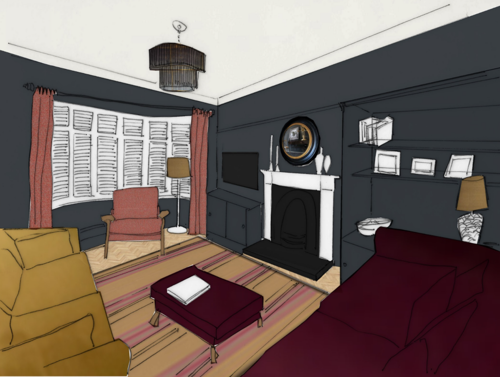
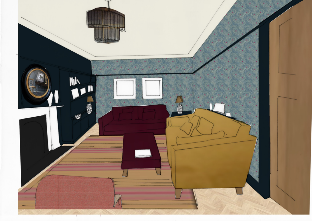
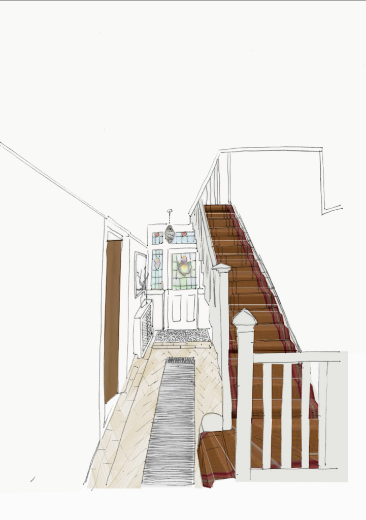
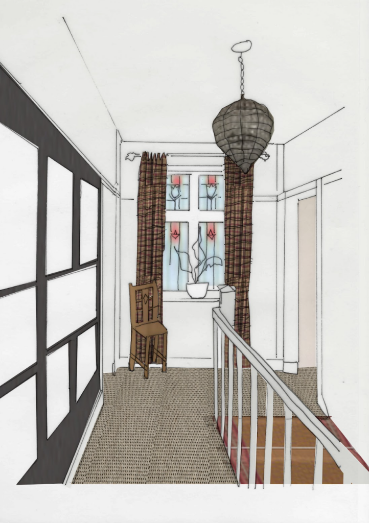
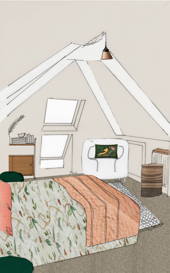
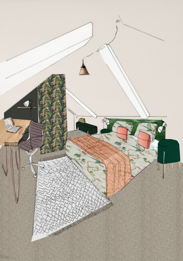
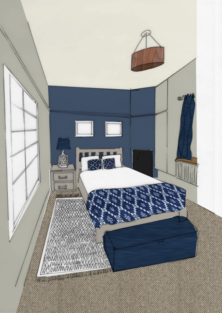
This part of the house tour is a little behind the scenes look at the design process. Sharing how some of my hand-drawn sketches in the early stage of design translated to the final look. There were lots of items that the family wanted to keep in the following rooms, plus more opinions to consider as we took on board the children’s preferences for the bedrooms. So let’s see how it all came together…
Living Room
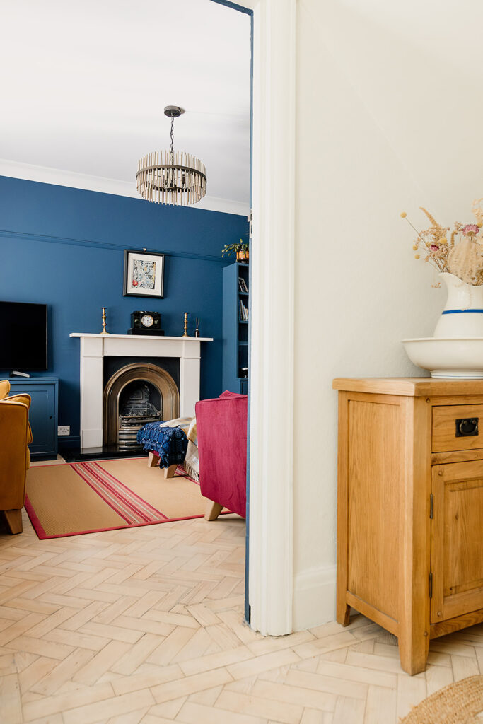
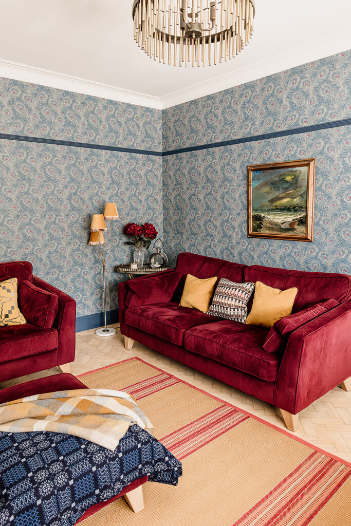
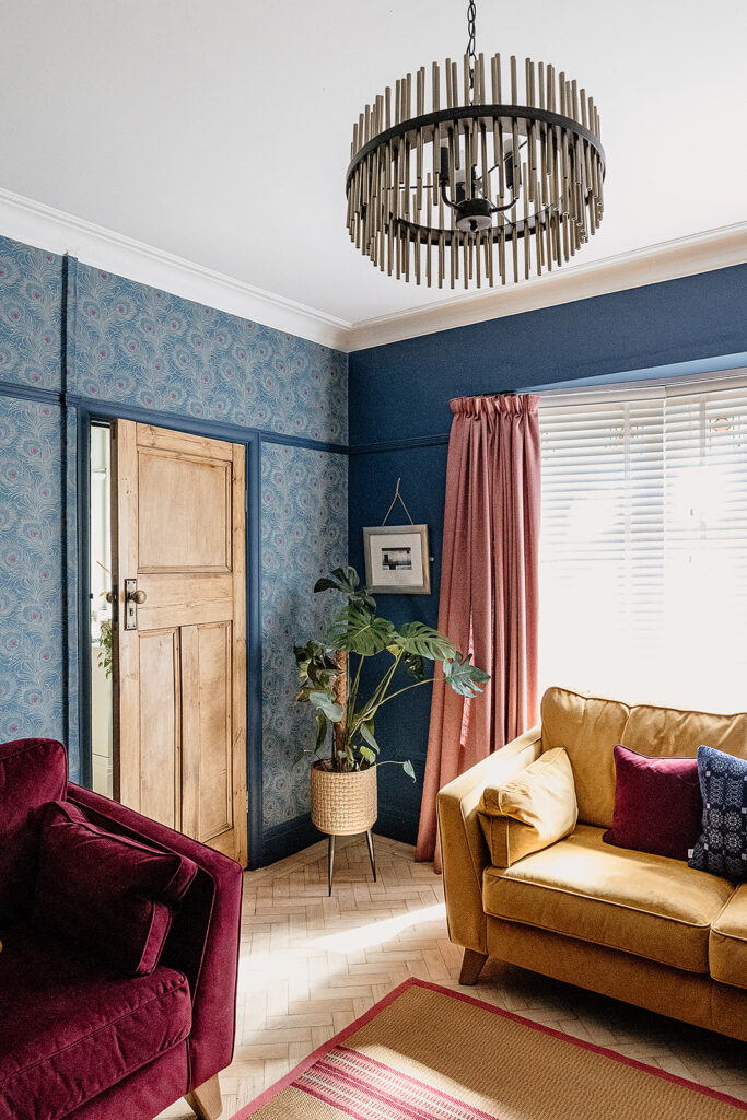
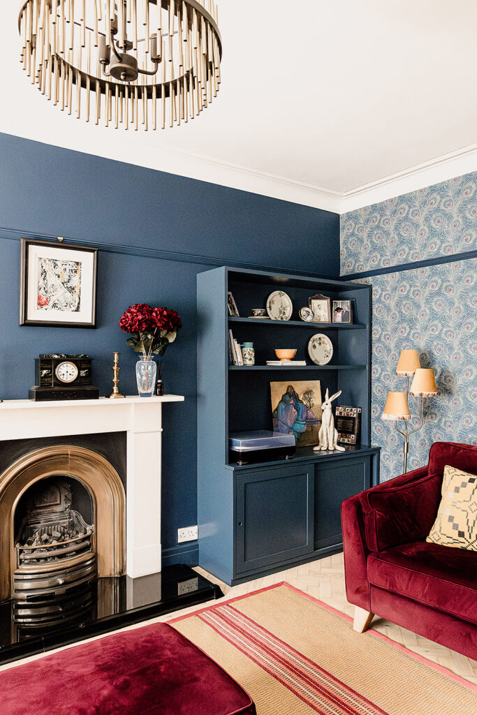
Our job in this living room was to create a space with a deliberately different feel to the open plan kitchen-dining room. The room was to be used for watching TV, having drinks, listening to music. It needed a cosy, darker mood. To do this, we leaned into the style of the existing sofas and footstool to create a cosy yet bold space with bags of personality. A contrast to the open Scandi feel of the kitchen-dining room. This is a real luxe-hygge vibe.
Sanding the existing parquet floor and lightening it with a bleaching product gave us a bright enough base so that we could begin to layer dark colours and heavy textures without it feeling cave-like. The lightness of the floor is a very Scandi touch – an essential ingredient in our Hygge & Cwtch design style. A flatweave rug in honey pink tones ties in beautifully with the furniture without distracting from the statement peacock wallpaper.
The dark blue shade on the walls complements the wallpaper and furniture, warming the room up alongside the pink and yellow tones. The bespoke cabinetry was designed to house drinks, records and the TV, so we carried the dark blue across the cabinetry gives a sense of cohesion. This allows the cabinetry to become a practical yet pretty background piece, rather than a star of the show.
Hallway and Stairs
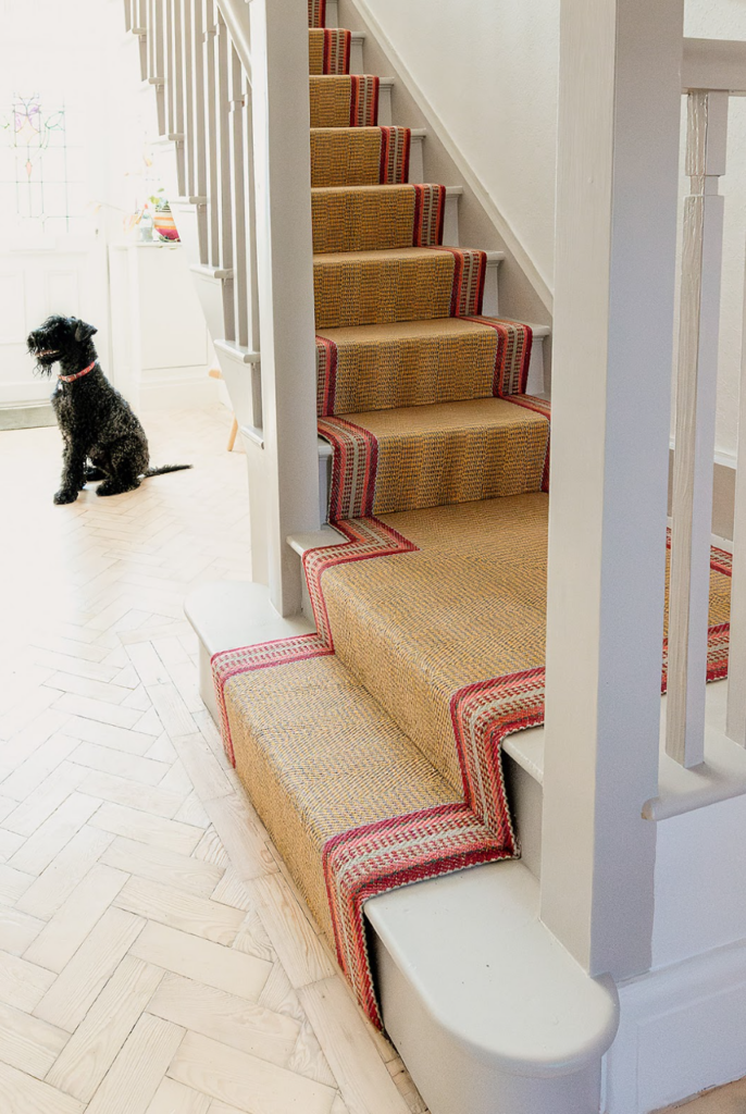
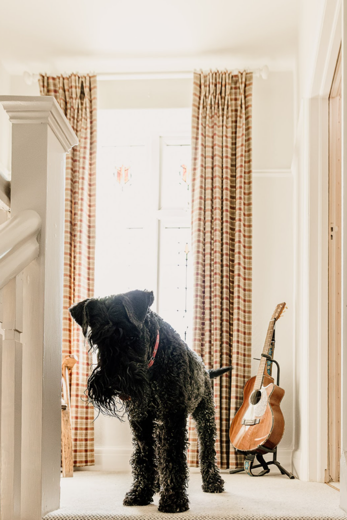
The main design brief for the hallway, stairs and landing were to brighten it up, add texture and make it practical. The parquet flooring is continued from the living room, and the flatweave stair runner is perfect for heavy-traffic parts of the home. It’s durable and practical, and – eagle-eyed readers will have already noticed – that it’s a matching design to the living room rug. This gives the hallway some added personality and creates continuity between the the living room and ties in with the existing curtains at the top of the stairs.
The carpet used up the stairs was carried through to all of the bedrooms. This is an element of the red thread throughout the house, providing continuity and a good sense of flow between rooms.
Master Bedroom
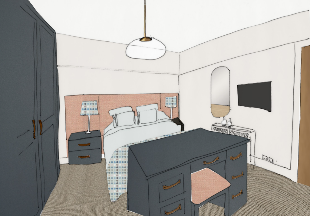
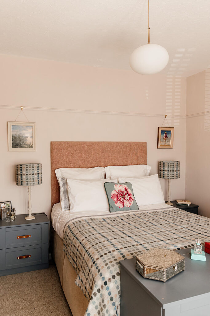
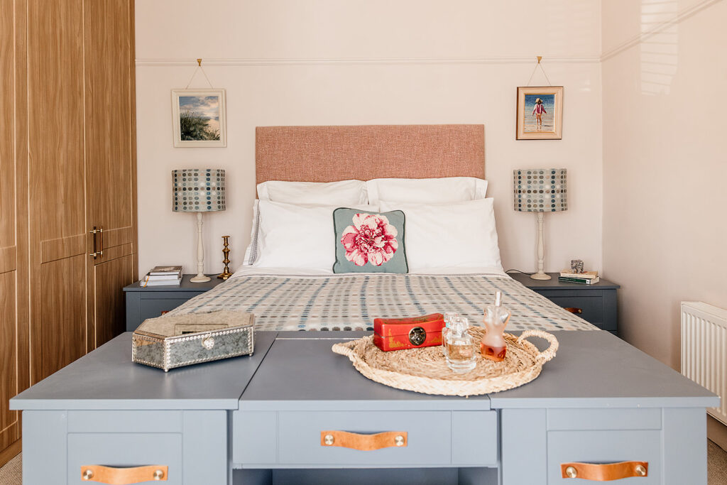
Continuing the house tour upstairs. Our aim for the Master Bedroom was a simple refresh, using as much of the existing furniture as possible and creating a calming space with the focus on aiding sleep and relaxation.
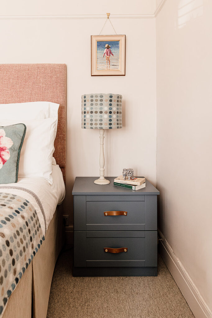
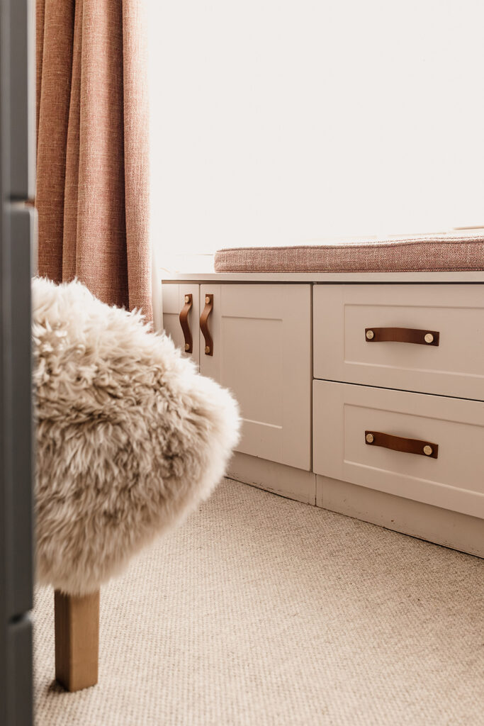
Using soft white and pink tones on the walls and ceiling immediately created an airy yet soothing feel. Adding new handles to the built-in wardrobes and upcycling the existing bedside tables and dressing table using a dark blue-grey shade helps to ground the space. Even in the lightest, brightest of rooms, it’s important to balance with some contrasting darker shades and patterns.
A bespoke headboard and patterned lampshades and throw from a local Welsh brand (supporting local businesses is a key part in creating a sustainable home) add depth and texture. Adding cherished artwork above each lampshade gives a real sentimental touch to this room. Such an important aspect of the Hygge & Cwtch design approach, the inclusion of personal items is essential to elevating a room into something special. The full height lined curtains in a matching pink fabric help to tie it all together and provide that essential black-out for quality sleep. It’s a real homely, cosy master bedroom.
Family Bathroom
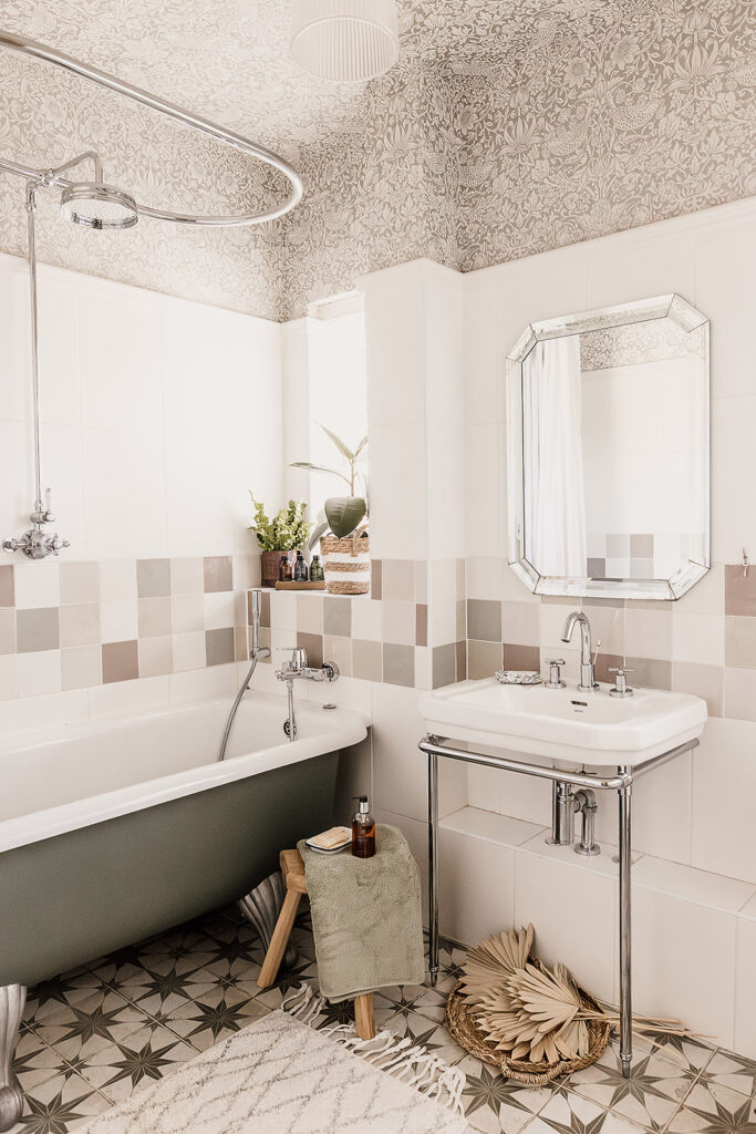
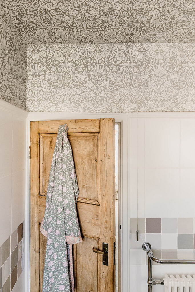
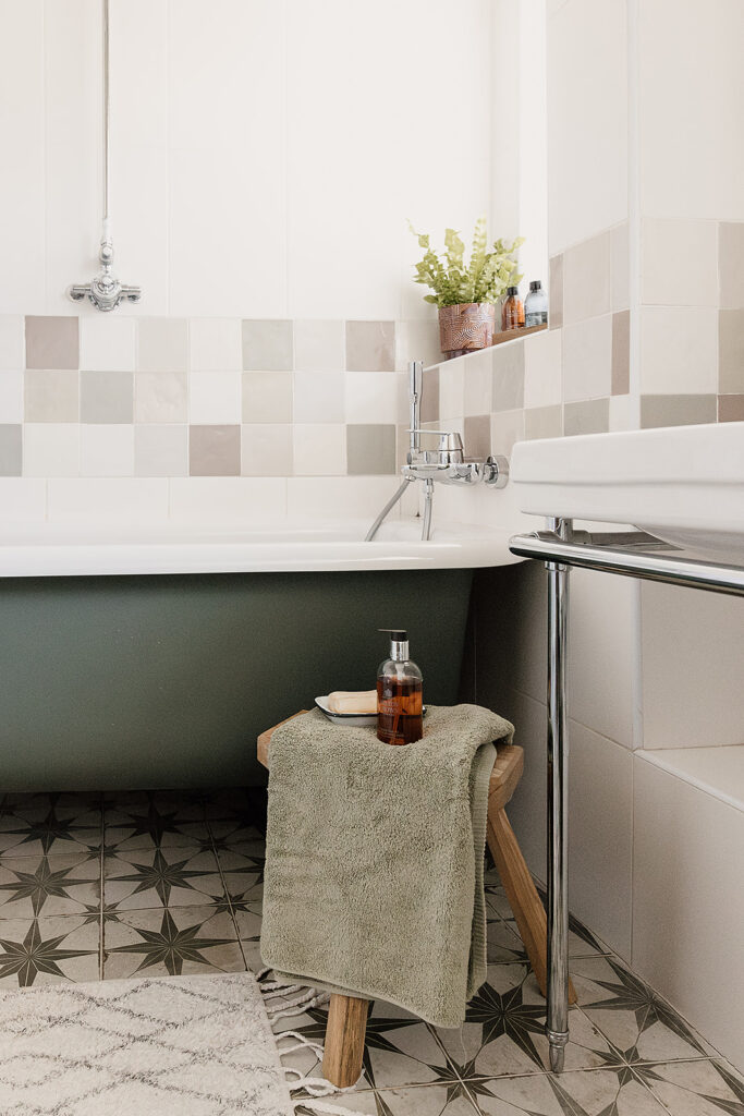
This bathroom design was built around the existing wall tiles and bathtub, which our client’s wanted to retain. To elevate those pieces into a bathroom which is in-keeping with the rest of the home, we went bold with our patterns. The beautiful William Morris Pure Strawberry Thief wallpaper created a slightly vintage feel in here, and the stone shade complemented the square wall tiles perfectly. The stunning Mandarin Stone Star tiles on the floor add to this vintage effect and provide some continuity with the downstairs shower room.
Taking the wallpaper down the walls to the picture rail is what gives it the real wow factor. An interior design tip when painting or wallpapering a ceiling is to do exactly this, and bring it down the wall if possible, even just a little. It prevents a boxy feeling where the ceiling meets the wall and creates a slightly cocooned effect. It’s part of the room, not an add on.
Painting the bathtub base in a solid dark colour helps to bring all of the shades together and acts as an anchor. Remember in the Master Bedroom we talked about using contrasting dark shades to act as an anchor to avoid the feeling that everything’s floating? Well here we are again!
The stunning wooden door and touches of natural materials and greenery help bring life into this space. Who says small spaces can’t pack a punch?
Loft Room
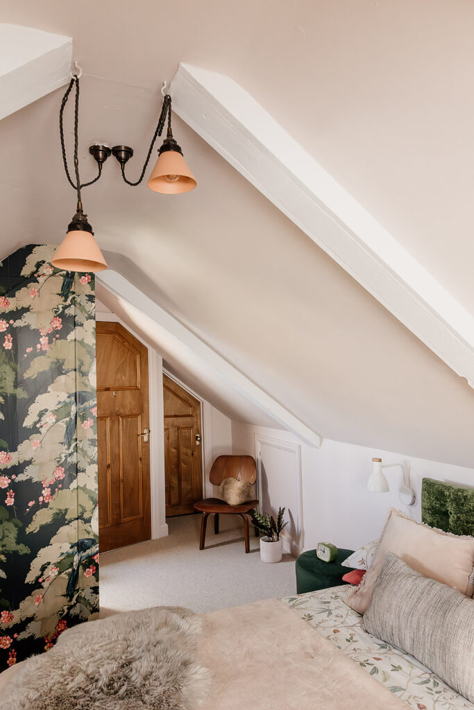
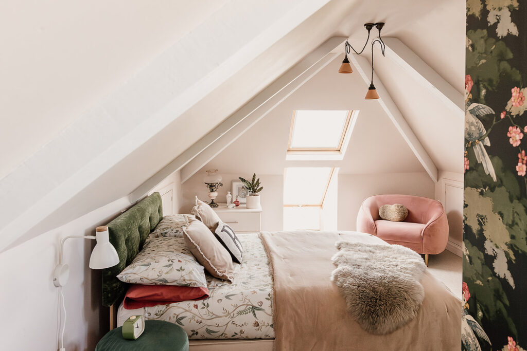
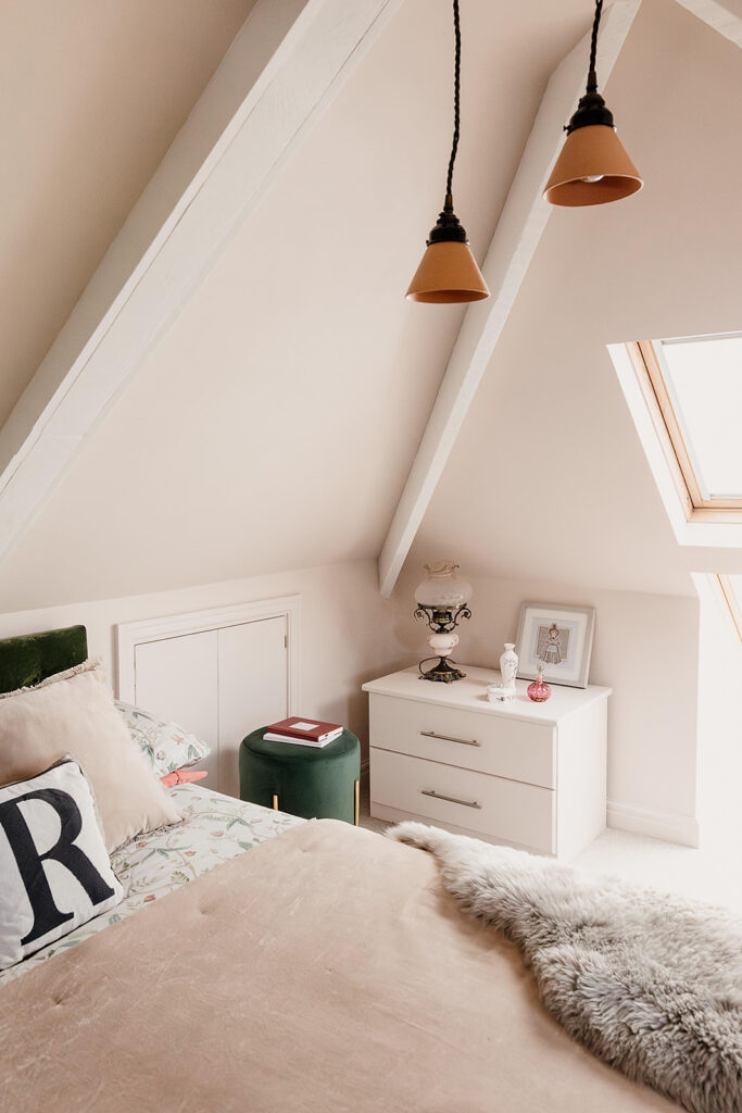
Our challenge for this beautiful loft space was that it not only needed to be a bedroom for their visiting daughter, but would double up as our client’s work space. Luckily we had plenty of room to work with which enabled us to create a welcoming, cosy room whether it was being used for rest or work.
The brief was to keep it light and airy, which can sometimes be a challenge in loft spaces with minimal natural light and low eaves. The colour palette was earthy yet light, with hints of pink and accents of deep green to create a calming and comforting backdrop.
The bold Jungle Jive wallpaper is whimsical and nature-inspired, featuring all of our client’s daughter’s favourite shades of pink and green. Used in a small dose such as this provides the fun and impact without affecting the overall light and airy feel of the room.
Bedroom and Guest Room
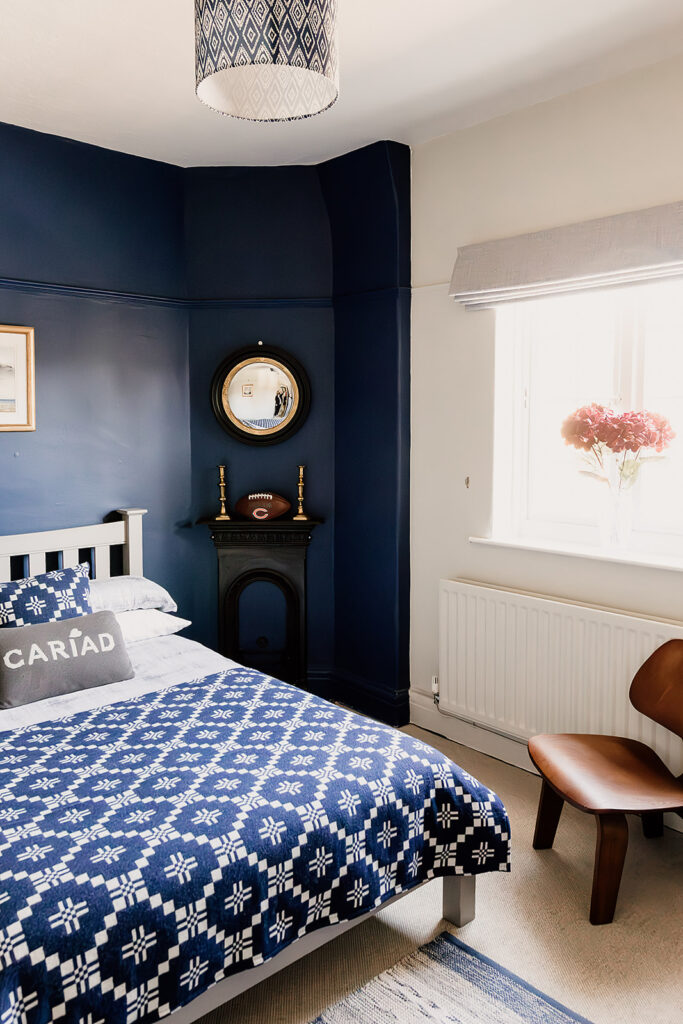
While the priority for this room was to provide a homely base for our client’s son to stay in when he visits, it also is to be used as a guestroom. We needed to make it personal enough for our client’s son to feel at home, but inviting enough for other guests. No-one likes to feel that they’re imposing on someone else’s personal space, so there was a balance to strike.
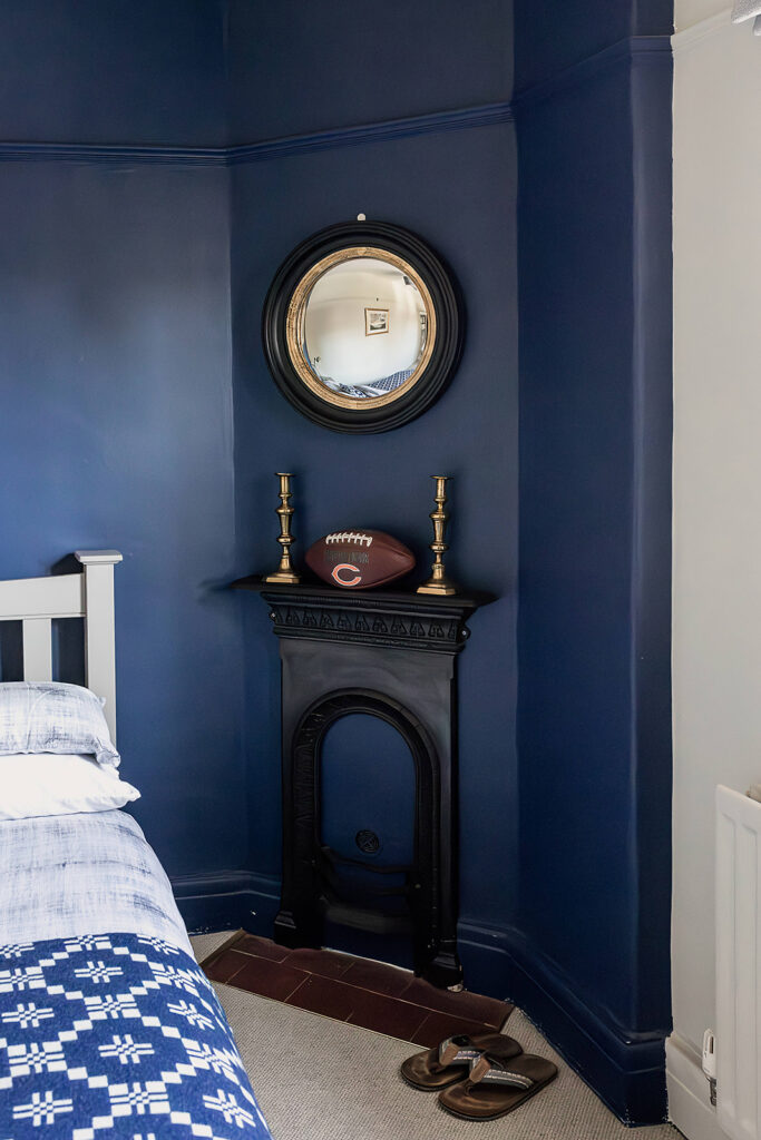
Probably one of the simplest refreshes of the house tour, we started by adding depth and personality with the strong blue shade behind the bed. This colour palette was based around the existing cushions from local company Melin Tregwynt (who also supplied the lampshades and throw in the Master Bedroom). The cushions and blanket gave the room a softer feel and the blanket box at the foot of the bed provides storage and gives the space a real ‘guest room’ feel.
The Scandi vibe is delivered by the wooden chair and leather pull handles, and a nod to the personal touch with the rugby ball makes it the perfect space for their sporting son to come home to.
Double Bedroom
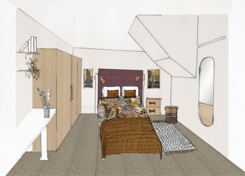
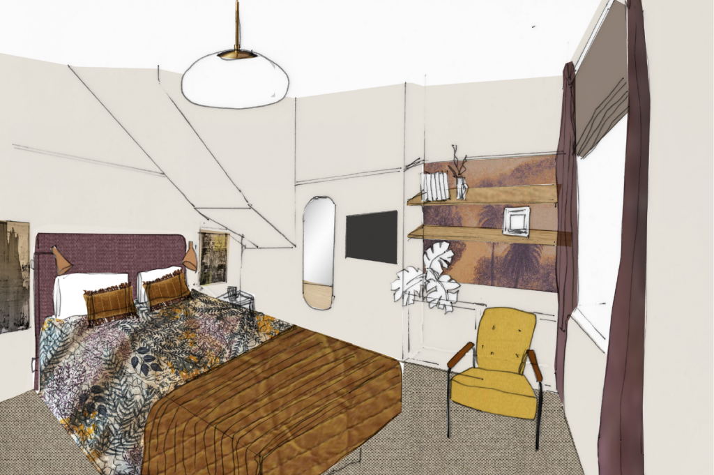
The fourth and final bedroom of this project is for our client’s other daughter, and being situated under the loft stairs meant that good space planning was essential.
We started by moving her bed to a different wall which freed up some space for closed storage. With plenty of clothes, books and art supplies, storage was key in this room.
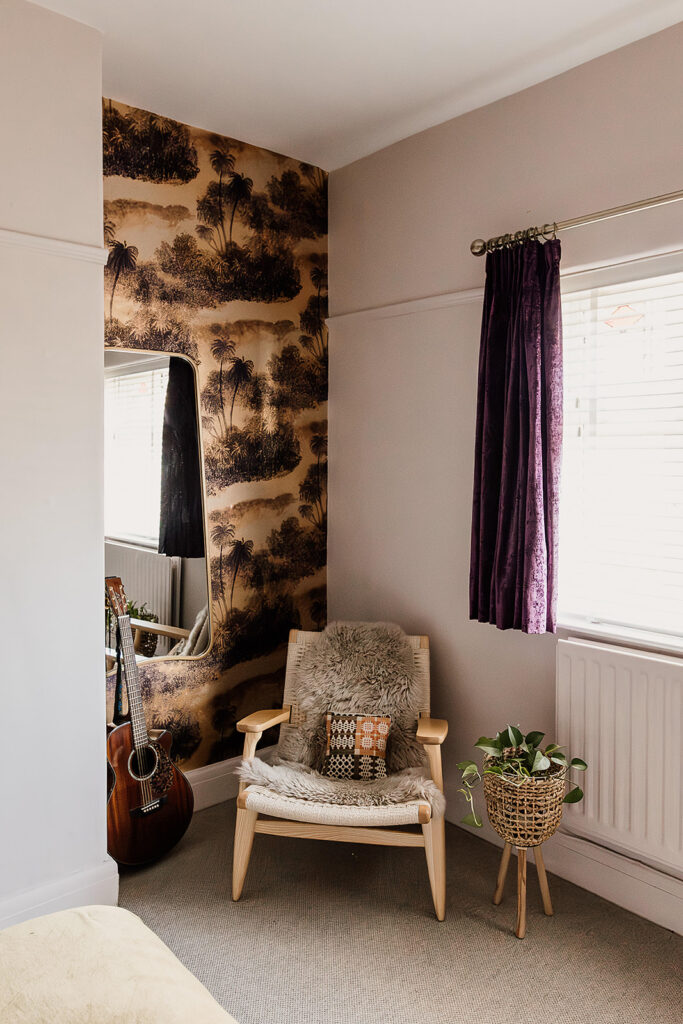
As something of a red thread throughout this house, the colour palette was made up of light and earthy shades for a warm and welcoming backdrop. Punctuated by bold colour and splashes of prints to deliver personality. We were inspired by our client’s daughter’s favourite palette of mustard and purple. Using a bold Matthew Williamson wallpaper, we took from it the hints of gold and mustard, and used our client’s existing purple curtains. These items influenced the soft furnishings and accessories around the room. Alongside the Scandi lounge chair, rattan plant stand and cosy sheepskin throw, it delivers a cool retro vibe, don’t you think?
The Study
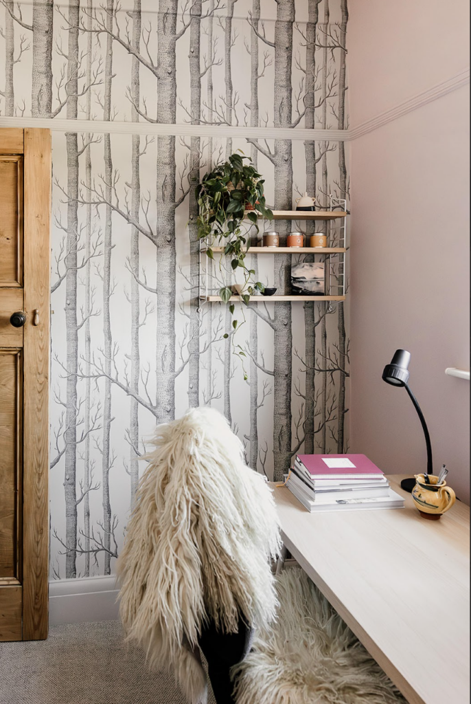
The final piece of the puzzle. Transforming a small, cramped box room into an open and spacious study, while retaining storage and designed to our client’s tastes. Even the most practical rooms can, and should, be beautiful.
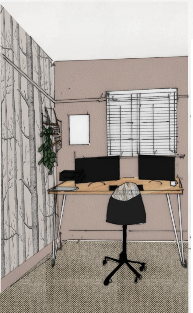
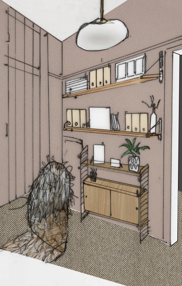
As with the rest of the home, we were after a Scandi luxe feel. Soft, earthy palettes balanced with metals in clean lines and simple designs. The Cole & Sons Woods wallpaper is a fail-safe option when you want to create that outdoors-indoors feel. With our passion for biophilic design, we know the power that having a nod to nature can have on our wellbeing and our focus. So where better to have this statement design than in a study.
Did you enjoy this house tour?
Do you like what you’ve seen of our Greenfield Project Part 2 House Tour? Would you like to work with us on transforming your own space into something beautiful? Get in touch and let’s have a chat! We’re a Cardiff interior design studio, and we’d love to hear about your project.
If you haven’t already signed up to our email newsletter, subscribe now to see our monthly musings and inspiration. Not just for interior design, but for living simply and authentically inside and outside of the home.
For more of our latest projects, follow along on instagram at @hyggeandcwtchstudio.
© hygge and cwtch creative studio 2025 | all rights reserved | privacy policy | cookie policy
considered Art & INTERIOR Design for Beautiful Spaces
cardiff, CORNWALL & WALES
Hygge Cwtch
&
quicklinks


+ Show / Hide Comments
Share to: