Hygge & Cwtch Design Studio were appointed architectural and interior designers for this open plan kitchen/dining renovation with garden design project in Cardiff.
Project Name
Grosvenor Road
The Property
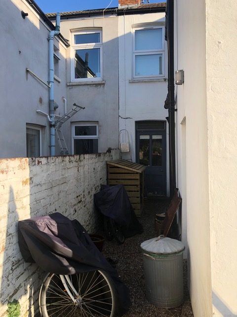
This is a 3 bedroom, terraced residential home. There is no direct access to the garden at the rear so it was important to complete the garden works prior to finishing the interior to minimise disruption.
The Brief
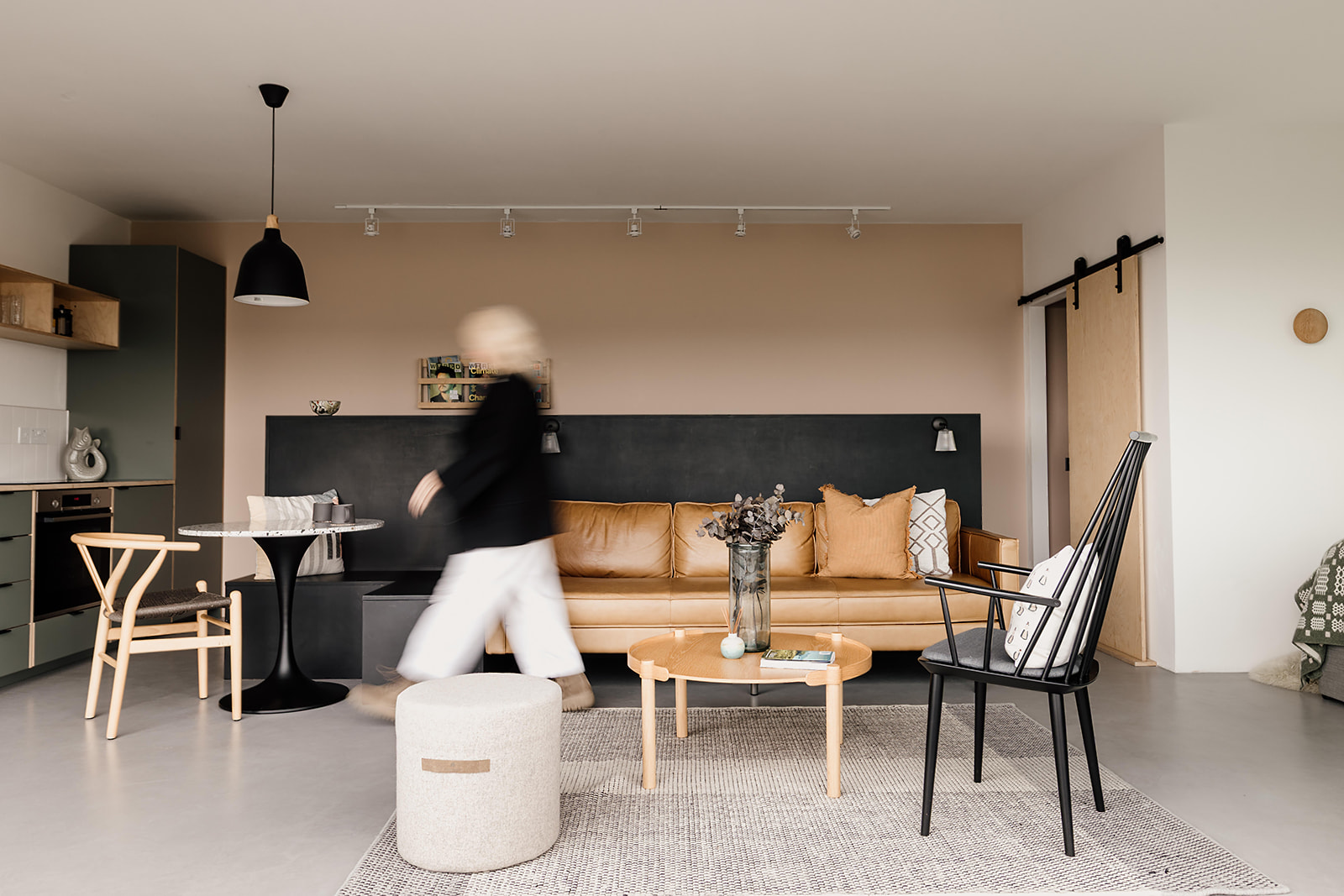
Our clients had an existing front bay living room, middle ‘play’ room and small rear kitchen/dining room with side disconnected access to the garden. Their dream was to create an open plan kitchen and dining space (with much improved connection to the garden), together with soft seating to relax with friends. They wanted to retain their separate front living room. Now their children were more grown up, they wanted to knock through from kitchen to middle room and create more of a gathering space for friends and family as well as introduce space and light. They love a mix of styles which combined amounts to a Japandi look (clean, modern lines, simplicity, limited palette, textures and contrasts) together with a good helping of our very own Welsh ‘cwtch’ too. They craved a home design which was shaped around their changing family lifestyle and priorities. It was important for them to bring a sense of quiet and calm to their home, to simplify and bring in lots of natural wood finishes. We were able to help them with our holistic interior and garden design service.
The 3D renders
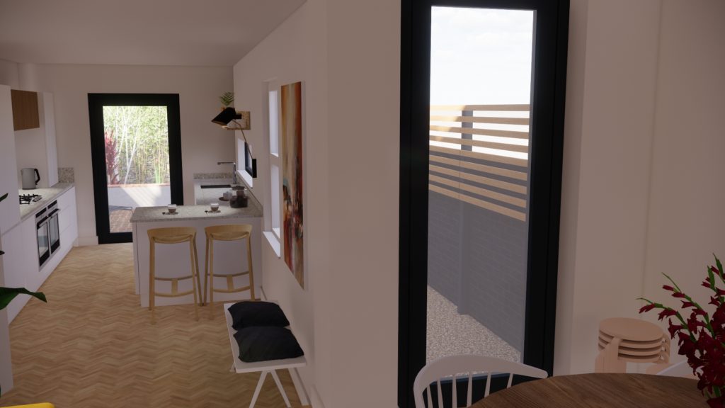
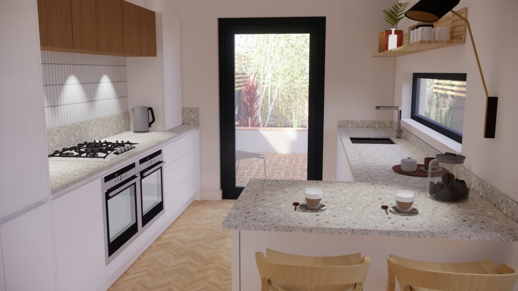
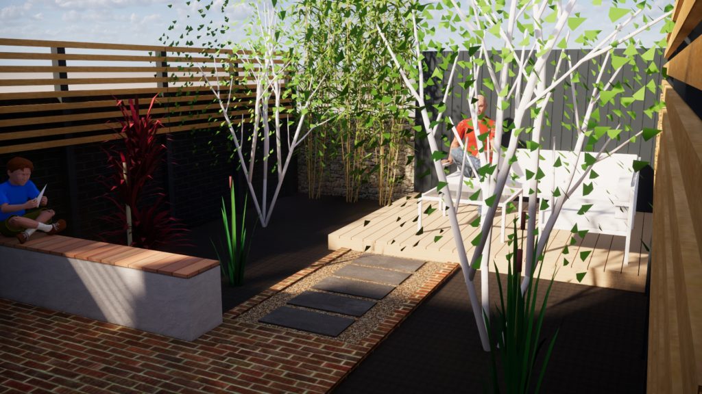
These are a few of our 3D renders showing the design in development, which evolved as we progressed through to finished design on site (see finished interiors photos below). We lead our clients gently through a design journey. People often come to us oozing with lots of ideas about what they love which we filter through into a design for their home, helping them realise their design vision to meet their available space and budget levels. Read further to see the finished interior photographs and the ‘before’ images. It is a real transformation and has dramatically improved the way they are able to interact as a family and with friends at home.
The finished renovation photos
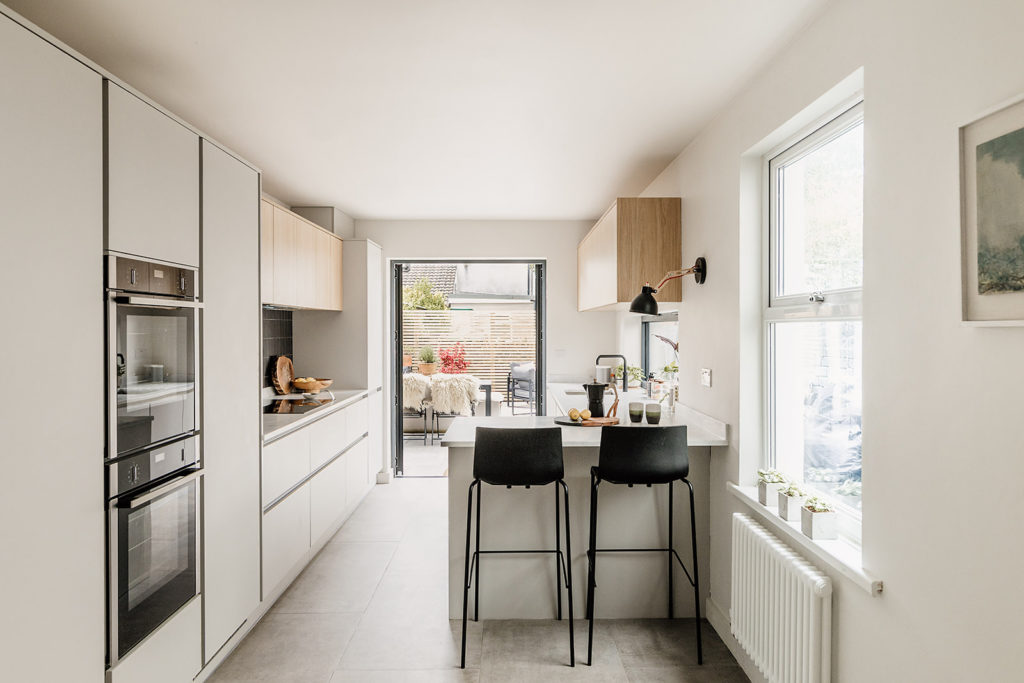
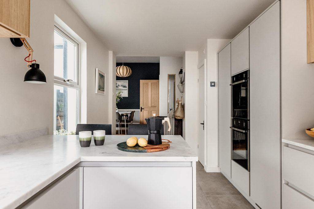
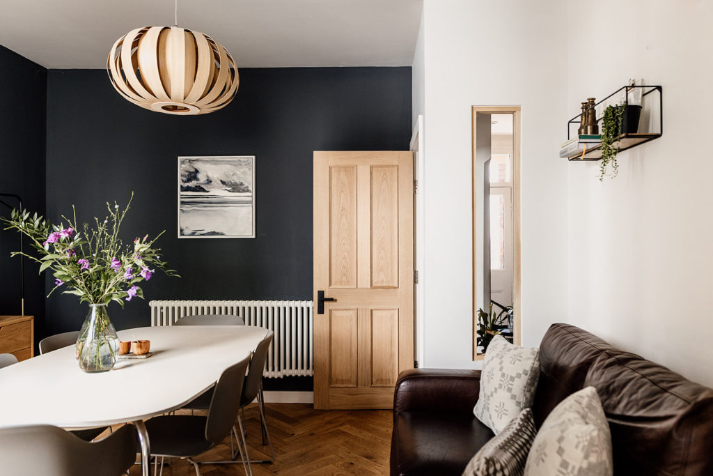
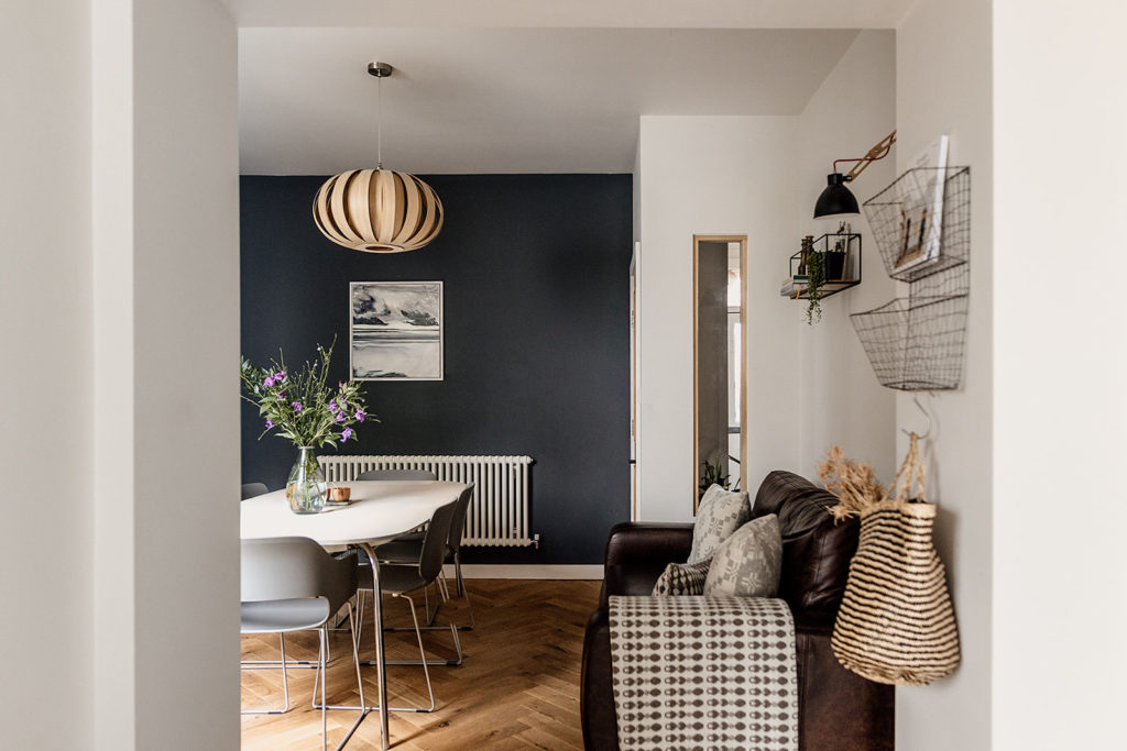
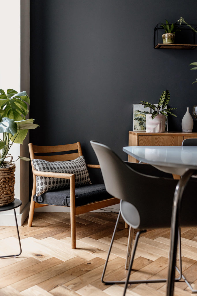
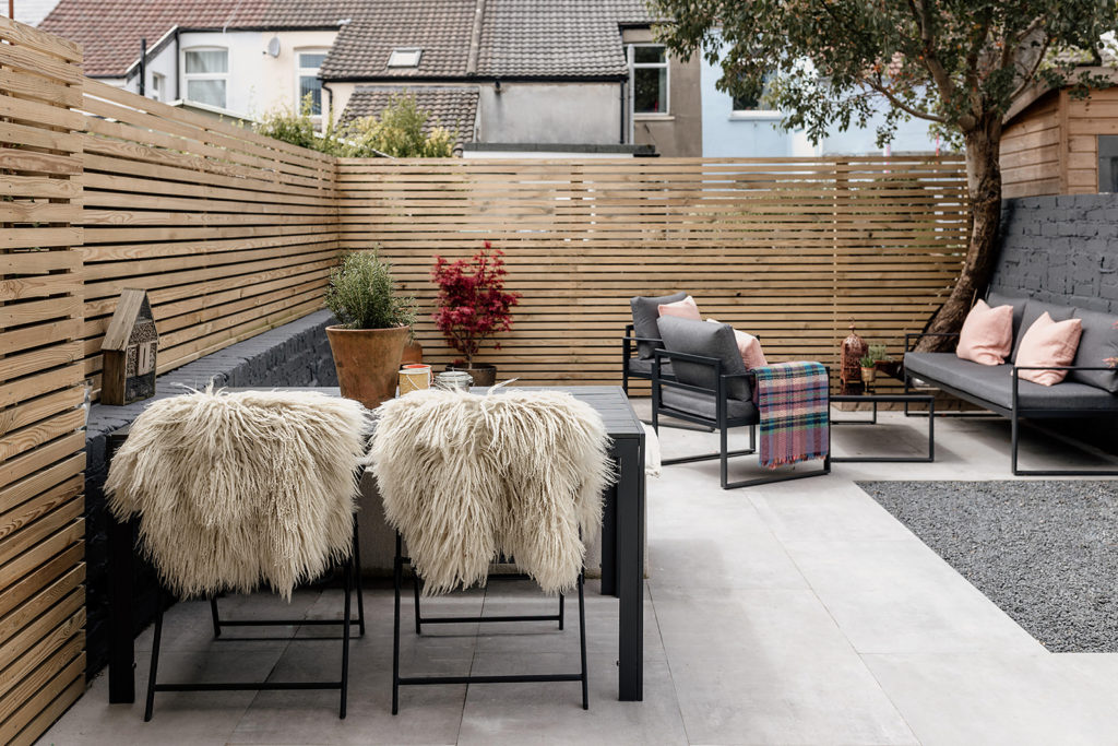
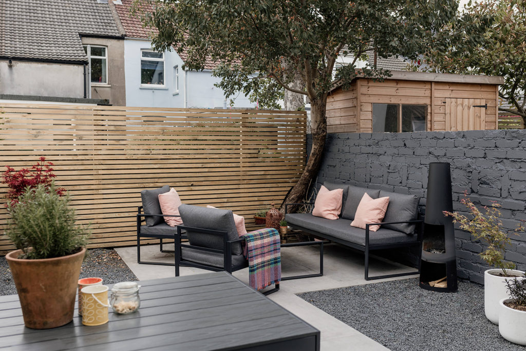
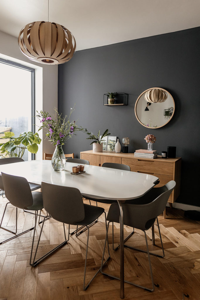
Here are a selection of the finished interior and garden photos for our scheme. Our clients wanted concrete effect tiles that could be laid inside and outside for an integrated, seamless look. They love the end result which blurs the lines between the interior and exterior of their home, making it feel as though their home is extended. In another change to the original design, we introduced smoke grey accent walls and tiles for more contrast and a statement. By keeping to a limited palette of colours and materials with the odd Welsh textile thrown in then overall the design is quiet, casual and effortless. The whole space was remodelled using the existing footprint. By opening up the two rooms, it feels more generous, light and inviting. We have considered the scheme holistically both inside and out.
The ‘before’ photos and design process
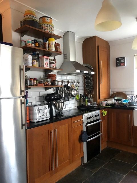
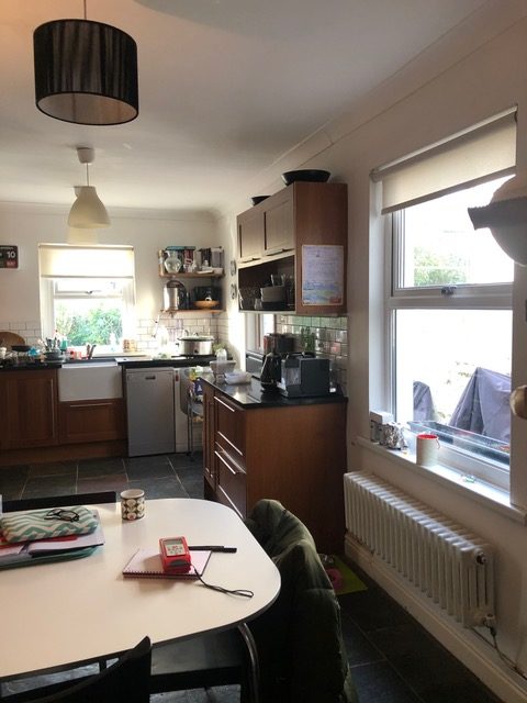
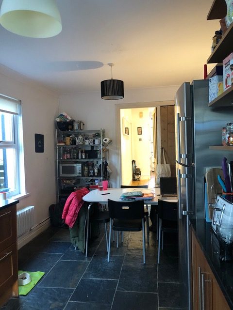
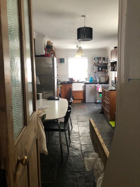
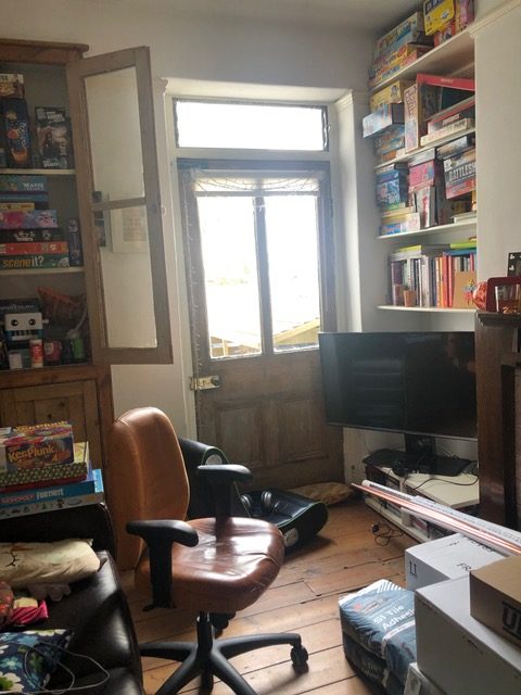
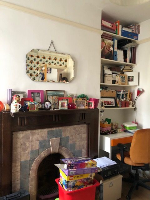
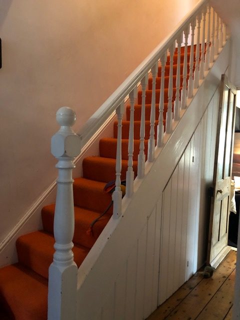
Typically, as for lots of our projects, the most important issues to address were layout and storage. By removing the chimney breast in the middle room, we could free up valuable extra space and afford more flexibility in terms of layout. In view of the width of the kitchen, it became clear that it was not possible to locate soft seating in the area closest to the garden. It was far better to create a generous kitchen with plenty of closed storage and a small peninsula for relaxed eating, drinking and socialising on bar stools within the kitchen itself. We kept some circulation space in the kitchen (because everyone loves to spend time in the kitchen at parties) and dedicated what was the middle room to the dining table and chairs plus our clients’ own leather sofa for relaxed seating in a great place both with good connection to the kitchen and dining spaces. We included a fully glazed door out to the garden, a long window on the side elevation and a closed full size glazed window within the dining area to let in plenty of natural light.
We blocked in the staircase and created a feature glazed window internally to send light through to the hallway and give our clients and their guests a glimpse through into the kitchen beyond on entering the house.
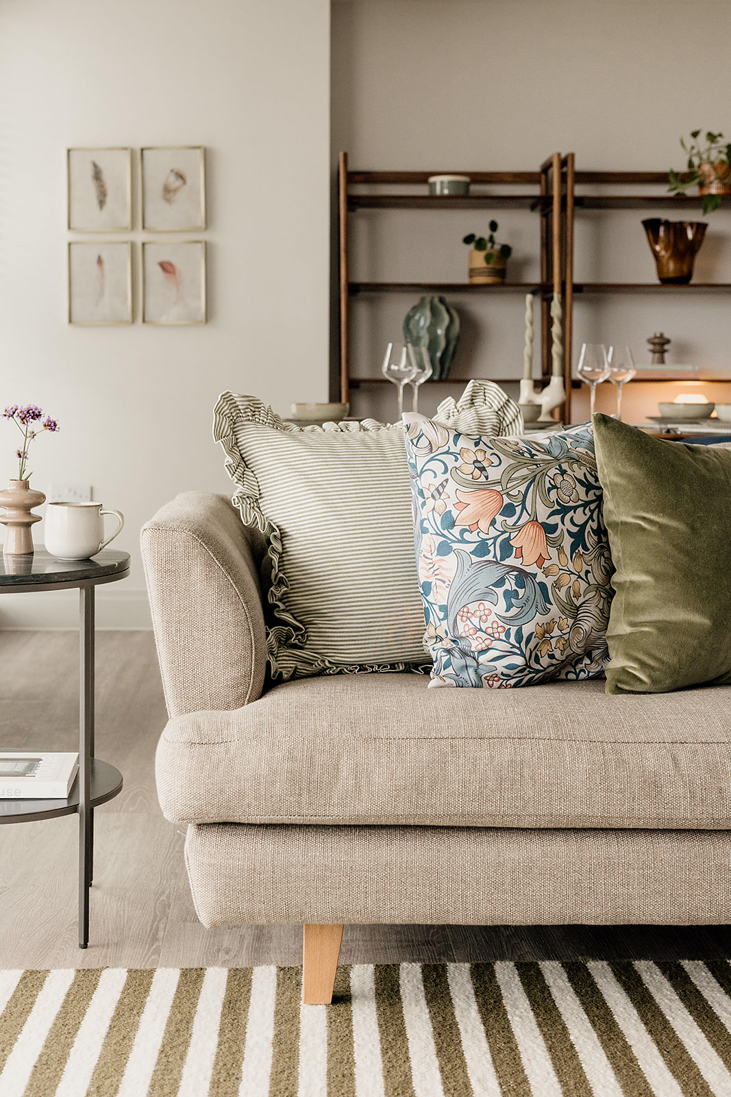
We worked closely with suppliers to create our clients’ desired look and feel in the kitchen, wall and floor finishes, lighting, furniture and soft furnishings. We love the Tom Raffield lighting and Melin Tregwynt cushions and throw.
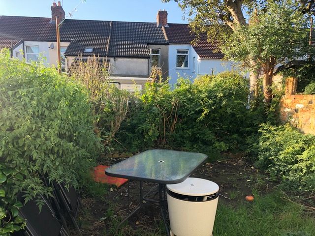
Our clients went from having an overgrown unusable garden space to a fabulous outdoor space for entertaining, which could be easily maintained and feels integrated with the internal space.
The ‘before’ photos
Here are the photos we took at the start of the project. They illustrate how important is was to design in storage, the feeling of extra space and introduce more light. Our clients needed the garden to be easy to look after and link well to the house to afford them greater space for living well and socialising with ease.
The Feedback
This feedback from our clients is music to our ears:
” An excellent service from start to finish, Hygge and Cwtch were with us every step of the way, and made every stage as stress free as possible. They helped us realise our plans for our house, developed and suggested great ideas and ensured the work was completed to a high standard. Our new space has changed our way of living in so many ways and we love our new space. We decided we wanted to modernise our home and make it stylish and practical for family life but had no idea where to start. We approached Hygge and Cwtch for help and never looked back. They took our brief and gave us so many ideas and options to choose from but at the same time helped guide us when we struggled with our decision-making.”
If you like what you’ve seen of our Grosvenor Road project and would love to transform your own home, get in touch for a chat! And remember to subscribe to our emails for a monthly dose of Hygge & Cwtch chat and inspiration.
Previous Post
Next Post
For more of our latest projects, follow along on instagram at @hyggeandcwtchstudio.
© hygge and cwtch creative studio 2025 | all rights reserved | privacy policy | cookie policy
considered Art & INTERIOR Design for Beautiful Spaces
cardiff, CORNWALL & WALES
Hygge Cwtch
&
quicklinks


+ Show / Hide Comments
Share to: