

February can often feel like an in-between moment. Still slow, still quiet. Very much still in the depths of Winter, yet it’s the month that we crave the comfort of home while beginning to peek ahead to the light and energy of Spring. This is a great time to consider the use of colour at home.
Intentional use of colour can support our mood while bringing us moments of joy and comfort in our everyday life. These transitional periods are always a good reminder that while we may want to fully embrace a palette that we’re drawn to at that moment in time, a new season is always around the corner. The key is in finding a colour palette that you connect with, and making sure it can work for you throughout the year.
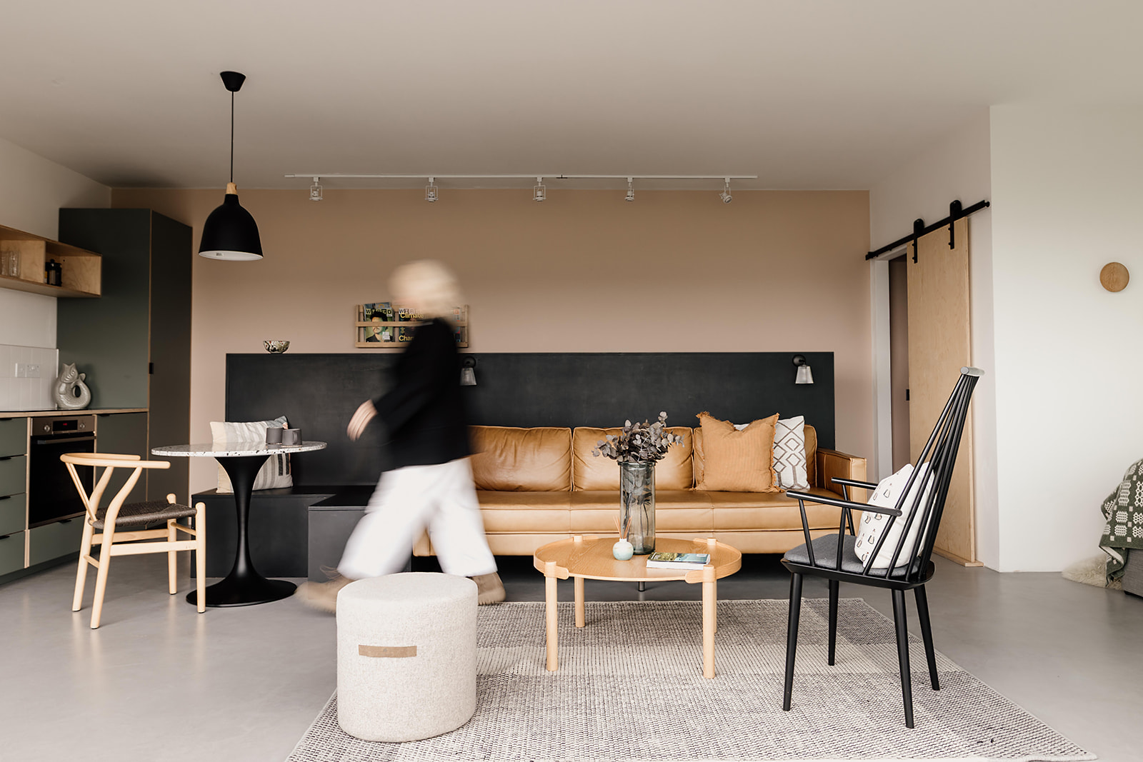
Living with colour, rather than decorating with it
Colour in our home needs to be more than superficial decoration. It needs to connect with us in a way that we can not only live with it, but come alive through it. It should create an experience and deliver a feeling. Importantly, the colours that achieve this will be different for everyone.
Our clients often come to us with a desire to use colour but a lack of confidence in choosing the ‘right’ ones. Our approach is always to dig deep with our client to find the colours that spark something. Ignore trends or social media influences. Sure, we can all be inspired and gain ideas this way, but it’s easy to lose sight of what we’re actually drawn to.
We help our clients find the colours that speak to them and find a considered use for them in their home. It doesn’t have to be all drama and bold statements. It can be subtle nods to a feeling or to reflect a personality. Colour to add depth, focus and contrast. We’re all about creating a timeless palette that brings a sense of comfort and quiet joy, that will work through the seasons and for years to come.
Colour, meet Texture
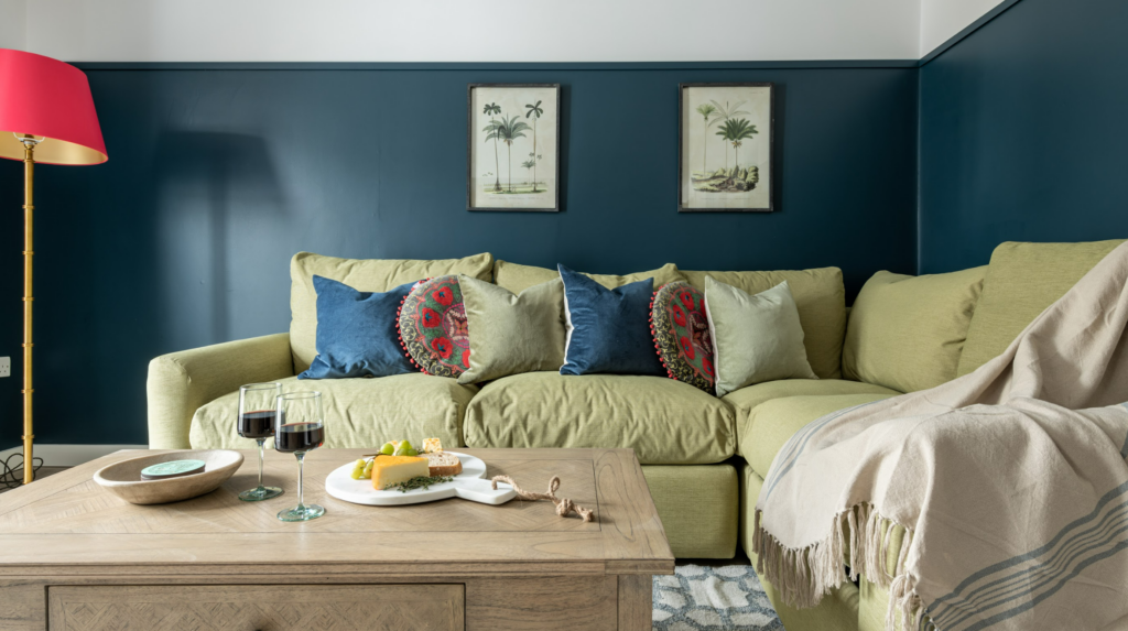
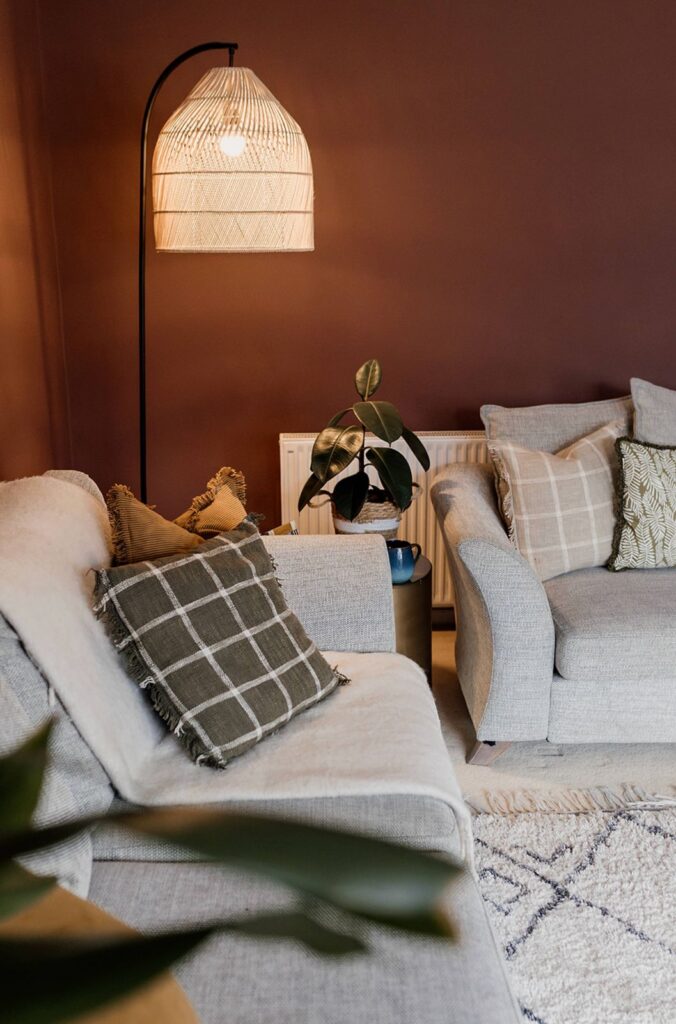
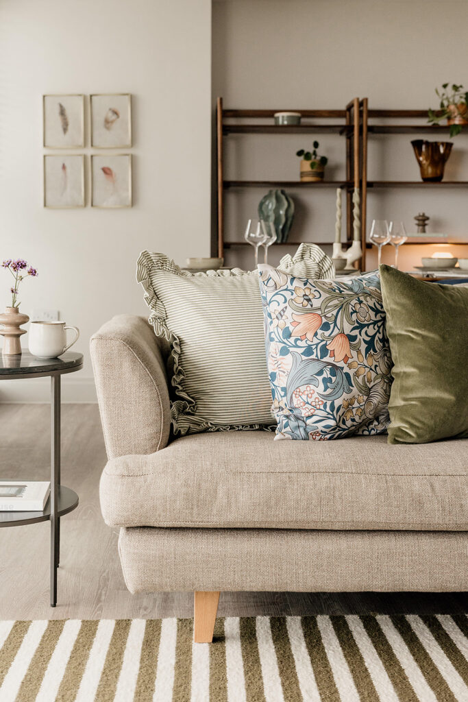
When considering the use of colour in a home, we always combine it with careful use of texture. Layering the right textures in a space can bring so much balance, synergy and depth to a colour palette. Whether it’s contrasting textures or a more sympathetic pairing to really lean into a vibe, the textures you add to a palette can elevate a room scheme no end.
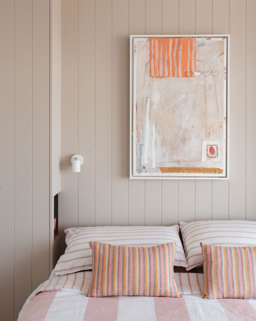
Textures are key to transitioning a colour palette between seasons. Open weaves and floaty movement gives a sense of lightness and space to even the richest, warmest palettes. While a gentle, cool, dusky or pastel palette, reminiscent of Spring and Summer months, can be cosied up with chunky knits, faux furs and textures with a sense of weight and warmth.
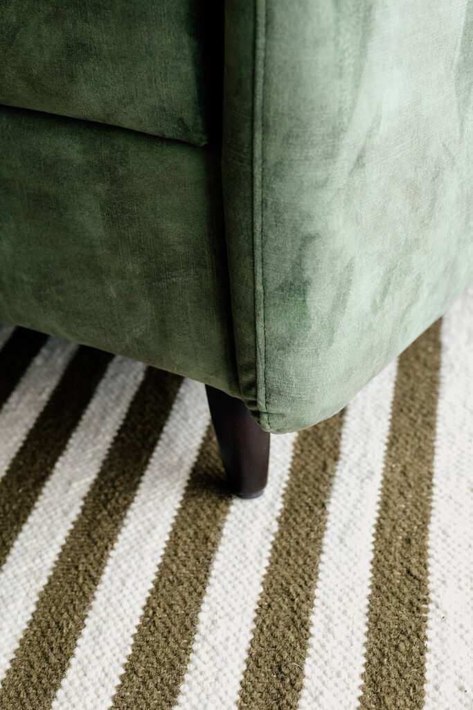
Natural materials are our go-to as they add such depth to a space and draw on the five senses. Think linens, wools, stone, wood. Biophilic design is key to our signature style, which is deeply rooted in nature, wellbeing and connection. When organic materials are intentionally paired with colour, magic can happen.
Layering colour, the hygge way
While we really love making a statement with colour, simplicity is always at the heart of our design work. Finding a colour palette that connects with the homeowner is key. Beyond that, it doesn’t have to be complicated to feel good.
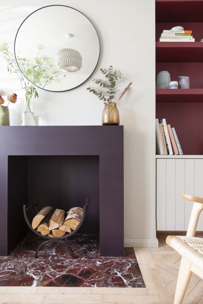
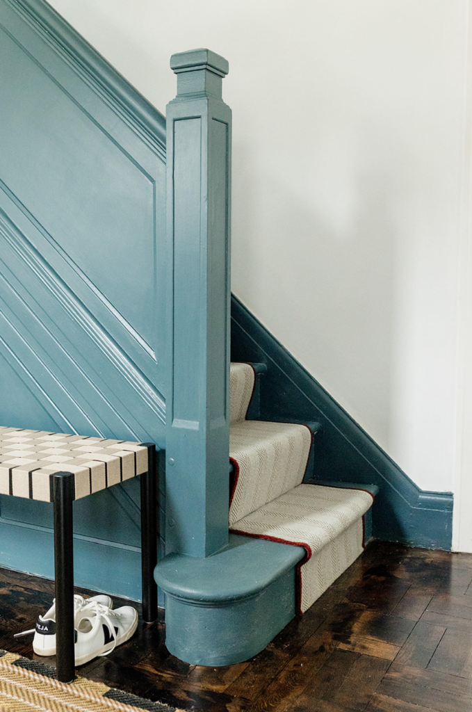
Building a scheme using different tones from the same colour family is a really elegant way of layering colour in a space. Sometimes, the simplicity of exploring the depth and range of a single colour – known as ‘monochromatic’ in colour theory – brings a certain sense of ease and calm.
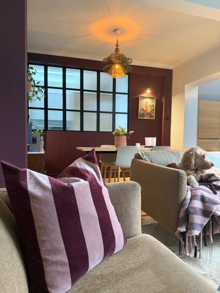
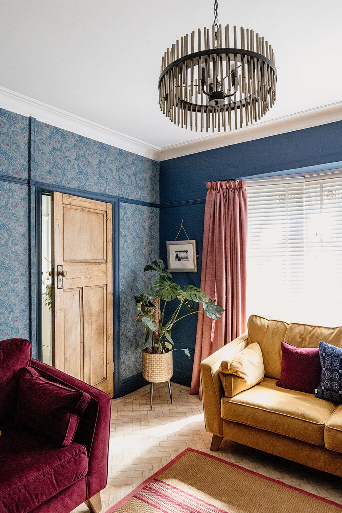
We love to use nature-inspired combinations, leading with the colour that best sets the mood and supporting with an accent to create a feeling reminiscent of a scene from nature. Whether it’s a palette inspired by the sunset, the ocean, seasons or woodlands, nature doesn’t go wrong when it comes to colour.
For a more varied palette, we take time to identify all the colours that our clients truly love and how they can create the mood they want for a space. Playing with combinations, proportions, lighting and texture helps us to create truly layered, considered interiors that are grounded in creating connection and pockets of joy.
Colour for beyond the seasons
We find so much satisfaction in using colour in our work, and our goal is to bring that same joy to our clients by designing homes with intentional, considered use of colour. Colour that they connect to, that makes them feel great and that will carry them through the seasons and beyond. If you’d like to work with us on introducing more colour into your home, get in touch for a chat.


For more of our latest projects, follow along on instagram at @hyggeandcwtchstudio.
© hygge and cwtch creative studio 2025 | all rights reserved | privacy policy | cookie policy
considered Art & INTERIOR Design for Beautiful Spaces
cardiff, CORNWALL & WALES
Hygge Cwtch
&


quicklinks


+ Show / Hide Comments
Share to: