Oh how we love it when we get the professional photography back from a recently completed project! It makes us feel a renewed excitement for jobs which can often be years in the making. Two years in fact, for this particular home, largely thanks to lockdown delays. As a Cardiff interior design studio, we really love working on homes in the surrounding areas in South Wales. It means we can get really involved in the progress of a project. Getting to know the property and the owners enables us really find the best solutions and make the house work best for them.
And that’s how we start the story of this full house re-design. This month, we want to take you on a tour of part of our Greenfield project in the beautiful location of Creigaiu. Let’s start with the real showstopper of the home, the kitchen dining room.
The kitchen dining room brief
The priority in this space for our clients was to create more connection between the rooms. Opening it up by remodelling within the existing footprint made sure there were clear sight lines between the kitchen and dining table. This enables an easy flow between the spaces and connection between the people using them.
Our clients had some specific requests on what they wanted in the space. This is part of the briefing process which we always embrace. Working with the our client’s most treasured possessions is all part of an interior designer’s challenge and ultimately enables us to create the most magical, personal homes.
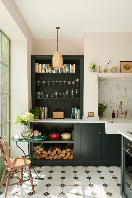
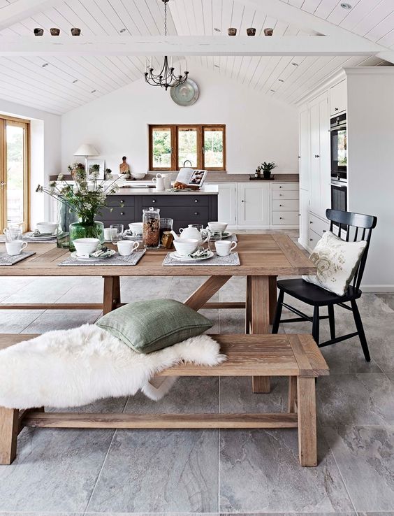
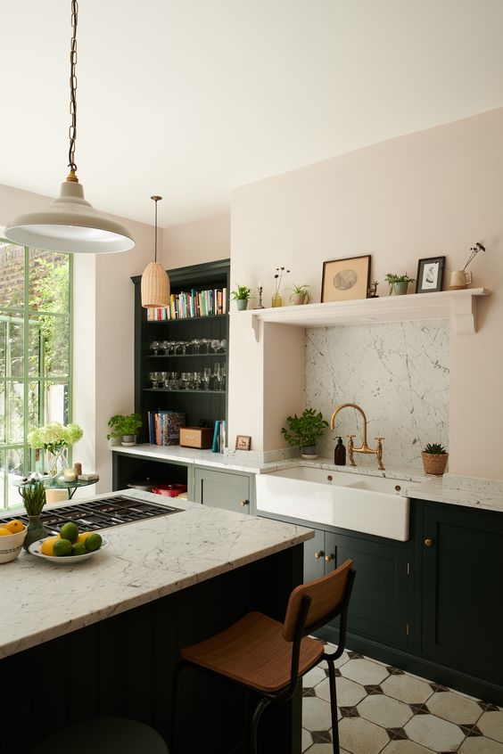
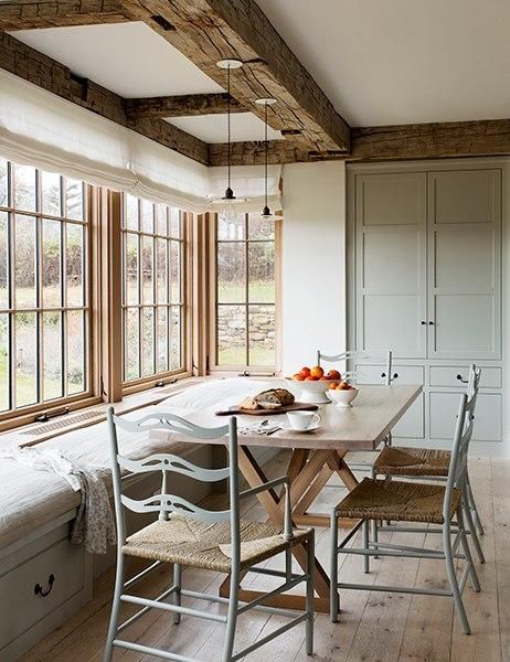
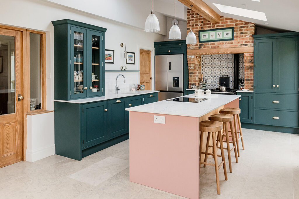
A large kitchen island and dining table were a must-have and we have to agree these two pieces are key to harbouring connection and encouraging socialising. It’s called the heart of the home for a reason!
Pink and green kitchen cabinetry was on their list too, as well as retaining their Range cooker and the exposed brick chimney breast. It was a balance of mixing old and new styles. Traditional finishes, Shaker-style cabinets and appliances, alongside a contemporary take on a split colour palette in bold shades.
Finally, our clients wanted to keep the internal oak beams and wooden doors throughout the space. This was a key part of the design in our eye. The oak tone was spot on, and natural wood is always high up on our list of materials thanks to our love of biophillic design. Tonnes of character and a real homely feel.
Visualising the new heart of the home…
It was important for a job of this scale – where we were drastically changing the layout, use and style of the entire space – that we planned meticulously and made sure our clients were comfortable and confident in proceeding with our designs.
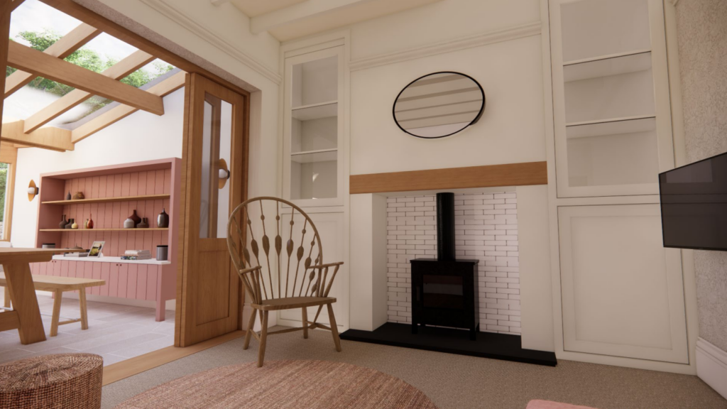
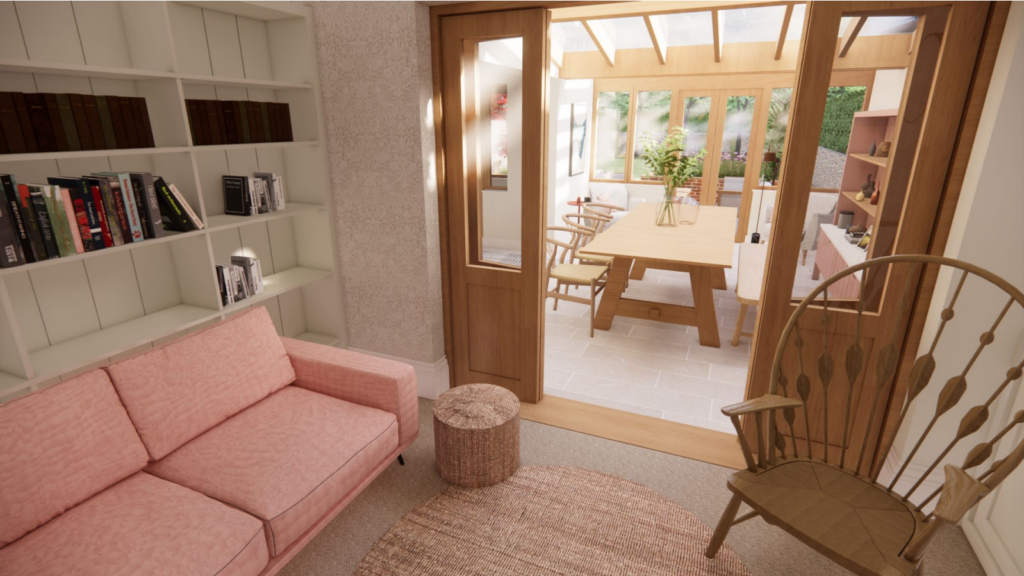
To enable this trust, part of our process was to visualise every room of the house through either hand drawn sketches or 3D modelling. We’ve shared some of both throughout this post, you can really see the benefit of visualisation and how closely a room can transform from paper to reality!
Here are the 3D interior design models (also known as ‘renders’) for the kitchen and dining room…
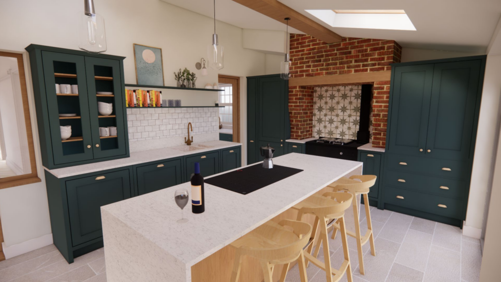
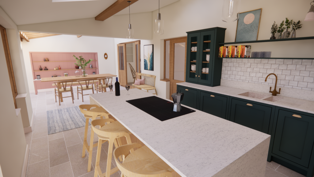
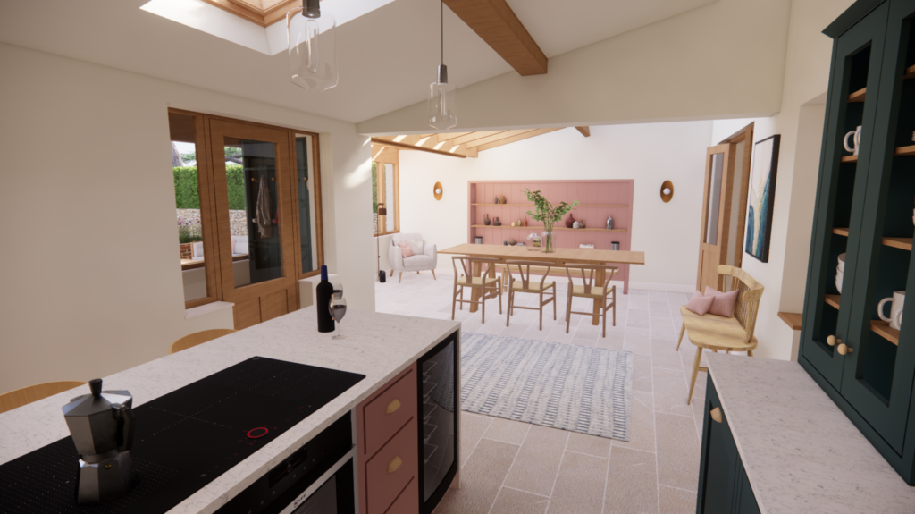
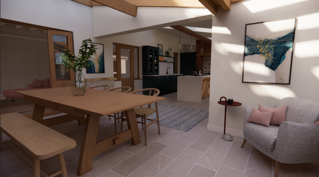
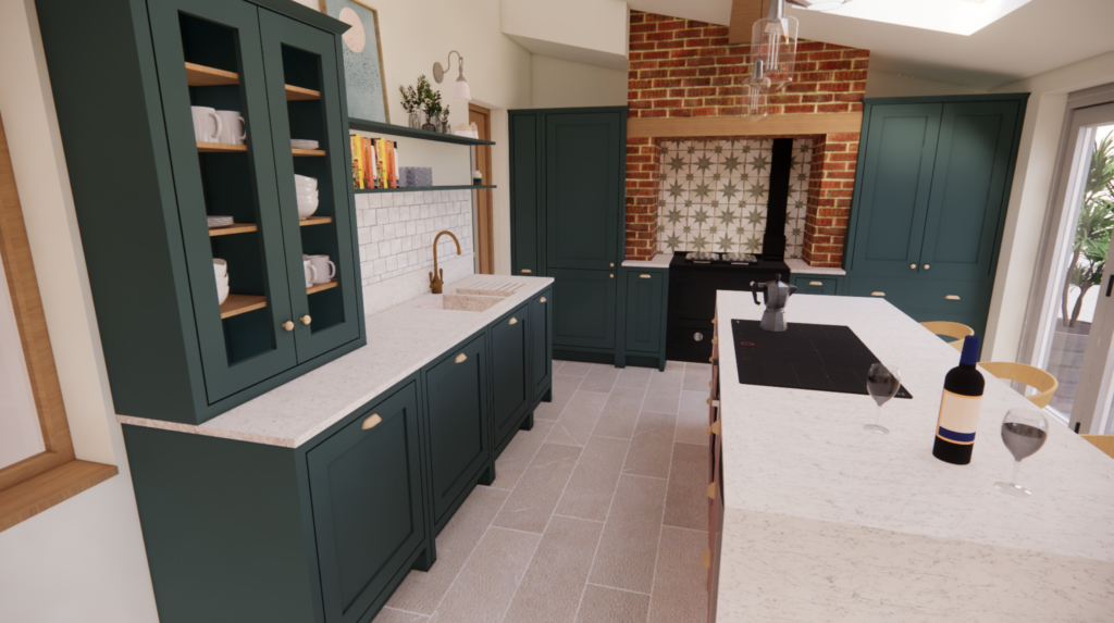
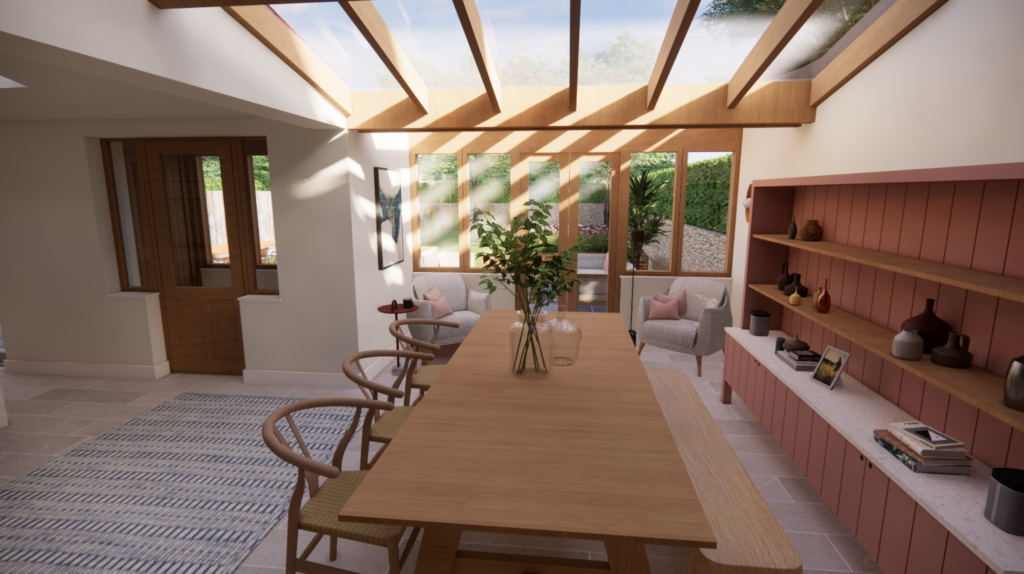
The finished kitchen dining room
The final space translated just as we’d hoped from the 3D renders. Our clients now have a bright, open, very personal and unique space. Perfect for hosting friends or catching up with the kids round the table.
We didn’t shy away from those pink and green cabinets! We selected tones which were quite saturated – Little Greene ‘Harley Green’ and and Little Greene ‘Blush’ – giving plenty of contrast against the exposed brickwork and creating an overarching feeling of personality and fun. To aid the sense of flow between the rooms, we carried the pink through to the dining space on the beautiful dresser unit.
We were able to identify a couple of red threads throughout this house to create a sense of flow, belonging and identity. The shades of pink and natural wood are a couple of the features that you will see pop up through the house tour.
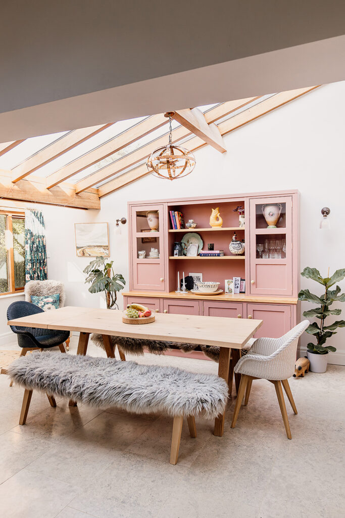
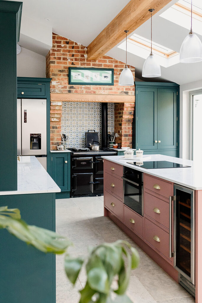
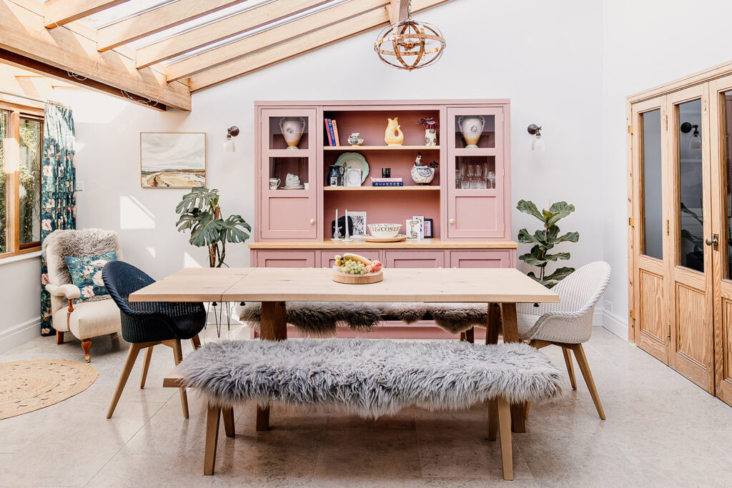
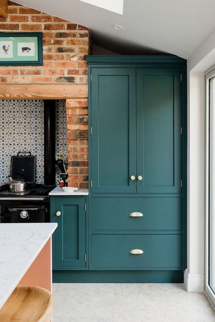
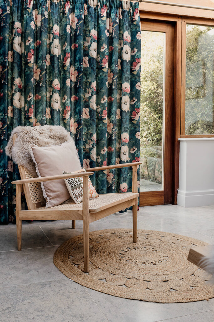
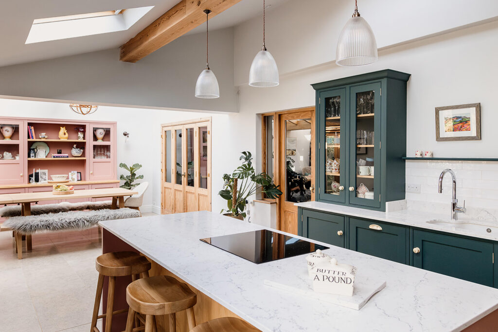
To add to the sense of homeliness, we included plenty of soft furnishings and some bold prints which helped to tie together the colour palette. The gorgeous bold floral curtains in the dining space, and the intricate tiling over the cooker, both helped to balance the solid colour blocking used throughout. Combined with the cushions, faux fur throws and different coloured dining chairs, the space instantly softened and felt not over-designed.
These are the details that we believe elevate a space from being well designed to being something infinitely more special. It’s how we blend old and new. It’s how we breathe new life into a space. Making it feel new but somehow also feeling like a truly lived-in and loved home.
Utility Room
The utility room came directly off the kitchen, so it was important that the sense of flow not only carried through the open plan space, but into every room touching it. In the utility room, we went for a ‘small space, huge impact’ approach. Not only visually but practically.
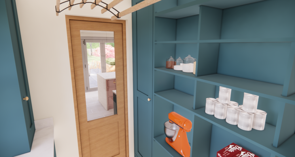
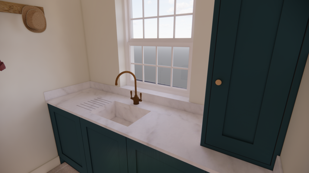
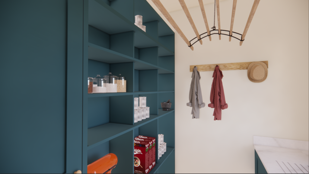
Running the white Caeserstone White Attica worktops and a slightly more blue-toned shade of green through the cabinetry created instant cohesion with the kitchen. A full wall of open shelving provides a huge amount of storage options for our clients to grab and go. The intentional closed cabinetry houses the necessities such as hoover, mop and ironing board.
An overhead clothes airer was the final touch in using this space to it’s full potential. It’s practical but the natural wood and black touches make it feel entirely in-keeping with the scheme.
Snug
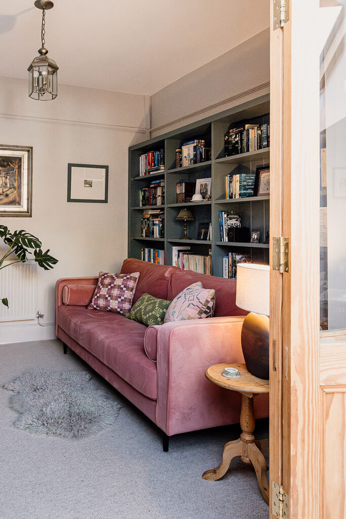
The snug is located directly off the dining area. It’s separated by oak French doors which allows the light to flow while giving the option to close off the room for a true snug effect. We closed off a door to this room from the hallway as part of our floor planning solution, which meant there was only one entry to the room. For the purpose of a snug, and to get the best use out of a small space, this was definitely best option.
This is probably the area that changed most between the renders and the installation, largely due to the wall coverings. Changing the bookshelf colour and losing the wallpaper allowed us to create a focal wall and bags of impact. Something we noted on first viewing our client’s house was the amount of books around the home. We presented this full wall bookshelf solution to them as a place to bring all their books together. Luckily they loved it, and so do we!
The blush velvet sofa and the dark green cabinetry contrast beautifully against each other. Having versions of these shades in this room delivers cohesion with the open plan space. With a log burner on the opposite wall, this small space packs a punch both visually and practically.
Downstairs Shower Room
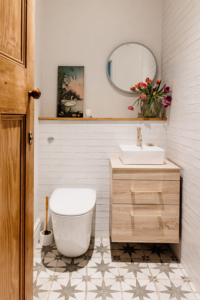
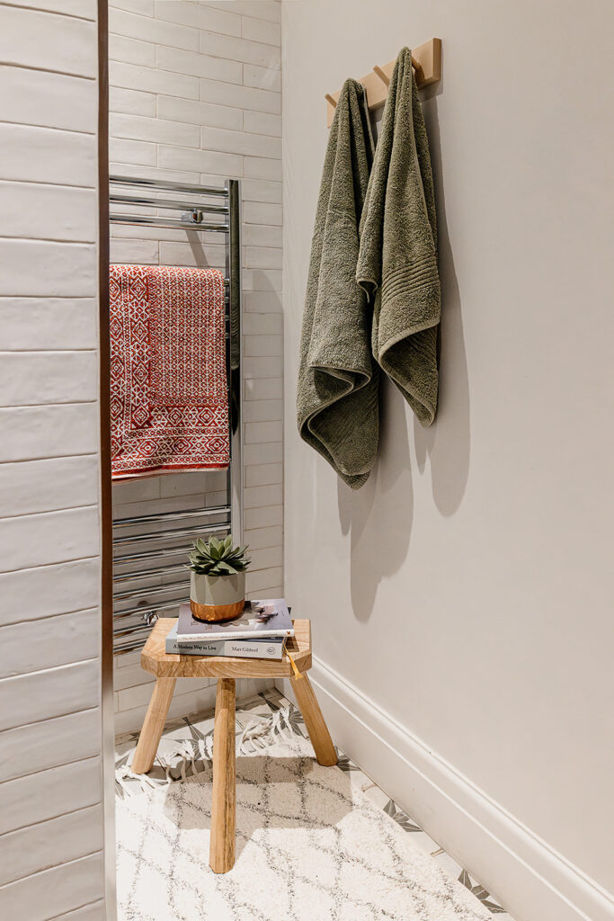
We wanted to reflect a change of pace in the downstairs shower room. Peaceful, clean and simple.
The floor tiles add the visual interest while the rest of the room relies on good space planning and texture. The rustic white wall tiles and natural oak are a match made in heaven. The floating sink cabinet gives the illusion of more space. We’ll let you in on an old interior design trick. To make a room feel bigger, select furniture which is lifted from the floor and on narrow legs. The more floor you can see, even if it’s underneath a piece of furniture, the bigger the space will feel.
Porch and Garden Design
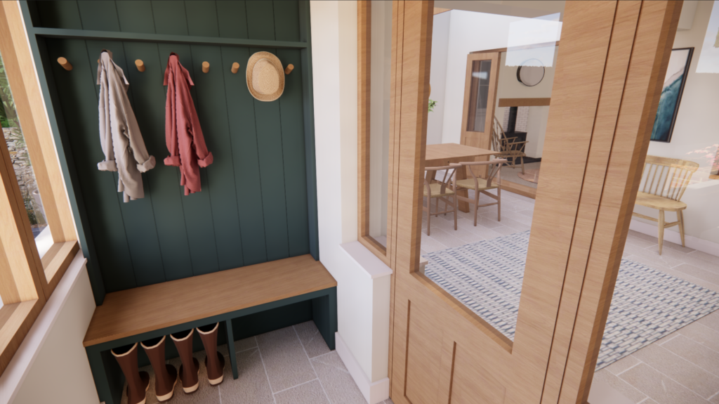
Our design remit also extended to the porch and the garden. The porch is a continuation of the home so we created a small boot room space using traditional tongue and groove in a green to match the kitchen.
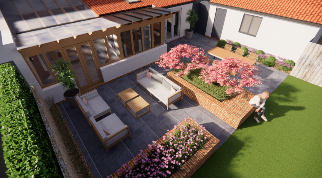
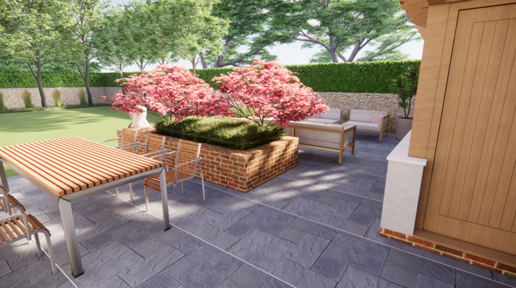
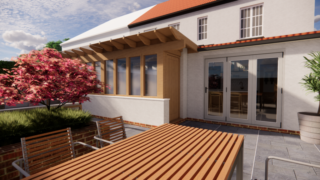
Garden design is one of our favourite services to offer. We were thrilled to pull together the plans for the landscaping, including some outdoor relaxed seating and a dining area. Blush-toned trees and pink bedding flowers continued the flow from inside to outside.
What our clients said…
“Annie really took time to understand who we were and what our taste was, and how our needs were changing with our family growing up and leaving home. I walk through my home now and love the flow and feel of it. I have colours and patterns that I would have been cautious about previously, but absolutely love.
We now have a home that we enjoy living in but also importantly, that works for our needs.
I would thoroughly recommend Annie to anyone thinking of updating their home”
And that’s where we’ll leave part 1 of our house tour of the Greenfield project. We’ll be sharing part 2 soon, including the living room, bedrooms and the family bathroom. Are you already subscribed to our email newsletters? If not, sign up here and be the first to see part 2 of this tour.
Special thanks to the wonderful Aga Hosking for her beautiful photography, used throughout this tour.
We’d love to know what you think! Would you like to work with us on your own project? Please get in touch and let’s talk more about how we can create a beautiful home for you.
We are a Cardiff interior design studio, working with homeowners across South Wales, Cornwall and the nearby regions. Not sure if we work in your area? Drop us a message and we’ll let you know!
Leave a Reply
For more of our latest projects, follow along on instagram at @hyggeandcwtchstudio.
© hygge and cwtch creative studio 2025 | all rights reserved | privacy policy | cookie policy
considered Art & INTERIOR Design for Beautiful Spaces
cardiff, CORNWALL & WALES
Hygge Cwtch
&
quicklinks


[…] in June we shared Part One of our Greenfield Project house tour. And now, as we take some time during the summer to rest and reflect on the first half of the year, […]