A look back at one of our interior design projects right here in Cardiff. Hygge & Cwtch Design Studio were appointed interior designers for this full ground floor renovation project.
Project Name
St Cadoc Road
The Property
A 4 bedroom, semi-detached residential home. Our clients had already worked with an architect to get planning approval for a small extension at the rear of their home. They appointed us to help develop an interior scheme on the ground floor that would not only offer a practical space to suit all their family needs but also give them a stylish and minimal design, using simple lines and have that timeless appeal.
The Brief
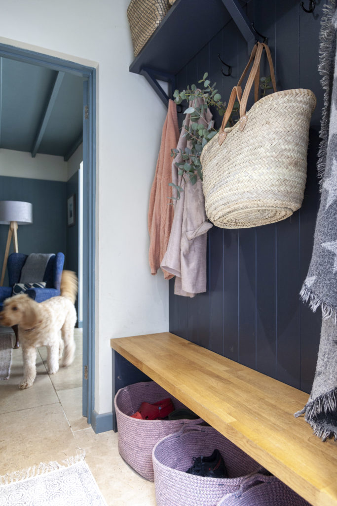
They prioritised an open plan kitchen and dining space connecting to the garden space, together with a ‘cwtch’ where they could sit and relax in front of the fire. Storage was a key requirement and they were keen to make sure that there was sufficient closed cabinets and drawers for all their family needs, as well as open storage to display precious things. Like most families, they had a lot of stuff which needed to be ordered and stored in a way that served them well. As well as children, we needed to consider their dogs and make sure the finished interior was practical and beautiful.
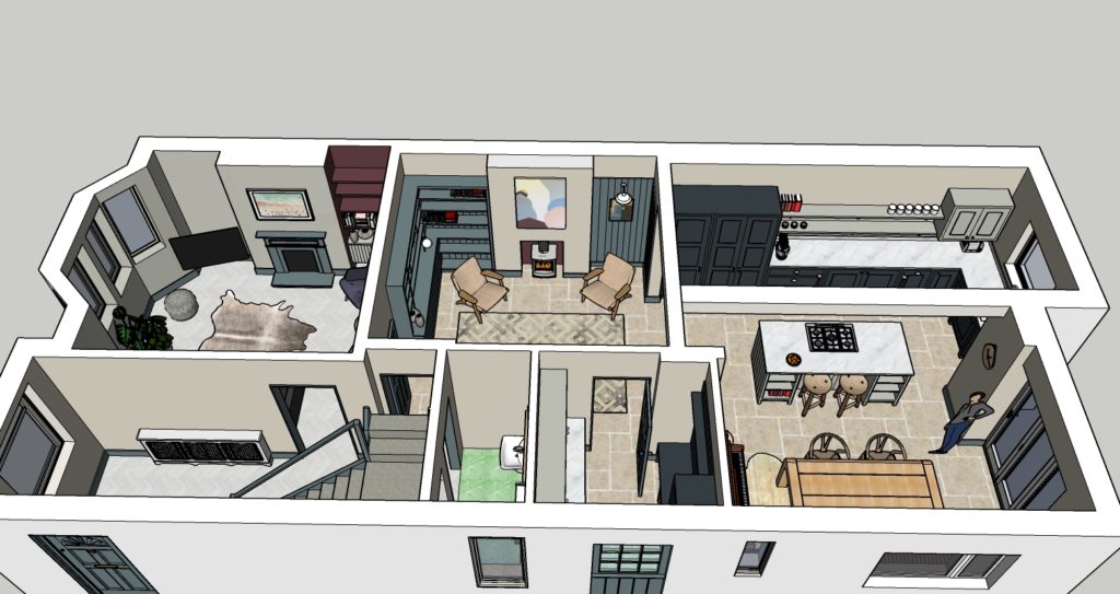
Our clients wanted to keep some existing furniture (a favourite armchair, dining table and chairs) and incorporate this in the finished scheme, so mixing old and new. They favoured a mainly neutral wall colour but loved the idea of colour blocking using bolder colour choices to make a statement. They also wanted to use textures like wood to bring in warmth and make the most of natural light. We updated their front living room, added a utility/boot room and downstairs cloakroom. The full aerial view of the interior scheme is shown below.
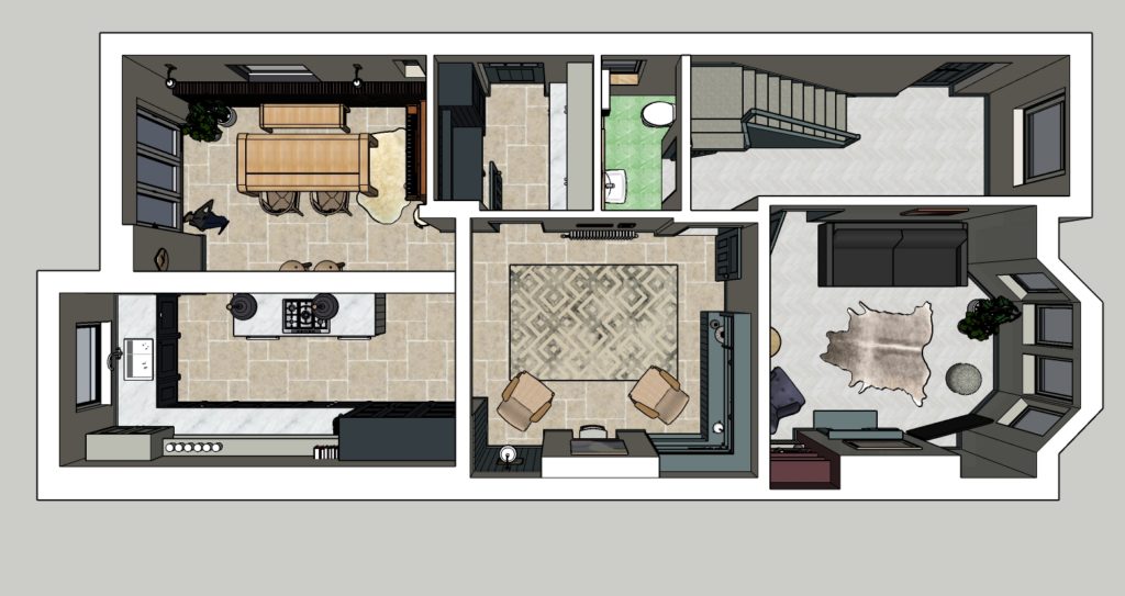
The Inspiration
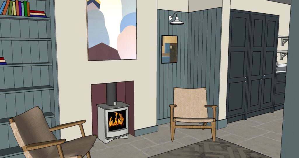
Our clients knew they wanted a blue ‘Shaker’ style kitchen with a kitchen island incorporated but other than that they had no firm thoughts about the scheme and were open to our ideas. So we were given free rein to develop a scheme based on their fairly limited brief. Here are some screen grabs of the sketch up model showing the design. As you will see below the final photographs are a close match to our design.
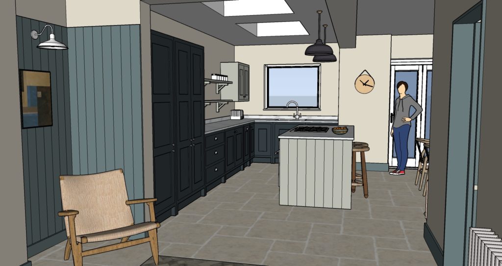
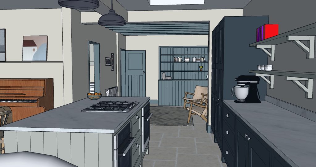
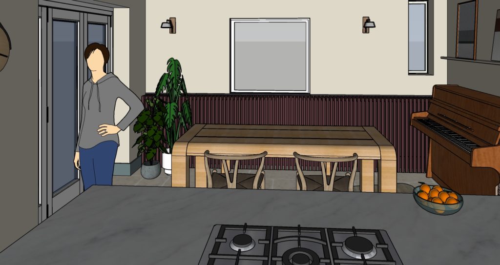
The Design Process
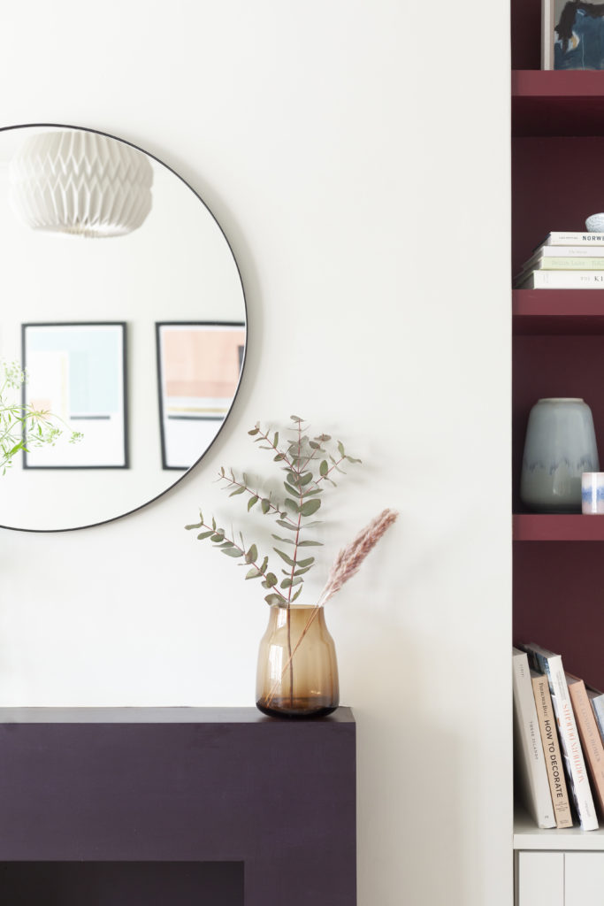
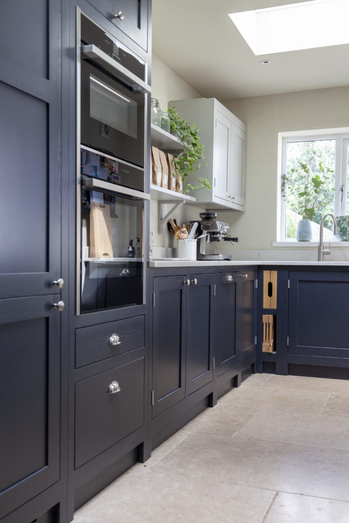
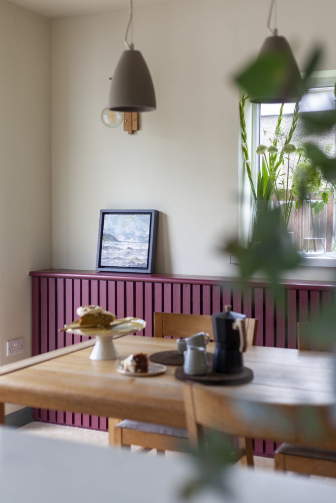
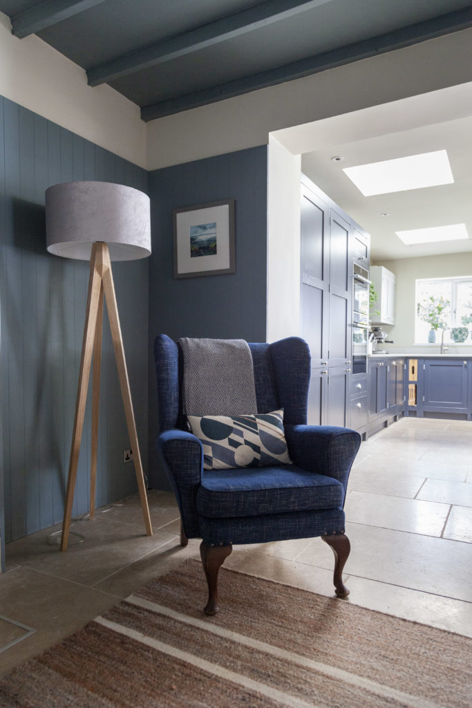
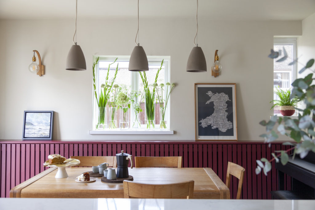
We spent some time upfront clarifying their colour preferences and blue was a clear winner. They loved a classic navy blue for their kitchen and agreed on Farrow & Ball de Nimes as another blue to bring into the scheme. It is described as ‘down to earth and grounding’ and was a perfect match for the timeless look our clients were seeking. As they were game for making a bold statement, we used de Nimes throughout the ground floor on the wood skirting, internal doors and architrave as well as the stairs from hallway to the loft, creating a strong colour flow and red thread throughout the house. By way of contrast, we used Farrow & Ball Preference Red in the scheme both as a colour for the bespoke radiator cover in the dining area and new open shelving in the front room.
We kept things simple by using neutral colours for the walls, including Farrow & Ball School House White and Cromarty. Our clients decided they wanted a limestone floor in the kitchen, ‘cwtch’ and utility/boot room areas, which complemented the Shaker kitchen and utility cabinetry. We took this lighter floor colour through the front living room and hallway by lightening their existing soft wood parquet floors so they had that Scandi feel. It helped keep an overall light appearance through the ground floor.
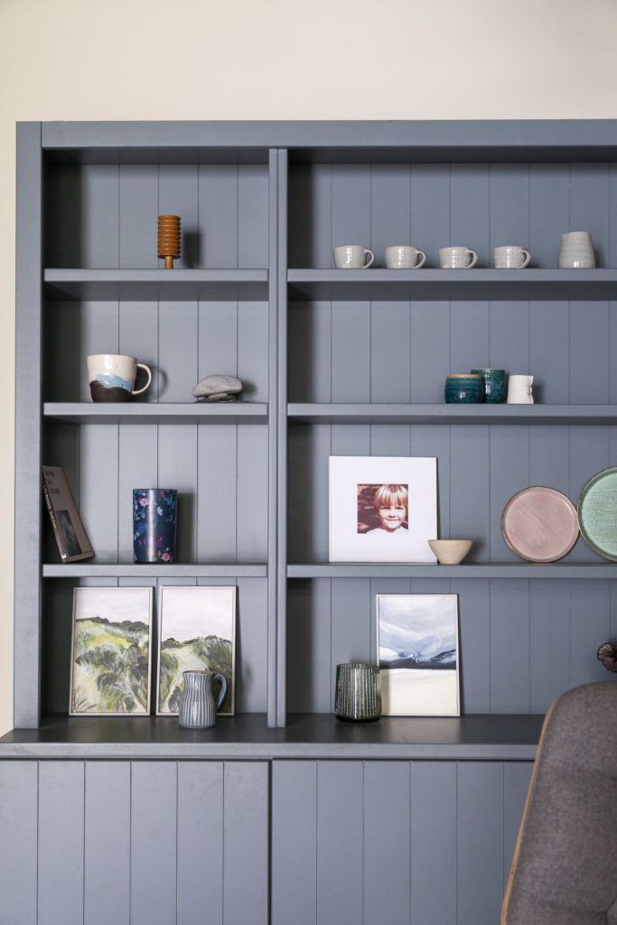
Once we had built up a good overview of the key elements, we started creating a 3D model of the spaces and develop the overall scheme. One key repeating theme was the use of a modern take on wood cladding as a wall finish and in the built in cabinetry and storage. This gives a cosy feel to the spaces yet still had that contemporary wow factor. We had in mind a modern take on the traditional Welsh dresser when designing the bookcase and closed storage in the ‘cwtch.’
By adding the all important wood-burning stove as a central feature in the ‘cwtch,’ this became the space our clients could see themselves gathering to read and chat, whilst still feeling that connection to the kitchen and dining areas. We finished off with some gorgeous Tom Raffield Hanter wall lights in the dining area, concrete look pendants over the table and simple french bistro lights in the kitchen, which complement the blue colour scheme. Finally we re-upholstered the favourite armchair in the ‘cwtch’ in a rich, denim blue and there are little Welsh and Scandi touches in the mirrors, soft furnishings and accessories.
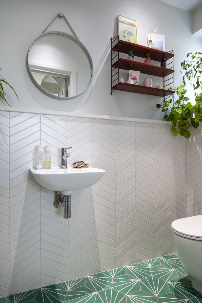
As the project evolved our clients became confident in their own choices and opted for a statement green hex tile in the ground floor toilet, coupled with a white chevron for a striking overall space.
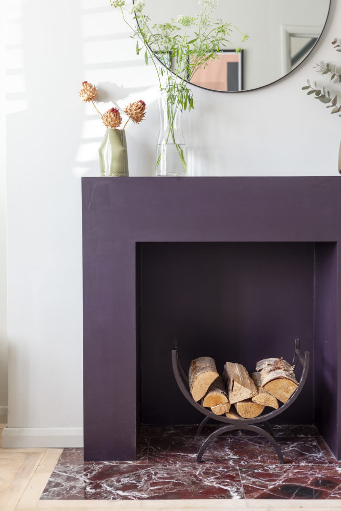
Another little twist was the use of a fabulous deep red marble tile in the living room hearth. It really does add great texture and interest.
The Finished Renovation Project
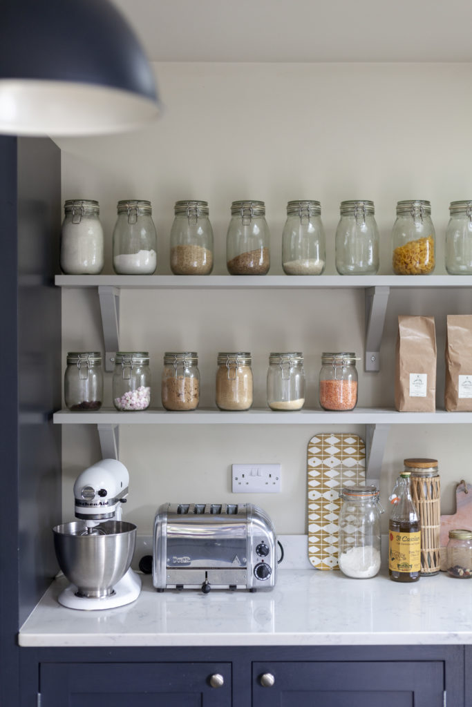
We love the bold use of colour and palette of blues, deep reds and pop of green against the neutral whites. It is rich and interesting, cosy and comfortable, offering a great social space in the heart of the home. Above all, it is practical and works fantastically well for the family who are delighted to live in it.
The Feedback
We love these wonderful words from our happy clients:
“We decided we wanted to modernise our home and make it stylish and practical for family life but had no idea where to start. We approached Hygge and Cwtch for help and never looked back. They took our brief and gave us so many ideas and options to choose from but at the same time helped guide us when we struggled with our decision-making.
Their mock up drawings and site visits were always a delight, each time we looked forward to a sneak peak of the next exciting chapter of our build. Annie was so patient with us whilst advising us on the interior design. We were complete novices but Annie encouraged us to make some bold design choices and we are so glad she did. Everyone who visits our house is always full of admiration of how amazing it looks. We cannot thank Hygge and Cwtch enough. They have given us a home that we love living in.”
If you like what you’ve seen of our Cadoc Road project and would love to transform your own home, get in touch for a chat! And remember to subscribe to our emails for a monthly dose of Hygge & Cwtch chat and inspiration.
For more of our latest projects, follow along on instagram at @hyggeandcwtchstudio.
© hygge and cwtch creative studio 2025 | all rights reserved | privacy policy | cookie policy
considered Art & INTERIOR Design for Beautiful Spaces
cardiff, CORNWALL & WALES
Hygge Cwtch
&
quicklinks


+ Show / Hide Comments
Share to: